
Treat Yo’self: Warm Holiday Wishes from Moz!
Posted by FeliciaCrawford
In almost the blink of an eye, 2016 is coming to a close. And yet as fast as it went, this year absolutely brims with memories. Now that we’re full-swing into the season of warm, fuzzy feelings and excruciatingly long lines at the store, the time is ripe to reflect back on all that’s passed. And in classic Internet fashion, what better way to reflect than with a quick quiz?
1. So, how are you feeling about this year’s wintry season (also known as Q4)?
A. Fantastic! I’ve been listening to Neil Diamond’s rendition of Walking in a Winter Wonderland since before Halloween. Pass the nog, please! ☃️
B. It’s been tough. I miss Prince and Bowie and Leonard Cohen. 2016 can’t end soon enough!
C. My inbox is full to bursting and I’ve yet to wrap up that big project. Can we tack on a couple extra weeks?
2. When was the last time you took a vacation, even if it was just a cozy weekend alone with a good book?
A. I’m on vacation this very instant, baby!
B. There’s a vague memory of sunlight and warmth, of laughter and joy… but the full picture eludes me. It’s been so long…
C. “Vay-cay-shun?” What is this strange tongue you speak, and why do you tease me so?
3. How did you spend your last day off?
A. Slept in ’til [time o’clock], poured myself a steaming mug of [favored beverage], and relaxed by binge-watching [latest season of original Netflix/HBO series].
B. Ran errands, did some chores, caught up on email — you know, everything I didn’t have time for during the workweek.
C. You’ve lapsed into that weird language again. Do you even realize you’re doing it?
4. When I say the word “traffic,” what’s the first thing that comes to mind?
A. My “Greatest Hits of The Cars” album sitting neglected on the turntable. Time to dust it off — I feel a boogie coming on!
B. Crowded commutes and stressful driving conditions. Everybody and their mother is hogging the road this time of year.
C. Oh, please don’t say that word! My site’s holiday seasonality is giving me indigestion.
How’d you do? If you answered “B” or “C” to any of the questions above, we think you might need to hear a little holiday story…
Many thanks to our awesome video specialist, Michael Bird, our talented star, Rachel Moore, Sadie the Goldendoodle, and a smattering of fantastic Mozzer extras for this poignant vignette!
No matter your method of relaxation — be it eagerly awaiting Season 2 of Westworld, settling Catan with a few good friends, baking cookies with your niblings, or a twelfth reread of Harry Potter — we think you’ve earned yourself a breather. You work hard at what you do. You stuck with us through thick and thin this year, smiling and commenting and thumbs-up-ing all the way. We couldn’t be here without you, and so we insist: Soak in all the goodness this season has to offer and take a moment to treat yourself and those you love. You deserve it!
Happiest of holidays from Roger Mozbot and everyone at Moz!
Sign up for The Moz Top 10, a semimonthly mailer updating you on the top ten hottest pieces of SEO news, tips, and rad links uncovered by the Moz team. Think of it as your exclusive digest of stuff you don’t have time to hunt down but want to read!
![]()
6 common PPC reporting mistakes that can make you look terrible
Your job is hard enough — don’t sabotage yourself by making these reporting mistakes. Columnist Frederick Vallaeys recounts common paid search errors and advises how to avoid them.
The post 6 common PPC reporting mistakes that can make you look terrible appeared first on Search Engine Land.
10 Unusual Sources for Customer & Competitor Insight by @IAmAaronAgius
Before making changes to your strategy, it’s important to take the time to gather customer insights—but from where? This article reviews 10 surprising ways to source those insights, power-up your growth, and improve customer engagement.
The post 10 Unusual Sources for Customer & Competitor Insight by @IAmAaronAgius appeared first on Search Engine Journal.
![]()
15 Cheerful Examples of Holiday Homepage Designs

A lot of eyes are going to be on your website in the upcoming weeks. A National Retail Foundation survey found that more than 56% of holiday shoppers will purchase gifts online. What’s more, almost 80% of shoppers are heading to the internet to research gifts, even if they end up actually purchasing the item in-store.
Those numbers are only going up. The smartest marketers will prepare for this not only by prepping their website for higher-than-normal traffic and optimizing it for mobile devices, but also by giving their website design a dose of holiday cheer. 
It all starts with the homepage: The first page many people will see when they come to your website. How have other companies redesigned their homepages for the holidays? Let’s take a look.
Note: Businesses change their homepages on a regular basis. The examples below may not be current.
15 Holiday Homepage Designs to Get You in the Spirit
1) Free People
When your business has a loud personality like American bohemian retail company Free People does, making a big first impression on your homepage can be a great thing. Free People’s redesign is all-encompassing, starting with a large, high-definition image of models wearing some of its latest festive holiday apparel.
We especially love the whimsical, fun font it used in the headline, “The Gift Shop 2016.” For certain brands, decorative fonts like these can be a great seasonal touch to the style of your homepage. (Get tips for using fonts in your web design in our free do-it-yourself design guide.)

2) PayPal
Who ever said online money transfer websites can’t have fun at the holidays?
PayPal’s holiday homepage works because it still looks like PayPal — just a little more festive. It’s still easy to navigate but adds seasonal flair with a clever spin on a lyric from “Jingle Bells” as its holiday slogan. The whitespace encourages visitors to focus on the happy models in the image, putting human faces to an industry that’s businesslike and technical.

3) Sephora
Like PayPal, Sephora didn’t make many changes to the overall look and feel of its website. What it did do was feature a holiday edition of its highest-rated products and editors’ picks, specially curated for different gift recipients, price ranges, categories, and so on.
By putting editors’ picks front and center, Sephora is reminding customers how much the company values customers’ success. Plus, we love the sprinklings of gemstones throughout the page — it’s a cute, festive way to separate modules on the page.

4) Baudville
While seasonal website redesign is often dominated by B2C companies, a few B2B businesses have been known to dress up websites a bit too. Baudville, an employee recognition solution, is one.
While some web designers like to add a ton of new elements to their holiday designs, Baudville shows you don’t have to. Something as simple as adding a holiday gift shop slide to your homepage photo banner can be enough to warmly welcome users to your site during this time of year.

5) La Colombe
La Colombe’s holiday homepage design features soft, wintry hues and festive lighting. Visitors are greeted with high-definition photography of people enjoying La Colombe coffee products around a shared table. This webpage is another example of a business staying true-to-brand with an added holiday touch.

6) L.L. Bean
For a U.S. outdoor retail company like L.L. Bean, the holidays mean winter … which means cold. (For most of us, unfortunately.) It keeps the holidays out of the seasonal redesign completely: The featured photo on the homepage is a model wearing apparel in front of pine trees covered in show, which is in keeping with the brand’s outdoorsy theme.
L.L. Bean shares a list of holiday gift ideas featuring some of its most popular and beloved products. The seasonal homepage slogan — “Gifts That Last Beyond the Present” — reminds visitors of L.L. Bean’s amazing satisfaction guarantee.
If you’re more attracted to a winter-themed seasonal redesign, consider using winter-themed stock photos for your homepage. You might also consider cooling down the color scheme of your whole site for the holiday season. This means using cooler tones like blues, purples, and greens to give it a more “wintry” feel. (You can read more about cool color schemes in this blog post about color theory.)

7) The Container Store
This homepage is a fantastic move for the holidays because it is chock-full of goodies for visitors. Every module on this homepage has something helpful to offer customers — stocking stuffers, gift ideas, luggage for holiday travel, party favors, and DIY projects.
The various CTAs on the homepage are clear and tell visitors everything they need to know about what’s on the rest of the site. The geometric shapes organize all of the content cleanly, so despite the fact that the homepage has several different offers on it, it’s not cluttered.

8) Xfinity
Between sporting events, holiday movies, and making your family binge-watch your new favorite TV series, with holidays comes lots of screen time. This homepage reminds visitors to be prepared for fun with their families.
The primary CTA isn’t just “Deals to save you money!” or “Deals to get you to buy from our website!” Instead, this homepage advertises its “Ready for the Holidays Sale” alongside images of families having fun spending time together, some with screens.
Thanks to this positioning, the message feels less like a way to make money, and more like an nod to holiday family time that includes a lot of togetherness, and probably some TV in between.

9) J. Crew
J. Crew’s holiday homepage goes above and beyond expectations for a clothing store. The whitespace on the page is simple and lets the clothing and accessories stand out on the page to prospective shoppers while keeping the website true to brand.
Its homepage advertises “Present-Topia,” a Gift Guide that breaks down J. Crew products by age, gender, and price for ease of shopping. The black callout box advertises a sale it’s running that includes seasonal clothing. J. Crew also published curated looks that visitors can browse or directly shop from to make the shopping experience easier and more visual. This homepage redesign prioritizes the user experience while still keeping the site beautiful and on-brand.

10) Microsoft
We like Microsoft’s minimalist holiday homepage because it stays true to brand and uses whitespace to showcase the new products it’s promoting this season. The simple red banner draws attention to their holiday shopping CTA and reminds people to think about products their friends and families might want. Then, there’s another CTA reading “Shop Now” that drives home the need to click around and start shopping.

11) Fitbit
The dark background of Fitbit’s homepage lets the festive gold color scheme and the products shine. The photography styling positions Fitbits as a gift similar to jewelry in beautiful boxes, rather than a piece of sporting equipment, to make Fitbit products appeal to a wider variety of shoppers and not just athletes.

The primary CTA is to “Shop The Gift Guide,” which leads visitors through all of the products with descriptions that suggest who they might purchase it for, making it easy for shoppers to imagine their family and friends using the product.
Additionally, the site has a neat feature where visitors can hint to someone that they themselves want to get a Fitbit as a gift.

12) John Lewis
British retailer John Lewis didn’t give its homepage a holiday makeover, but by tailoring each module to the season, it makes it hard for site visitors to navigate away before looking at the brand’s products and projects ideas.
The main module above the fold features festive holiday decorations with a suggestion to look into the kitchen and home goods to prepare for big family meals. Just below, John Lewis features helpful information about delivery dates for ordering holiday gifts and the bonus that it offers free shipping.
We also love the “Be Inspired” section featuring travel and style ideas that don’t advertise John Lewis products outright but instead, provide helpful content in the true inbound marketing way.

13) HP
We can’t guarantee that HP’s holiday homepage video won’t make you cry, but we can say that it’s a unique and heartfelt spin on traditional holiday marketing. HP’s homepage is another example of a site keeping the page minimally decorated with only their featured video, “Reinvent Giving,” above the fold.
The touching video features a brother using HP technology to come up with the perfect gift for his brother, who is hard of hearing — a guitar set that displays flashing lights when played so his brother can see himself playing music, even if he can’t hear it. Emotion in advertising is effective, especially around the holiday season — everyone has a friend or family member they want to find the perfect gift for.

14) Madewell
The image and header on Madewell’s homepage are very much in line with the company’s typical branding: a model wearing a gorgeous dress in front of a neutral background, accompanied by a holiday spin on their name in festive, embellished font.
This is both attractive to first-time visitors who are greeted with simple imagery and user experience, as well as returning users, who expect a design like this but still appreciate the added holiday touches. The #giftwell hashtag prompts visitors to start a conversation about their shopping experiences on social media, which fosters a sense of brand loyalty.

15) Warby Parker
Warby Parker stuck to the basics of beautifully simple design in its seasonal homepage redesign. “Winter 2016” is the simple headline, which showcases a man dressed in winter apparel, set with a whole lot of negative space to draw attention to the details of his outfit — and namely, his glasses.
While the primary CTA is still its usual “Shop Now,” you’ll notice a secondary CTA as you scroll that introduces “We Like It, We Love It: Warby Parker Editions.” This social proof compels visitors to click, leading them to a curated list of fun holiday gift ideas, such as dog toys and books, including one the brand published called “50 Ways to Lose Your Glasses.” This section is unique because Warby Parker is selling items different from what it usually sells to help valued customers fulfill their holiday shopping lists, which is a neat way to foster brand loyalty.

Finally, Warby Parker’s responsive design gives mobile users a pleasant holiday shopping experience. According to Google, 53% of people who shopped online in 2014 used smartphones or tablets, and mobile searches about products while shoppers are still in the store have increased 30%.
The numbers are expected to rise this year, especially now that more people are searching Google on their smartphones than on desktop, so be sure your website is mobile-friendly in time for the holidays.

(To see more examples of ways ecommerce businesses have redesigned their websites for the holidays, check out this library of examples on Crayon.co.)
Oh, and one more thing: As you plan your own website design strategy for the holidays, be sure to plan and prepare your site for higher-than-normal traffic. The last thing you want is for your site to go down during a time when you hope to be doing great business.
What great homepage redesigns have you see this holiday season? Share with us in the comments.
Editor’s Note: This post was originally published in November 2015 and has been updated for freshness, accuracy, and comprehensiveness.

![]()
The 10 Best & Biggest New PPC Features of the Year by @LarryKim
The year 2016 will be remembered for some huge and unexpected changes, some awesome new PPC features, and welcome changes to both the Google AdWords and Bing Ads platforms.
The post The 10 Best & Biggest New PPC Features of the Year by @LarryKim appeared first on Search Engine Journal.
![]()
SearchCap: Google AMP changes, BrightLocal study & PPC mistakes
Below is what happened in search today, as reported on Search Engine Land and from other places across the web.
The post SearchCap: Google AMP changes, BrightLocal study & PPC mistakes appeared first on Search Engine Land.
New Search Engine Hoaxy Tracks the Spread of Fake News by @MattGSouthern
A brand new search engine called Hoaxy, which aims to track the spread of fake news, is now available in beta.
The post New Search Engine Hoaxy Tracks the Spread of Fake News by @MattGSouthern appeared first on Search Engine Journal.
![]()
How One Simple Change Can Improve Your Client and Employee Satisfaction Rates

Making a U-turn in a Ford Focus is easier than in an 18-wheeler.
In the same sense, making substantial changes to your company structure is much easier at an agency of 10 people than an agency that has grown to 50 or more.
But that challenge and discomfort shouldn’t keep you from working to improve your agency’s structure. If you approach the process strategically and for the right reasons, change can be a positive force for your company — and it could potentially result in pretty impressive growth in the long run.
When my content marketing agency, Influence & Co., grew to about 50 people a year and a half ago, we decided to change our entire company structure.
When I discuss this change with my fellow agency leaders, they often think (at least initially) that a switch to a client-based team structure instead of siloed departments would be chaotic, difficult, and possibly negative for clients who were used to and preferred the existing model.
But change — even major structural and procedural change — doesn’t have to create chaos. If you and your leadership team manage development effectively and commit to transparent communication with your team and clients, you might be surprised by how smooth the process can be.
If you’re considering making a change within your own agency’s team structure, take a look at whether an approach like ours would work for you.
Why We Saw Change on the Horizon
In our agency’s infancy, our client services team was divided into departments by role. Our account strategists managed sets of clients from their own department, while editors, in a separate department, worked on content for all clients according to their individual capacities.
This is a fairly common structure for content agencies, but its prevalence doesn’t mean it’s perfect. In fact, we found it was responsible for a number of inefficiencies and incidents of tension between departments.
A lack of regular contact between editors and clients often left editors in the dark about concerns like strategy and tone, which resulted in a disconnect that reduced content quality. Account strategists were split between two very different job functions: account management and content strategy. This not only left them feeling stretched too thin, but also made it difficult for us to hire and train content marketers and project managers.
This problematic disconnect made it challenging for us to effectively service clients, and kept our employees from performing at their best. We knew we needed a change — we just had to determine what it would look like.
How One Change Can Improve Everything
After six months of internal research and planning, we rolled out the client-based structure we use today.
Rather than separate departments, we designed smaller teams called “pods” that include three team members essential to an effective content strategy who collaborate to serve their assigned clients. Each pod contains an account strategist who manages client relationships, a content strategist who manages client campaigns, and an editor who manages content creation.
The pod structure completely broke down the silos that kept our client-facing team members from working together as efficiently as we knew they could. The new structure also included dividing the account strategist role into two positions, which allows the three pod members to specialize in their own areas of expertise. And because these team members are dedicated to working together and serving their shared group of clients, they each understand those clients, those clients’ strategies, and one another’s roles much more thoroughly.
Because of the targeted focus on client service and employee performance, this change has helped our company grow and improve by every metric we measure.
Our client lifetime has grown by 30%, client satisfaction — as measured by Net Promoter Score — improved by 29% three months after the change; employee satisfaction has risen by 23%; and our top-line revenue has grown by more than 50% since the switch.
Planning for growth has also become easier. In the past, the resignation of one account strategist meant we’d need to transfer all his clients to other account strategists right away. That back-and-forth transfer of clients weakened the client experience and added stress to other team members. Now if one person in a pod leaves, that client has two other familiar faces he or she can trust and continue working with while the third role is being filled.
Plus, the remaining pod members can temporarily pick up the slack while we transition a new employee into the vacant role, giving us enough time to properly hire and train another team member. The entire structure is a much more stable approach to growth and client management than any we had before.
Get the Team Involved for Effective Change Management
We did our best to roll out these structural and procedural changes — big and small — in a way that our team could embrace. What we didn’t do was walk into the office one day and say, “Hey, everyone. All of your roles are changing. We’re doing a pod thing now. Good luck!”
Conversations with team members began about six months before we actually shifted to a pod structure and about three months before our support-structure change. Beginning with discovery conversations with people in all affected roles, we asked how employees thought it would impact their jobs and what resources they needed to make the transition smooth.
We also asked our team to poke holes in each idea. What did they think wouldn’t work about these changes? Were we overlooking something important? How could we make this even better?
With this information, we laid out a transition plan, communicated the changes to our team (including why we felt this plan was the right choice), and set aside an entire day to turn off client work and integrate into the new roles. And we haven’t looked back since.
So whether you’re behind the wheel of a Ford Focus or a semi-truck, change will be inevitable — but there’s no reason for it to drive you off the road. The major changes Influence & Co. has introduced over the past year and a half have resulted in amazing growth and improvement: Our clients are more satisfied, employees stay with us longer, and everyone reports feeling more supported.
Your agency is only as strong as your employees and their abilities to serve clients. Isn’t it worth exploring the changes that might positively affect them?

![]()
Google Search Console Update: Critical & Non-Critical AMP Errors by @MattGSouthern
Google Search Console’s Accelerated Mobile Pages (AMP) report will now differentiate between critical and non-critical errors.
The post Google Search Console Update: Critical & Non-Critical AMP Errors by @MattGSouthern appeared first on Search Engine Journal.
![]()
How to Submit Your Website to Google (And Why It Matters)

So, you’ve developed an amazing site. You’ve put together some seriously valuable content, iterated on the design, and gathered a ton of feedback. Now, you’re finally feeling ready to share it with the world.
And as soon as you publish your new site for the world to see, all of your content will immediately start showing up in Google, right?
Well, maybe. Although, it takes a little more than just hitting the publish button. To get your site listed, you’ll need to check a few boxes first. Let’s walk through it …
How Google Finds Your Content
Google, in its own words, uses a huge set of computers to crawl billions of pages on the web. This crawler, called the Googlebot, essentially begins with a list of web page URLs generated from previous crawls and then augments those pages with sitemap data provided within Google Search Console. During the crawling process, the Googlebot looks for new sites, updates to existing pages, and any broken links.
If new pages are within your sitemap, Google will discover them and crawl the content and then potentially list the page within search results based on its evaluation of 200+ criteria.
Once the crawling process is completed all of the results are fed into Google’s index, and any new sites or updated content will be listed accordingly. During the processing of results, Google looks at information on your page such as title tags, meta description, alt tags, and more. If you have dynamic content on a page, the Googlebot may not be able to read it and will crawl the default version — it’s recommended that your default version is optimized for search.
As a result of Google’s crawling, you may never need to submit your website as it will be discovered automatically. The downside to this approach has always been that it’s reliant on Google’s timeframe to crawl and index your site content, which may not happen as quickly as you would like.
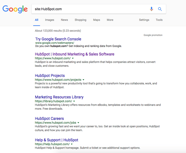
Want to check if a particular site is listed in Google? Just begin your search with “Site:Sitename.com.” For example, here’s what is displayed in Google for HubSpot.com:
If no content is indexed yet for a site, Google will let you know that your search did not match any results.
If no content is found, your next step should be to create a sitemap that can be submitted to Google.
If you want more information about how to create a sitemap, take a look at this post.
(HubSpot customers: Your sitemap is automatically generated and maintained. Simply go to yourdomain.com/sitemap.xml to see it.)
How Long Does It Take to Index Content?
My colleague Casey Henry wondered this very question and ran a test to see how long it took Yahoo and Google to crawl and index content. The results? Well, they were staggering.
When publishing content without manually submitting an updated sitemap, Henry found that it took Google 1,375 minutes to crawl, while Yahoo took 1,773 minutes. To put those numbers into perspective, that’s roughly a full-day just to crawl your content.
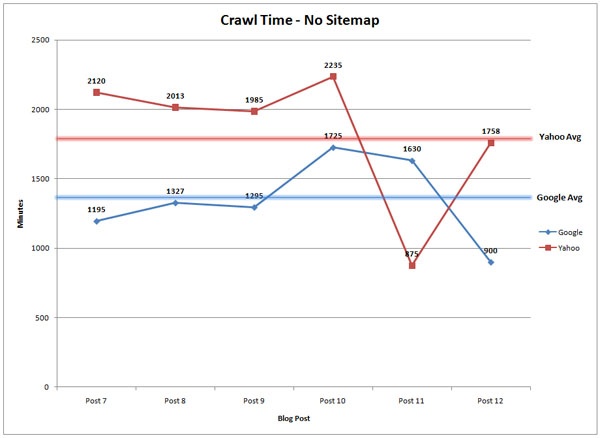
Source: Moz
On the other hand if you are launching a new website, or adding a number of new pages, it may be worth submitting an updated sitemap. According to the same study, Henry found that after submitting an updated sitemap, the average time it took for a bot to visit the page was 14 minutes, compared to 245 minutes for Yahoo. In other words, your new page can start generating organic traffic and conversions on the same day.
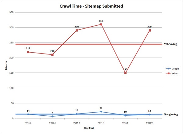
Source: Moz
How Do I Submit My Site to Google?
If you have a brand new site, you should first verify you own the site within Google Search Console and then submit it here.
If you have an existing site and are launching a number of new pages, then instead you should submit an updated sitemap to ensure it gets listed as quickly as possible.

To submit an updated sitemap, log in to Google Search Console > Crawl tab > Sitemaps. Once you’re there you can submit your updated sitemap for Google so it can begin crawling it as soon as possible.
Based on the above, you may be asking if you need to submit an updated sitemap every time you publish a page. While you certainly could do so, it’s best to manually go through the submission process if you’re working with critically important content that needs to be indexed quickly. If you’re just making minor updates or corrections to pages, then it may be ok to wait until Google crawls that page and updates its index.
Do you generally submit an updated sitemap when you publish new content? Let us know what you think in the comments.

![]()