
Fonts & Feelings: Does Typography Connote Emotions?

Think about your favorite book for a moment. How did it make you feel when you read it? Is that part of what made it such a compelling story?
My favorite book series is Harry Potter, and apart from the awesomeness that is a magical boarding school, the font in which it was published may have influenced my affection for the series.
You see, visual elements are just as important as the words on a web page or blog post. And fonts serve as a visual marketing tool for publishers to leverage when compiling their story. The font you choose ultimately plays a hand in conveying the message you want to send your readers.
In this post, we’ll explore how fonts can influence reader emotion and how marketers can use this information in their content.
Fonts vs. Typefaces: What’s the Difference?
“Font” and “typeface” are two terms that are often incorrectly used interchangeably.
A font is one particular weight and style of a larger typeface. Typefaces are categories comprised of many different fonts. For example, Serif is a typeface, and Times New Roman is a font that is part of the Serif family.
There are a variety of different typefaces and fonts. Here’s a quick rundown:
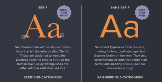
Serif
Serif fonts are identifiable by the small lines on the edges of letters (called serifs) that make the font easier to read in print.
Fonts in the Serif typeface include Times New Roman, Georgia, and Book Antiqua.
Sans Serif
Sans serif font letters don’t have a serif attached to them, so they display more clearly on websites.
Fonts in the Sans serif typeface include Arial, Verdana, and Helvetica.
Here’s a diagram of the difference between Serif and Sans Serif:
Source: CreativeBloq
Script
Fonts in the Script typeface are meant to imitate the fluidity of human handwriting.
Fonts in the Script typeface include Comic Sans, Kristen, and Lucida.
Here’s an example of Kristen below:

Source: FontsPlace
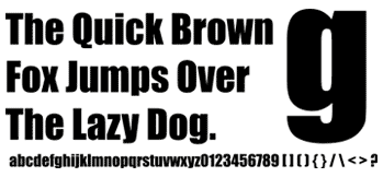
Modern or Display
The modern typeface is characterized by variance between thin and thick bold lines in the lettering.
Fonts in the Modern typeface include Impact, Rockwell, and Agency.
Here’s an example of the Impact font:
Source: FontCo
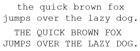
Monospaced
Monospaced fonts have larger spaces between each letter and were designed to look like text was written using a typewriter.
Fonts in the Monospaced typeface include Courier, Consolas, and Monaco.
Here’s what Courier looks like:
Source: PrePressure
These different typefaces and fonts are widely used across the internet, and research has been conducted about the impact of fonts on communication and overall perception. Let’s dive into the data and see if you agree with their findings.
Which Fonts Connote Which Emotions?
Wichita State University’s Software Usability Research Laboratory conducted a survey in 2006 to determine if different fonts had different emotions and personalities associated with them.
In the survey, they asked more than 500 participants about their perceptions of a variety of different fonts across the typefaces outlined above. The fonts that respondents answered questions about were:
Source: UsabilityNews
Different uses of each font were evaluated in the survey, such as emails, letters, spreadsheets, web pages, headlines, and news articles.
Respondents were then asked to assign personalities and emotions to each font, and the results were organized according to personality factors that the different fonts shared most frequently. The fonts within specific typefaces ended up grouping together, as you can see in the diagram below:
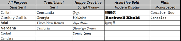
Source: UsabilityNews
The study then produced a detailed breakdown of the fonts most commonly associated with both positive and negative emotions and personality traits. The results are intriguing:
Serif fonts were rated as “stable,” “practical,” and “mature.”
Sans serif fonts didn’t receive any particularly positive or negative personality associations.
Script fonts were perceived as “feminine,” “funny,” and “casual.”
Modern fonts were categorized as “masculine,” “assertive,” and “coarse.”
Monospaced fonts were called “dull,” “plain,” and “unimaginative.”
Here’s the full breakdown of the top three fonts for each emotion and personality trait in the survey:
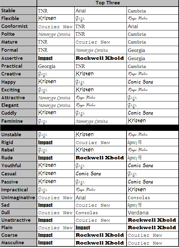
Source: UsabilityNews
While that study provided some interesting insight around the way people view specific fonts, there are numerous other studies and theories that point to why certain fonts connote specific emotions.
For example, in a 2014 study, medical patients received the same set of at-home care instructions in different fonts, and the harder-to-read fonts made patients think the tasks were harder to do. This is an example of cognitive fluency, a theory that posits when our brains have difficulty processing information, the task at hand appear more challenging.
Similarly, a 2008 study, in which participants were presented exercise instructions in hard-to-read fonts, revealed that the challenging font choice made the task seem to require more time to achieve.
The lesson? Based on cognitive fluency, if something is easy to read, it also seems easy to do.
But that’s not all. The semantic memory associated with fonts also influences how readers feel about the fonts and the content they’re reading. For example, the Helvetica font is used on United States tax and Internal Revenue Service forms, which influences how the font is perceived — depending on their experience with the federal tax system.
All of this is to say that there are numerous theories surrounding the psychology and emotional response to different fonts. In marketing specifically, fonts can capture your audience’s attention and help reinforce your brand’s messaging, so let’s dive into some actionable takeaways for content marketers getting ready to type.
3 Takeaways for Selecting Fonts to Use in Your Marketing
1) Choose fonts strategically by focusing on readability and legibility.
Creative Bloq created an infographic that outlines many factors to consider when choosing fonts for different projects, and they found a few trends in which fonts are widely used specifically among blogs:
20% of blogs use Georgia (Serif) for header text
10% of blogs use ![]() (Sans serif) for header text
(Sans serif) for header text
10% of blogs use ![]() (Sans serif) for header text
(Sans serif) for header text
20% of blogs use Arial (Sans serif) for blog body copy
10% of blogs use Helvetica (Sans serif) for blog body copy
Sans serif fonts are particularly clear to readers: Without the serifs on the lettering, Sans serif fonts like Arial are easy to read even on small screens, where users are spending a lot of time online these days.
Based on the research, fonts on your web pages and blog posts should be clear and easy-to-read. In fact, the simpler the better — that way, articles will be readable on a variety of different screen sizes, and your content won’t be associated with difficulty or inconvenience. Below, you can see that The Atlantic publishes articles in Proxima Nova, a Sans serif font that is one of the most popular fonts among internet publications.

Source: The Atlantic & Fount
2) Use typography that communicates to visitors who you’re looking for.
If your goals include attracting a broad audience to your website, use typography that makes your content as universal and accessible as possible.
On the other hand, if your content is meant to communicate particular emotions and messaging, you can communicate that with your font choices.
For example, childish, playful fonts like those in the Script typeface may be the right fit for children’s clothing websites. Below, you can see that a Serif font was the right choice for Pottermore — it makes readers remember the classic Serif font used in the Harry Potter books themselves.

Source: Pottermore & Fount
3) Remember: Things seem easier to do when they’re easier to read.
Make sure that fonts for your calls-to-action, headlines, and landing pages are bold, clear, and motivate site visitors to fulfill the task you want them to with your content. Here at HubSpot, we used a clear Sans serif font for our homepage and calls-to-action to make the information crystal clear to site visitors.

Source: HubSpot & Fount
The visual elements on a web page are just as important as the content you’re writing about, so experiment with different fonts that send the right message and elicit the feelings you want from your audience. When you’re ready to start typing, read more about how to choose typography and text layout on our blog.
What’s your favorite font to use for blog posts, landing pages, and calls-to-action? Share with us in the comments below.

![]()
15 Must-Have Features for E-commerce Sites by @HollystarPR
All websites are unique in their own way but there are certain elements that every e-commerce site should have to stay relevant and competitive. Here is a list of 15 must-have features that attract online shoppers.
The post 15 Must-Have Features for E-commerce Sites by @HollystarPR appeared first on Search Engine Journal.
![]()
59 Marketing Posts You Probably Missed in 2016 (and Need to Read) by @seo_travel
2016 was packed with fantastic marketing material to read online so I thought I’d pull together a selection of my favorites. Put even a small handful of these tips in place and you’re guaranteed a successful year!
The post 59 Marketing Posts You Probably Missed in 2016 (and Need to Read) by @seo_travel appeared first on Search Engine Journal.
![]()
Will Facebook 360 Change Brand Storytelling Forever? by @chris_hart
Facebook 360 launched in 2015, but we have yet to see advertisers and marketers really nail the execution. This article will introduce the concept of 360 photos and video and bring together a handful of industry resources.
The post Will Facebook 360 Change Brand Storytelling Forever? by @chris_hart appeared first on Search Engine Journal.
![]()
2016 End-of-Year Recap [Video]

2016 brought change the marketing industry in many ways — from powerful innovations to continuously evolving mediums.
But digital marketers know that change happens frequently in our industry, and adaptability is key to continue driving results in the face of burgeoning trends, growing social networks, and new, advanced technology.
Now that we’ve rung in the New Year here at HubSpot, we wanted to remember the biggest changes that happened in the world of marketing in 2016. From Peach’s rise and fall, to the launch of Facebook Live, to Google’s latest algorithm update, there’s a lot to cover. That’s why we made a short video — sound not required, of course — to review it all.
From all of us at HubSpot, Happy New Year! Thanks for sticking with us through all the change. Now let’s keep the 2017 conversation going by sharing this video on social media.
What was your favorite social media moment of 2016? Share with us in the comments below.

![]()
How to Delegate SEO Work Effectively
Posted by zeehj
Whether you’re the only SEO at your company, work within a larger team, or even manage others, you still have to stay on top of your projects. Project management skills aren’t and shouldn’t be exclusive to someone (or some tool) with the title “project manager.” I believe that having good project manager skills is essential to getting work done at all, let alone delivering high-quality work in a timely and efficient way.
In defense of management
Freakonomics Radio released this podcast episode in October called In Praise of Maintenance. The TL;DR (or TL;DL, rather) is that our society rewards innovators, but rarely (if ever) celebrates the maintainers: the people who get sh*t done, and do it reliably, often without anyone’s noticing. This podcast episode confirmed what I’d been feeling for a long time: We don’t award enough praise to the good project managers out there who keep engagements moving forward. And that’s largely because it’s not a sexy job: it’s not exciting to report to stakeholders that necessary services that have been reliable for so long are, as always, continuing to be reliable.
It’s only when things aren’t running smoothly does it seem project managers get recognition. A lack of a rewards system means that we’re not teaching PMs, Consultants, Account Managers, and more that their excellent organizational skills are their most valuable asset. Instead, the message being communicated is that innovation is the only praise-worthy result, which oftentimes may not be essential to getting your work done. The irony here is that innovation is the by-product of an excellent project management framework. The situational awareness of knowing how to delegate work to your colleagues and a repertoire of effective organizational habits is vital if you ever want to free up your attention to allow for the headspace and concentration ingenuity requires.
Sound familiar? Lately I’ve been focused on the idea of a cluttered headspace, where it feels like everything on your to-do list is floating ephemerally around in your head, and you can’t seem to pin down what needs to be done. Of course, this isn’t specific to just professional life (or consulting work): it can happen with personal tasks, which can present their own set of organizational challenges. Regardless of your professional role, crunch time is exactly when you need to put on your project manager hat and get yourself organized. Read on to find out the tools and tricks I use to stay on top of my work, and how I delegate work when needed without losing a personal touch on projects.
Manage projects with tools that work for you
What do you do to make that process easier? One Slack conversation that seems to always come up is which project management tools do we use (and which is best). I take the annoying middle-ground stance of “whatever tool you use is best” and I stand by it (don’t worry, I’ll get to the actual list in a minute): a tool is only useful if it’s actually used.
So how do you get started? It’s always important to have preferred methods for project tracking, note keeping, and reminders. Depending on your role and learning style, you may find that some tools work better than others for you. For instance, while I have a few tools I work with to stay on top of client work, I also have a clear plastic desk cover that I can jot down notes and reminders on. Here’s a breakdown of the tools I use to manage projects, and the needs they meet.
Inbox by Gmail. Yes, it’s different from classic Gmail. The two greatest aspects of Inbox, in my opinion, is the ability to snooze emails until a specific day and time, and save reminders for yourself (e.g. “Check in on Ty’s progress for the page speed audit,” or “Watch the video in this link after work”).
Why are these my favorite Inbox features? Both functions serve similar purposes: they tell you what you need to know, when you need to know it. The ability to snooze emails and save reminders for yourself is invaluable when we’re talking about headspace: this way, you can use your email as your to-do list for any given day. If you know you don’t have to respond to someone until X date, there’s no reason their previous email should sit in your Inbox taking up space. As a result, I use Inbox as my personal assistant to remind me when I need to jump back to a deliverable or respond to a client. It’s possible to reach Inbox zero on a given day, even if you have an email awaiting your response. Just snooze it and attend to it when you really need to. Google Drive. Sure, not a sexy or new tool, but it’s my home for everything. Not only does GDrive cover all the file types that I need (Documents, Sheets, and Presentations), it also allows for easy, real-time collaboration on files with your colleagues and clients. If you like to nudge people to do things, too, you can assign contacts work to do from your GDocs (just highlight text, click the comment icon to the right, and insert the @ symbol with their name). If you’re crafting a presentation with a colleague, for instance, you can assign slides with questions for them. I recommend tagging them with your question and including a due date for when you need their answer.Tools my colleagues love:Trello. It’s not my personal favorite, but a lot of my teammates love using Trello as their to-do lists, or even for tracking web dev or SEO projects. If you prefer text over visuals, you can also try Basecamp (which I tend to prefer).Asana. Another great project management tool — I tend to use it on a project basis rather than a to-do list. If you’re a developer, you may prefer JIRA.
Of course, it’s possible to manage and delegate work without these, but I’m of the mind that pen, paper, and email can only get you so far, especially if you want your delegation process to be somewhat automated (think tagging colleagues in comments within documents, or assigning projects to them within standard project management tools like Asana).
How to delegate effectively
Tools can only get you so far: any good delegation process starts with a conversation (no more than five or 10 minutes) about the work you need and a great brief. The conversation establishes whether your colleague actually has the bandwidth to take your work on, and the brief goes into greater detail of what you actually need done. The brief format I follow works for a large number of different deliverables — I’ve used this same layout to delegate page speed, technical and backlink audits, and content briefs to colleagues. Below are the fields I always include, and the type of information always provided:
Subject: [BRIEF] Work I Need Done
Deadline: The precise date and time you need it, with enough time for you to review the work before delivering it to your stakeholders or your client. If it’s something like a page speed audit, I would allow up to a full week to review it and ensure that it’s in the best format and all the information is correct. Of course, it also depends on how familiar the delegate is with projects like these — if they’ve done a number of audits for you in the past, they may know your style and you may not need as much time to edit their final work.
Output/Deliverable: The format in which you need this work delivered to you. Maybe it’s a Google Doc or an Excel Spreadsheet. This brief format can work for any output you need, including more creative pieces (do you need a video edited to :30 seconds in a .mov format? A photo edited to certain specs and saved as a PNG or IDD?).
Expected hours: This may be the most challenging element of the entire brief. How long do you anticipate this work to take, start to finish? Keep in mind the experience level of the person to whom you’re delegating. Is this their first SEO technical audit, or their 30th? You will almost definitely need to check in with your delegate a few times (more on that later), so how long do you anticipate these meetings to take? Just like the deadline timing estimate, use your best judgment based on work you’ve done with this person in the past, and the type of work you’re assigning.
Relevant materials: This is where you can provide additional articles or tools that should help your colleague do the work you’ve assigned to them. Some good examples are 101 articles (like ones on the Moz blog!), or a tool you know you always use in projects like the one you’re delegating (think SEMRush, new photo editing software, or Google’s Keyword Planner).
Check in with your delegate along the way
Once you’ve delivered your brief, the next step is to make sure you check in with your delegate along the way. Even the most experienced person can benefit from added context, so whether it’s an in-person meeting or a five-minute call, touching base shortly after delivering a brief is necessary to ensure you’re on the same page. Beyond kicking off a project, it’s important to have check-ins along the way to stay on track.
At Distilled, we like to follow a check-in model at the following completion points:
1% (kickoff conversation); 5% (validation of process); 30% (ensure you’re on the right track before you invest too much time into the project); and 90% (final editing and proofing).
Not only is this good to keep everyone on the right track, it’s even more valuable both to the person delegating and the delegate to know how much work should be completed at which points, and how much detail is required as you give feedback.
In many ways, great project management and delegation skills are really future-proofing skills. They allow you to be on top of your work regardless of what work (or life) throws at you. You can be the best SEO in the world, but if you can’t manage your projects effectively, you’ll either fail or not see the greatest impact you otherwise could achieve. It’s time to ditch praising the model of a lone innovator who somehow “does it all,” and instead truly celebrate the maintainers and managers who ensure things remain operational and steady. Often, our biggest problems aren’t best solved with a complex solution, but rather a clear mind and supportive team.
A large part of turning projects around comes down to improving the project management process, and being organized allows you to juggle multiple clients and acknowledge when you’re at capacity. Without a solid foundation of project management skills, there is no groundwork for successful innovations and client projects. The next time you’re looking to bolster your skill set, do an audit of how you manage your own work, and identify all of the things that prevent you from delivering the best work on time.
Sign up for The Moz Top 10, a semimonthly mailer updating you on the top ten hottest pieces of SEO news, tips, and rad links uncovered by the Moz team. Think of it as your exclusive digest of stuff you don’t have time to hunt down but want to read!
![]()
Grain Valley School District’s new approach to 21st-century education
Editor’s note: As part of the ExploreEDU event series, schools are working with Google for Education Premier Partners to throw open their doors and invite neighboring educators to learn first-hand from their own experiences using Google tools to innovate and improve. To see if there is an event near you, visit the ExploreEDU site. For those who can’t join in person, we’ll also share the schools’ experiences here. Today’s guest author is Nicholas Gooch, Director of Technology, from Grain Valley School District. The school is hosting an event on Dec. 15-16 with Best Buy.
It’s daunting to realize that many of us are preparing students for jobs that don’t yet exist and a world we can’t quite imagine. At Grain Valley School District, we’ve designed our schools to prepare students for the future workplace. We’ve created our curriculum to emphasize communication and creativity. We’ve done away with the traditional 100-point grading system to instead focus on helping students master their subjects. We’ve even started the process of redesigning our high school campus to create dedicated spaces for group and individual learning.
We see technology as critical to helping students master the skills they’ll need in the 21st-century workplace. We began integrating technology into everyday learning by launching G Suite for Education at our high school, two middle schools and four elementary schools during the 2014-15 school year. Last year our high school became the first of our schools to go 1:1 with Chromebooks. Each of our 1,250 high school students has access to a Chromebook that they can use in class and at home. With the help of technology and the support of our innovative teaching staff, here are a few ways we changed how we educate to better prepare students for the future:
Fostering teacher leadership and innovation
To empower our teachers to push the envelope and take more risks with technology in the classroom, we created Breakthrough Learning cohorts. The cohorts are made up of elementary and secondary teachers who applied for the program. One day each month, these teachers work with our instructional technology coaches to learn the best practices for integrating technology into their curriculum. These sessions go beyond typical “how-to” sessions and instead focus on helping teachers make learning, assessment, and digital citizenship a seamless component of the classroom. Not only does the program develop this capacity in our own teachers, it allows them to do the same for their fellow teachers.

High school students using TV screens to collaborate on shared assignment.
Emphasizing subject-mastery over grades
In 2006, school and district leadership reexamined the 100-point grading system. They decided to try a new approach — helping students achieve subject mastery rather than measuring them on a graded scale. Standards-based grading and feedback practices have been fully integrated at the high school since the 2013-2014 school year. Today, we personalize each student’s learning program. Google Classroom has also helped us emphasize the learning process rather than a final grade. Teachers can easily give feedback on an assignment, even before a student has turned it in.
Building for collaboration
The new architecture for our high school is designed to make it easier for students to study together outside of class. We’re creating communal spaces with whiteboard walls and TV screens. Students can use these TV screens to visualize projects they’re working on together — for instance, a presentation they’ve made in Google Slides. We’re also providing WiFi access and ample charging stations for laptops and mobile devices across the campus. Over the next few years we hope to introduce similar changes to other schools in the district.
We’re excited to be hosting an ExploreEDU event on December 15-16. If you’re in the area, join us to hear more about how we redesigned our approach to teaching and learning for the 21st century, supported by technology and an openness to change.
Bringing a virtual Pride parade to students in Bogota, Colombia
Editor’s note: Earlier this year, we launched #prideforeveryone, a global virtual reality Pride parade that anyone, anywhere could join. Since then, we’ve distributed Google Cardboard and the virtual Pride experience to more than 20 groups and nonprofits, worldwide. This is the story of Alba Reyes, founder of the Sergio Urrego Foundation, who brought the parade to students in Bogota, Colombia.
In 2014, my son Sergio took his own life because he was suspended and discriminated by his school for kissing another boy. Unfortunately, neither I nor his friends were able to prevent the harassment and isolation he felt.
Since then, I’ve made it my mission to make sure what happened to Sergio doesn’t happen to any other young person in my country. I started the Fundacion Sergio Urrego to travel to schools across Colombia and lead inclusion workshops with local students. Although LGBTQ children may be more likely to feel isolated, many young people don’t feel accepted by their families, friends or teachers. My workshops create activities and safe spaces that help students understand how it feels to be discriminated against – reinforcing the importance of diversity and inclusion.
An important part of these workshops is helping students put themselves in another person’s shoes. This summer, we used Google Cardboard to give students in my workshops a way to experience Pride parades from across the globe. Most of these students have never seen a LGBTQ Pride parade. But with virtual reality, they can learn more about the global LGBT community, and feel supported by a global community that celebrates diversity.
Celebrating Virtual Pride in Bogotà, Colombia #prideforeveryone
After seeing the impact of my workshop and virtual Pride parade on children in Colombia, institutions like the Ministry of Information and Communication Technologies have have showed their support to scale my workshops to even more children across the country.
My fight is not just for my child. It’s for all children who have endured discrimination and bullying from their peers, teachers and community.
If you’d like to join Alba, teachers, and community leaders around the world in bringing this virtual reality experience to your group, you can use this discussion guide created by one of our Google Educators. Interested in creating your own #prideforeveryone lesson plan based on the 360 film? Share your lesson on TES, the world’s largest online community of teachers
New Year’s Day 2017 Google doodle features balloon drop to mark 1st day of the year
Google follows its New Year’s Eve doodle with an animated image of celebratory balloons.
The post New Year’s Day 2017 Google doodle features balloon drop to mark 1st day of the year appeared first on Search Engine Land.
7 White Hat SEO Techniques to Double Traffic in 2017 by @ChuckPrice518
As the Google Algorithm continues to get smarter with the use of machine learning and Artificial Intelligence, white hat SEO is now more important than ever. Learn which white hat techniques can have the greatest impact on your website and how you can double, triple, or even 10X your traffic in 2017.
The post 7 White Hat SEO Techniques to Double Traffic in 2017 by @ChuckPrice518 appeared first on Search Engine Journal.
![]()