One average, Facebook is home to 1.18 billion daily active users — from CEOs, to students, to companies. And while the community is clearly there, connecting with them from a marketing standpoint isn’t always easy.
For brands, posting on Facebook alone isn’t enough anymore — especially for ones just starting out. Sure, you can throw money at your efforts to drive people to your Facebook Page and send them to your website, but that only works if you’re smart about it.
One way to do just that is to create optimized Facebook Ads targeted at the right audience. Optimized ads can help you spend your PPC budget wisely and see a positive return on your investment. 
So, what does optimized Facebook advertising actually look like? If you’re looking for some great examples, you’ve come to the right place. In this post, we’ll quickly go over the three overarching formats for Facebook Ads: right column, desktop News Feed, and mobile News Feed. Then, we’ll show you eight different types of Facebook Ads, each with real-life examples — along with some insights into why that ad is so successful.
But before we get to these examples, let’s discuss the four components of a good Facebook Ad (or any ad, really) regardless of its type …
4 Components of Successful Facebook Ads
1) It’s visual.
Visual content is not only treated more favorably in the Facebook algorithm, but it’s also more likely to be shared and remembered than written content. The lesson for Facebook marketers? No matter what type of ad you create, your image needs to be visually appealing.
Check out this blog post for a detailed guide to image sizes for various ad units on Facebook along with some tips on posting visual content.
2) It’s relevant.
Relevance is critical for success when using Facebook advertising. Remember, you are spending money when someone views or clicks on your ad (depending on the settings you use). If you’re showing ads that aren’t relevant to your target audience, you’re wasting your time and money and will likely not see success with any kind of advertising.
Back in February 2015, Facebook launched a feature in the Facebook advertising platform that rates your ads and gives you a relevance score, similar to Ad Rank in Google AdWords. The more relevant your ad image, ad copy, and destination page is to your audience, the higher your score is — and the more favorably Facebook will treat your ads.
3) It includes an enticing value proposition.
A value proposition tells the reader why they should click on your ad to learn more about your product. How is your product or service different from any other? Why should the viewer click on your ad to see your website?
Your value proposition should be believable. For example, saying you have the greatest sandwiches in the world will not make people come to your business’s Page, but maybe offering 20% off will. Or, perhaps adding social proof will help — something like, “Sandwiches loved by over one million people every year! Come try yours today and get 20% off your order with this coupon.”
4) It has a clear call-to-action.
A beautiful and relevant ad is great, but without a call-to-action (CTA), your viewer might not know what to do next. Add a CTA like “Buy now and save X%,” or “Offer ends soon” and add a sense of urgency to your viewer. Your CTA should encourage people to click on your ad now.
The 3 Primary Formats for Facebook Ads (With Examples)
Format 1: The Right Column Ad
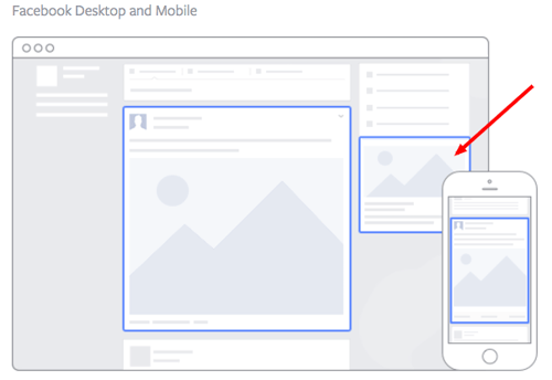
Source: Facebook
This type of ad is the most traditional on Facebook, it appears on the right side of a user’s Facebook News Feed. This is the first type of advertising Facebook had, and it still exists today.
Although ads in the News Feed are likely to get higher engagement metrics due to its native advertising features, right column ads shouldn’t be forgotten. We often see less expensive clicks and conversions when using these ads. In order for a right column ad to be successful, it needs to be relevant, have a value proposition, a good visual, and have a call-to-action. Let’s look at an example below from Winc (formermly known as Club W):
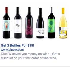
Here’s what makes this ad great:
It’s visual. The visual is clear, simple, and appealing to all types of wine-lovers.
It’s relevant. This came up in my wine-obssesed colleague’s News Feed. Need I say more? Two thumbs up on relevance.
It includes an enticing value prop. Three bottles for $19? What a steal. They also pull the viewer in with an additional value: a discount on their first order of wine.
It has a strong call-to-action. The word “get” is strong call-to-action language, and it’s used twice here. A time limit on this offer would have made it even stronger.
Format 2: The Desktop News Feed Ad
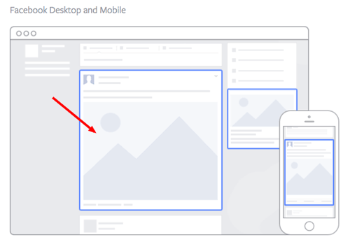
Source: Facebook
This type of ad appears directly in a user’s News Feed when they access Facebook on a desktop computer, and it looks more like native advertising. In our experience, these ads have a higher engagement rate than right column ads, but they can also be more expensive. These ads must follow organic Facebook posts best practices and be both engaging and visual.
This is how an ad from Amazon looks in the News Feed on a desktop:
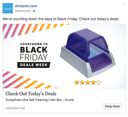
Here’s what makes this ad great:
It’s visual. Not only is this image larger than the right column ad display, but it also uses warm colors, white space, and directional lines which drew my eye towards the featured product.
It’s relevant. As a cat mom, this offer is clearly tailored to my consumer needs.
It includes an enticing value prop. Amazon has advertised a self-cleaning litter box here, which is of tremendous value for any cat owner. Additionally, it shared the strong customer ratings below an image of the product. (Social proof, anyone?)
It has a clear call-to-action. Amazon instructs me to click on its ad today, after which point the deal for the litter box will presumably disappear. “Now” is strong CTA language that compels clicks.
Format 3: The Mobile News Feed Ad
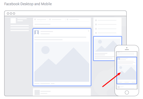
Source: Facebook
Like the desktop News Feed ad, this type of ad appears in the user’s mobile News Feed and displays like an organic posts from people and Pages that they follow.
This is what a mobile News Feed ad for The New York Times looks like:
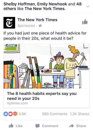
Here’s what makes this ad great:
It’s visual. The quirky cartoon drew my eye as I scrolled on my mobile News Feed through lots of text and photography. The nontraditional illustration pulled me in for a closer look at the content.
It’s relevant. I’m a person in my 20s, and I used to write about health care. This is an article I would definitely be interested in reading, and it helps that the ad appears like a native post promoting an article in my New Feed.
It includes an enticing value prop. The ad shows me which of my Facebook friends also like, and presumably read, The New York Times. This social proof makes me more likely to click and read the article.
It has a clear call-to-action. This ad is dedicated to increasing the page’s Likes, and by asking a question in the ad, the call-to-action makes me want to click the article to learn more.
Now that we’ve covered the three main ad formats, let’s dig into a sampling of the wide variety of post types you can use.
8 Types of Facebook Advertising & Some of the Best Facebook Ad Examples
1) The Facebook Video Ad
Video ads appear fairly large in the user’s New Feed and offer more engaging content than static posts. And with 8 billion videos being watched on Facebook every day, it serves as an interesting — and potentially profitable — ad type for marketers to try out.
Need some inspiration? Check out this example from Key Jewlers below:
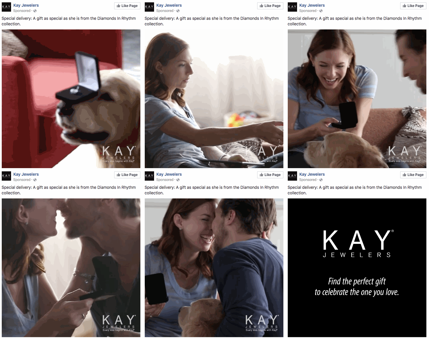
Why this works:
It’s visual. Even though this is a video, I have a general idea of what I will be watching, thanks to the screen capture it started with. Additionally, I can understand the gist of this ad without playing with the sound on, which is important given that 85% of videos on Facebook are now viewed without sound.
It’s relevant. It’s relevant to me because I was recently scouring jewelry websites, specifically for necklaces like the one in the ad.
It’s valuable. Kay shows potential customers the value of purchasing with the help of the happy reaction from the woman receiving the gift in the ad. Plus, who doesn’t love dogs?
It has a solid call-to-action. This ad is set up to drive Page Likes, which is an easy, one-click way for me to get more relevant content served up to me.
How can you create your own video ad? First, understand Facebook video ad requirements including length and video size. We suggest keeping your video as short as possible, even though Facebook allows you to upload a much larger video. Create a video that displays your product or service, and upload directly to the Facebook ads manager by following these instructions.
2) The Photo Ad
Another type of rich media advertising on Facebook is a post of an image. This is one of the most popular types of ads ever since Facebook began favoring visual content. The optimal size for News Feed photo ads is 1200×628 pixels, otherwise your image will get cropped. Adjust your image based on the target audience’s needs and by what will appeal to them the most.
Here’s an example of a photo ad from NatureBox:
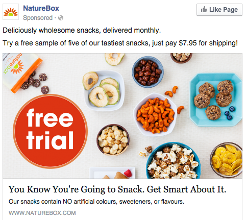
Why this works:
It’s visual. The image shows you exactly what you’re getting, and it calls out the “free sample” CTA well.
It’s relevant. Everyone likes to snack. In all seriousness, the person who saw this is a fan of several lifestyle subscription companies, which is what NatureBox is.
It’s valuable. This ad is full of value. First, the “free trial” callout is the first thing your eyes go to when looking at the image. Second, it clearly mentions the healthy aspects of the goodies in its product.
It has a clear call-to-action. Nature Box is asking you to try its free sample. It couldn’t be easier to know your next step.
3) The Multi-Product Ad
Multi-product ads allow advertisers to showcase multiple products within one ad. Viewers can scroll through the images and click on individual links to each product. You can promote multiple of anything, not just products — like different blog posts, ebooks, or webinars. These ads can be created in the Facebook Power Editor.
Here’s an example of a multi-product ad from Shutterfly, along with the additional images that are used in the ad. Each image has a different offer, to appeal to many different demographics in one ad.
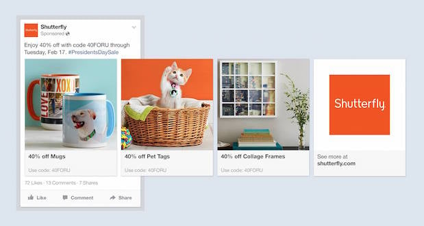
Why this works:
It’s visual. This series of images leands on a consistent color pallette, making it feel both cohesive and on brand. (Having a cute cat doesn’t hurt either.)
It’s relevant. The person who saw this loves taking photos and creating sentimental gifts. Spot on, right?
It’s valuable. There is a very clear value for the user, 40% off each of the products being advertised. The code and sale end date are also clear in the ad description. This ad also has an added level of value, it is showing the many different ways people can use Shutterfly, in ways many may not be aware of.
It has a clear call-to-action. I know I need to use this before February 17th when this deal expires, so I would be encouraged to take action right away.
4) The Local Ad
Local ads on Facebook only work if your business has a physical location that you are trying to drive real foot traffic to. If you fall into this category, then locally targeted Facebook ads may be a great fit for you, as you can hyper-target on Facebook down to the mile.
If your business has an offer or event going on at your store, set up a few Facebook ads that appear only to people within a short distance of your store. Have these ads appear a few days prior to the event and on mobile devices while the event is happening. You may want to reach some people the day of the event who happen to be in the area and checking their Facebook account on their smartphones.
Take this ad for example from Mizzou Campus Dining:
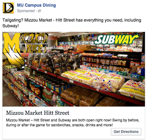
Why this works:
It’s visual. This image has college pride, a variety of salty and sweet treats, and a well-known logo to attract hungry college students.
It’s relevant. This ad is likely only being shown to students on campus who are in its target audience. It also mentions the sports game that was going on at the time, and plays to the student’s current needs: snacks and Subway sandwiches.
It’s valuable. Mizzou Market is telling hungry college students that it has everything students need for the big game.
It has a clear call-to-action. This ad has the option to show directions, making it extremely easy for a college student on the go to follow the walking directions to this market.
5) The Offer Ad
An offer ad is a newer form of Facebook advertising where a business can promote a discount on a product or service that can be redeemed on Facebook. The benefit of this? It eliminates one step in the buyer’s journey, which ultimately increases sales.
The offer ad has many benefits. First, it drives the user directly to the offer. The user claims it directly on Facebook, removing any added friction of needing to to go to your website for the offer. You also can reach any type of audience that you want, as all the Facebook targeting options are possible.
Finally, you can include all the information needed for the user to decide if they want it or not, including the time period it is usable, the number of people who has already claimed it, and the exact amount the offer is. This will eliminate any unqualified clicks, which cost you money.
Here’s an example of an offer ad Boston Sports Club:
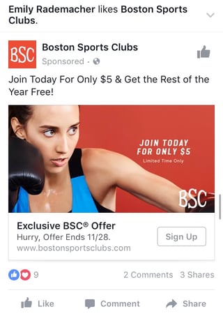
Why this works:
It’s visual. The featured photo uses bold colors and clear typography to draw my attention to the details of the offer, and the woman exercising gives me an idea of what I could gain from purchasing the offer.
It’s relevant. I recently moved to Boston and have been searching for gyms in my area online, so this ad is highly relevant to my recent Facebook and search activity.
It’s valuable. Paying $5 for a monthly gym membership is a great deal. Even though the price may increase in the future, the low price definitely makes me want to click.
It has a clear call-to-action. The CTA emphasizes that the discount offer is limited and should be claimed quickly using the word “hurry” and telling me when the offer expires.
6) The Event Ad
Event ads promote a specific event. The CTA on these ads usually send users directly to the ticket purchase page, wherever that happens to be hosted.
Using this type of ad will help drive a targeted group of people to attend your event. These will show up in the News Feed of the specific audience you’ve chosen. Events are a big part of most businesses, but getting people to attend even a small event, can be tricky. Promoting your event to a targeted specific audience on Facebook can help drive the right kind of attendees.
A good ad in this format will clearly show the benefit of attending the event: The price, dates, and a clear CTA to purchase a ticket. The events ad below for the Tortuga Music Festival displays the date and time and the bands playing:
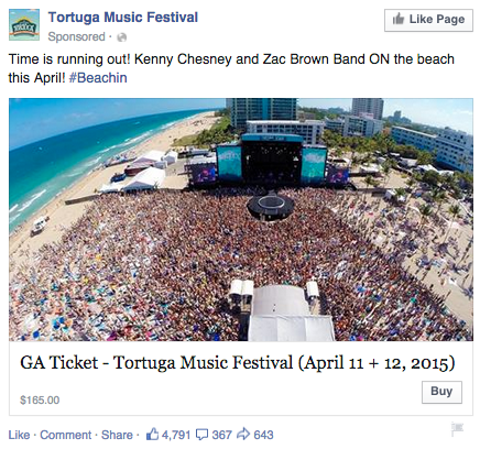
Why this works:
It’s visual. The picture alone is worth a thousand words about how much fun this concert would be. Not only is it on the beach, it was also taken on a gorgeous day and the stage looks amazing. Also, it clearly represents what to expect during the event, and it catches the eye as someone scrolls through their News Feed. (The beautiful ocean water definitely helps.)
It’s relevant. The person who saw this ad is a fan of Kenny Chesney and has been to his concerts before. They’re also originally from Florida, which is where this event takes place.
It’s valuable. Since the image was taken on a beautiful day, it looks like an ideal place to be — especially to those of us viewing it from our office desks. It also clearly tells you the cost of the ticket so you know before you click. (This is also good for the advertiser: By including the price, the ad allows users to self-select based on whether they can afford the ticket. If they can’t afford it, they won’t click through, thus saving the advertiser money on unqualified clicks.)
It has a clear call-to-action. The CTA is clear: “Buy.” The advertisers also add urgent wording with the title “Time is running out!”, encouraging you to purchase your ticket now before it’s too late.
7) The Retargeting Ad
A retargeting ad promotes an ad to a specific list of previously identified people. Have you ever seen ads follow you across the internet after visiting a certain website? Then you’ve seen a retargeting ad.
Facebook has the same capability. An advertiser can advertise to a list of leads or customers by uploading a list of email addresses it already has into the Power Editor to make a custom audience. A good retargeting ad acknowledges that the brand knows you’re already interested in its product. (Because, let’s face it … retargeting can be a little creepy.)
Last week, I started shopping around for a bridesmaid dress for an upcoming wedding. Today, this ad appeared in my News Feed:
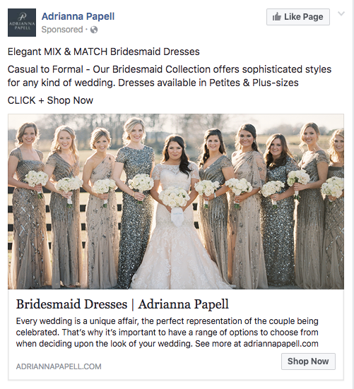
Why this works:
It’s visual. The image gives me a good idea of what to expect from the designer’s website, and it definitely helps that the gowns are both unique and stunning. Talk about a showstopper.
It’s relevant. The ad called out that I was already shopping for bridesmaid dresses, and what’s more, I had previously looked at dresses on this exact website, so this ad is highly relevant to my search.
It’s valuable. The variety of dresses in the ad’s image and in the description make this website worth a visit for someone trying to find the perfect gown out of thousands of options.
It has a clear call-to-action. The CTA is “Shop Now,” which encourages me to click to purchase the beautiful dresses in the ad’s image.
8) The Boosted Post
A boosted post is an organic Facebook post that was originally on the homepage of a company’s Facebook, and that later was boosted with advertising money.
This is different from the above ads because it’s not created in the Facebook Ads Manager. You can include more in the description, as there is no limit to word count on boosted posts like there is in ads. You can also have a link in the copy.
The cons? Boosted posts leave you fewer options for bidding, targeting, and pricing. You also cannot run any types of A/B tests because you’re promoting a post that’s already been creating, not creating one from scratch.
Here’s an example of a boosted post from Bustle, who promoted one of its articles on Facebook:
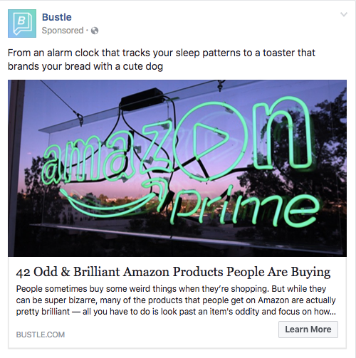
Why this works:
It’s visual. Lots of people are familiar with the Amazon Prime logo, but not in neon lights in a window display. It made me do a double-take while scrolling through Facebook.
It’s relevant. As we’ve already learned from earlier examples, I like shopping on Amazon and also read Bustle, so this article is a combination of those two behaviors.
It’s valuable. “Brilliant” is a strong adjective to describe products, which makes me curious to learn more about purchasing them.
It has a clear call-to-action. The ad entices me with information about useful and “brilliant” gadgets I can get delivered to my door within two days, which I’m happy to click to learn more about.
Getting Started
There you have it: A list of all the different types of Facebook posts and a few examples of awesome ones from all different brands. The Facebook Ads Manager platform will walk you through how to set these up with simple, step-by-step instructions — so don’t feel overwhelmed.
Note for HubSpot customers: You can now integrate Facebook Ads reporting into the HubSpot Ads App to make reporting and analyzing your advertising ROI easier. You’ll be able to easily see which Facebook Ads generate leads and increase your ROI without having to analyze the data yourself. You can also use this integration to edit Facebook Ads from directly within your HubSpot portal. Customers can sign up to test this integration here.
Now, stop reading and start creating.
Want to see how HubSpot uses Facebook? Like our Facebook Page here.
Editor’s Note: This post was originally published in June 2012 and has been updated for freshness, accuracy, and comprehensiveness.
![]()
