Most people are familiar with Black Friday and Cyber Monday as some of the busiest shopping days of the year; businesses spend months preparing their holiday campaigns in order to make the most of these two days. But each year it seems that more and more companies are also taking advantage of #GivingTuesday by finding ways to entice their audience not only to purchase holiday gifts, but to donate and give back to charities and nonprofits.
In this article, we’ve analyzed 8 of these campaigns from 2016 to find out which ones have what it takes to engage readers and meet their fundraising goals, and which ones unfortunately fall flat. Read on to learn more about what makes a #GivingTuesday campaign a winner or a loser.
The Winners
#1 The San Diego American Marketing Association (AMA)


The San Diego AMA is a nonprofit, professional organization geared towards providing information, education, resources, and connections for those looking to further their career in marketing. They created this #GivingTuesday campaign in order to encourage people to donate to their 2 scholarship programs: The Social Impact Scholarship and the Diversity Leadership Scholarship. There are quite a few things they did right in this campaign, namely:
They explained briefly what #GivingTuesday is all about
They included their goal (to raise money for the scholarships) in the beginning of the email
They linked the 2 scholarships to pages that give more information about them
They included a plug for a future event the organization is hosting
They included a section dedicated to teaching readers about how to refuel their content strategy, which is essentially a preview of what the organization does for those who join.
Finally, they thanked the groups that sponsor them.
All in all, I consider this a winning #GivingTuesday campaign for the AMA because it was simple, eye-catching, and full of great content.
#2 The San Diego Fleet Week Foundation

The San Diego Fleet Week Foundation is a nonprofit group that supports Military Veterans by putting on entertaining events during Fleet Week. The event is held annually, and any proceeds raised that exceed the operating expenses for Fleet Week are donated to military charities.
We consider this #GivingTuesday campaign a win because:
They included pertinent facts about why Fleet Week is a necessity in San Diego (they have the largest military concentration in the world)
They explained their goal clearly and in the beginning of the campaign- to encourage people to donate $20 to provide lunch for a family of 4
They explained how this campaign has been a success in the past (they’ve provided over 1200 meals for service members and their families)
They included a button to donate right in the email, making it quick and easy to give money
They provided a link to their website for those looking to learn more
The email is colorful yet easy to read, and it contains real pictures of servicemen and women in the community who will benefit from the donations.
#3 PayPal
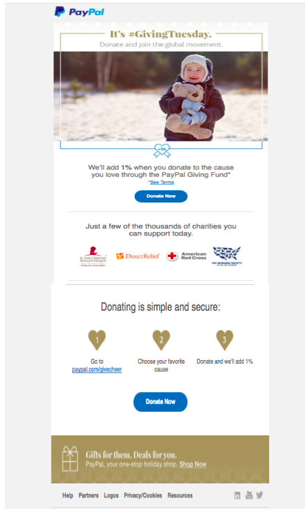
Most people are familiar with PayPal seeing as it’s one of the most popular ways to send money electronically. It only makes sense, then, that they would create a #GivingTuesday campaign devoted to sending money to those who are less fortunate. Their campaign is a little different; for one thing they’re not a nonprofit, and instead of supporting one group, charity, or organization, they let users choose the charity they wish to support. Here are some reasons why we consider this campaign a great one:
They created a campaign that compliments their business. PayPal is all about making it easy and simple to send money to others, and that’s the premise behind this fundraiser. They’ve made it easy and simple to donate to thousands of charities around the world.
Another major bonus is that they plan to add 1% to each donation made; this adds up to a pretty substantial number, and there aren’t many companies offering to do so.
They included 2 separate buttons for people to donate, truly making it quick and easy.
They explained the security of their donation process, which also emphasizes the security of PayPal in general.
They included a nice photo of a young girl to put a face on the donations.
They suggested several big-name charities that people have the option to support, and made it possible to click on their icons to learn more about the charity and as another way to quickly donate money.
Note: If you do choose to click on a charity icon, it directs you to a nice page that explains that 101% of your donation will go to the charity, PayPal will cover all the fees, and you’ll immediately receive a tax receipt.
Finally, they included a link at the bottom of the email encouraging users to go to their website to purchase a variety of gift cards to meet their holiday shopping needs- a plug we think they deserve considering their offering to add money to others’ donations.
#4 Illinois State University
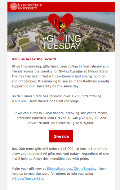
The University in Normal, IL hosts a #GivingTuesday campaign every year with the purpose of raising money for various programs and projects across the campus. This campaign is successful because:
They are asking readers to break last year’s record of donations, which creates a sense of purpose and urgency in the campaign.
They state, in numbers, exactly how much money they’ve already raised and how much more they’d like to raise, making their goal transparent and easy to understand.
They provide a link for people to donate right in the email
They’ve also created their own special hashtag, #GivingTuesdayISU, to spread the word about their campaign on social media
The email is short and sweet but still contains all the pertinent information that readers need to know about the campaign
They send readers periodic updates on how the campaign is doing, and if you click on the “donate” link you’re taken to a page that shows exactly how much they still have left to raise.
#5 Workshops for Warriors
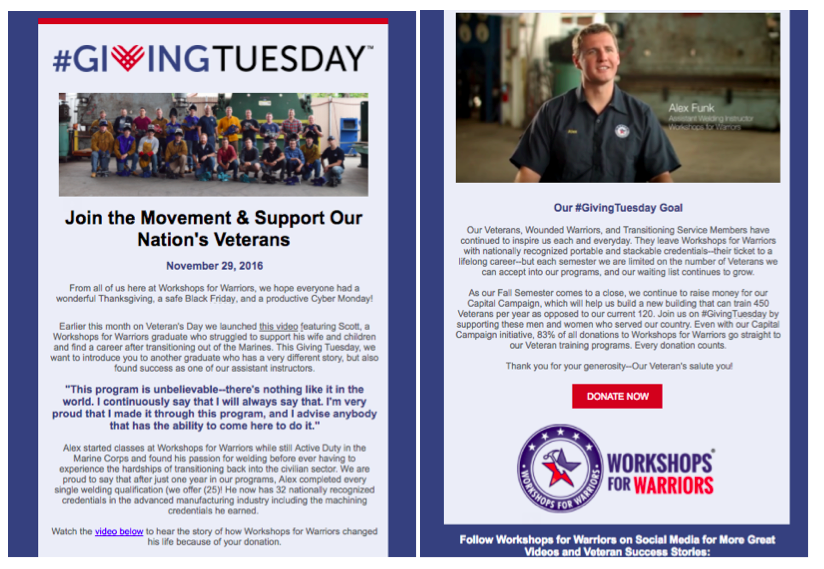
Workshops for Warriors is a nonprofit school that trains and certifies veterans into advanced manufacturing careers. Their #GivingTuesday is a great one- here’s why:
The headline clearly states the purpose of the organization- to support military veterans
Throughout the campaign they provide videos of veterans explaining why they need assistance and how Workshops for Warriors is able to provide the much-needed help. This gives a very personal touch to the fundraiser.
They also included a specific goal for the funds raised- to build a new building that can train 450 veterans as opposed to the current 120.
They include an easy-to-see donate button.
They use a pull quote to help break up the catch and keep interest
They link to social media at the end so you can share the campaign and also access more success stories from veterans.
A Few Campaigns That Could Use Some Work
#1 Pro Kids The First Tee of San Diego

Pro Kids is a sports program that teaches kids the game of golf while also teaching them life lessons and leadership skills. While the program seems to be full of positive attributes, unfortunately their #GivingTuesday campaign didn’t use this to their advantage. Note that this message did come into my inbox the day before Giving Tuesday, but there were still opportunities missed. They ended up on this list because:
The “Be ready to support Pro Kids” headline seems like they’re telling readers to donate as opposed to asking them.
Because of this poorly worded tagline, I almost missed the part where the board of directors have agreed to match all donations. This should be a huge part of the email, not just a small line tucked away at the top (still though, wonderful idea!).
There are no personal stories, photos, videos, etc. anywhere in the email. While it says you’ll be helping 100 underprivileged kids, I have no idea who these kids are. Where are their photos? Where are the success stories?
The email doesn’t say anything about what the Pro Kids organization is; I had to Google it myself in order to learn about their goals and mission statement.
One thing I will say though is that the colors are excellent in this campaign. The designer did a great job, it’s just the content and CTAs that need some improvements.
#2 Monarch School

The San Diego Monarch School is a K-12 program designed to help San Diego’s homeless youth receive an education. While their website provides a ton of information about the great work the program is doing, their #GivingTuesday campaign email unfortunately didn’t meet the mark. It’s on the list because:
It explains very little about what the Monarch program is, their purpose, and their goals. It also doesn’t link to their website, which fortunately does provide this important information.
It states that donations will help their literacy program, but it would be nice to have been provided some more information about exactly how the money will be spent- on more books, computers, a nicer building?
They came up with the GREAT idea to have a 3rd grade class take over Facebook and explain why reading is important, but we don’t see any of this in the email. Instead, all they provide is the Facebook logo and expect you to click on it and travel to another site. People most likely won’t do this unless they’re already hooked on this campaign. It would have been nice if they included a preview of what some of the students said (and their photos) in the initial email. Then readers might be more inclined to visit another web page to learn more.
#3 Kinship United
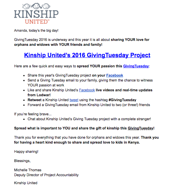
Kinship United is a group that works with underprivileged countries throughout the world, helping widows and orphans get the resources they need to survive through the church and rescue groups. While it certainly is a noble cause they are working for, and their hearts are in the right place, this #GivingTuesday campaign falls a little short. Mainly because:
They don’t give any information about the specific #GivingTuesday project they are launching- their goal(s), what group they are targeting, etc.
There are no photos or anything else to personalize the campaign.
The email is disorganized and hard to follow because it’s missing headings and subheadings. It appears that random phrases and sentences have been bolded without a lot of thought into why.
However, one thing this campaign did great is ask others to share, which is something none of the others on this list can say. A great tactic that simply gets overlooked.
Make sure to check out this article to learn how to make the most of your email marketing strategy. Do you know any more #GivingTuesday campaigns that make good examples? Comment in the section below!
Amanda DiSilvestro is a writer for HigherVisibility, a full service SEO agency, and a contributor to SEW. You can connect with Amanda on Twitter and LinkedIn.
