
Scope Creep Is Killing Your Bottom Line: Here's How to Prevent It

Picture this all-too-common scenario: You’re 12 revisions into a client project, when you promised only four. You’ve now spent almost triple the time you intended on the project, which gives you less time (and energy) to devote to other clients.
It’s a frustrating situation, for sure, but the damage goes beyond that — it’s also hurting your bottom line.
Scope creep is the ever-lurking monster under the bed for marketing agencies. A recent Deltek study on agency workflows, for instance, found that nearly 40 percent of agencies exceed their budgets because of scope creep.
It whittles away at your profitability, and when you’re constantly handing out a dozen or more revisions, it also sets unrealistic expectations for your clients. If left unchecked, it can mean less time for your agency to grow its business.
Of course, there’s a fine line between providing good service to your clients — which sometimes does require going above and beyond — and flat-out giving away your services for free.
I’m not suggesting you nickel-and-dime clients to death, but it is essential to set strict limitations on what you will (and won’t) do and stick to them. Otherwise, your profits will continue to seep out of the hole you’ve failed to block up at the bottom of your boat.
Scope Creep Starts with Vague Proposal Documents
It’s easy to blame clients for scope creep, but truthfully the blame sits right at your feet. At the end of the day, it’s your responsibility to serve as the gatekeeper of your agency’s services. Scope creep is entirely yours — not your client’s — to control.
Vague proposal documents are the number one culprit when it comes to this problem. They lead to over-servicing your clients, which in turn leads to lower profits.
The key: Set limits, set boundaries, and be very specific. Good scope documents include assumptions about both the project and the processes. Clearly outline the ripple effect that will happen if one piece of the project is delayed or altered, and detail how changes should be addressed, should the need arise.
Your clients need to know explicitly what they can and cannot expect from your team. If you specifically outline the deliverables you will provide each quarter, with little room for interpretation, then you’ll be setting yourself up for success.
It’s a Numbers Game: Know the Math, Increase Profits
OK, so you know you need to tighten up your language on your proposal documents, but where do you start?
Before you add in any additional fees for excessive revisions or change orders, you must intimately know the math and exactly how your agency makes money.
You may find that you are literally paying for the privilege of working with certain clients. If you run profitability reports for your clients (and you should), you might see that certain clients — those who consistently exceed scope with “small projects” and “just one more revision” — are actually costing you money.
But it’s not just agency leaders who need to be financially savvy. Your account team also should have a clear understanding of how the business works. After all, they are the ones in charge of communicating with the client and monitoring the budget.
If they don’t understand agency math — or how you spend your AGI — then how are they supposed to know when to say “yes” or “no” to a client request?
3 Strategies for Stopping Scope Creep in Its Tracks
Scope creep is an issue all agencies face, but it’s not impossible to stamp out of your business practices. Here are three strategies to ensure you’re both maximizing profitability and providing clients with top-shelf service.
1) Teach Your Employees the Rules of the Game
Every single day, your agency is either making money or losing money.
If your team members don’t understand the dollars-and-cents of the business, they will continue to believe their greatest priority is keeping clients happy. The easiest way to do this, of course, is to over-service clients — not a great tactic for maximizing profits.
if you educate all employees on the costs of your goods and services, they’ll be better able to balance keeping clients happy and servicing your firm.
2) Leave No Room for Misinterpretation in Your Scope Documents
At the very least, your scope documents should define your deliverables, the number of revisions you’re willing to do, and each project’s timetable.
Use language that leaves no room for interpretation, such as “With this estimate, you are going to be granted four revisions. Any revision after the fourth will result in a $250 fee.”
The number of revisions and the fee amount should be tailored to your agency, but the important thing is that your client knows from the very beginning of your contracted relationship exactly what they’re agreeing to. Once the client signs the document, there doesn’t have to be a big discussion every time the fifth revision rolls around.
3) Don’t Be Afraid to Issue Change Orders
Change orders give your scope documents some teeth. How you treat changes in scope helps train your clients with how much you’re willing to bend. So try not to bend.
The biggest reason change orders aren’t issued is that agency leaders and employees think they don’t have enough time or it’s not worth the headache. Here’s how the thinking usually goes: “By the time I calculate the change order cost, write up a document, and get it signed by the client, I could have just made the change.”
The reality, though, is that you can’t afford to not issue change orders. By doing this, you’ll prevent the client from future abuse of scope. You want to make the client happy, but you are also running a business. And businesses run on profitability.
There will be times when the client or the circumstance justifies waiving that change order fee. But by having the fees in place, those free revisions become a gift you are giving clients, not a right. Giving one revision out gratis sure beats handing out 10 for free — which is what you may be doing now.
Being specific and firm with your scope won’t damage your client relationships. Rather, being firm will train them to get their ducks in a row before they request changes or revisions.
It’s tough love, sure, but you’ll be surprised how receptive your clients will be to having firm parameters to operate within. Most importantly, you’ll no longer have to watch project scope continually creep and profitability shrink.

![]()
(Google) Home for the Holidays
It’s that time of year. Holiday music, sweet treats, classic movies — all the reasons to cozy up and spend time at home with the ones you love. And with Google Home, there are countless ways to spread the holiday cheer.
Play Netflix on your TV with the magic words “Ok Google”
Serve up the holiday classics that make your season bright, hands-free, right to your TV — when Google Home is paired with a Chromecast device. Now, in addition to YouTube videos, you can stream any movie or TV series from Netflix to the TV, using just your voice*. Start with “Ok Google, play Stranger Things from Netflix on my TV” or “Ok Google, play Love Actually on Netflix on my TV”. You can even control your media with commands like “Pause this episode”, without lifting a finger. Here’s how to link your Netflix account to the Google Assistant from the Google Home app (make sure you’re running the latest version). Netflix linking in the Google Home app is available now for iOS and rolling out to Android this week.
Enjoy your Google Photos on the big screen, hands-free.
The holidays is the perfect time to gather around and relive memories from the year. Google Photos now works with Google Home, so you can share your photos on your Chromecast-connected TV, using just your voice. Simply say, “Ok Google, show my photos of Lake Tahoe on my TV” to see your beautiful pictures bigger. Even if you can’t remember the name of the album, you can search for pictures. Try “Ok Google, show my photos of selfies at Christmas on my TV” or “Ok Google, show my photos of Brazil sunsets on Chromecast”. You can even use your voice to search for your places, things and people.
Learn how to link your Photos account to the Google Assistant here.

Enjoy holiday music from your favorite apps
Fill your home with festive tunes from your favorite music apps like Google Play Music, Spotify, Pandora, or YouTube Music with just a simple voice command. Say, “Ok Google, play Hanukkah music” or “Ok Google, play Christmas music” and you’ll get into the spirit in no time.
Keep track of Santa
Whether he’s preparing his sleigh or already in flight, your Assistant keeps you informed of Santa’s latest whereabouts (tracked by Google Maps). Just say “Ok Google, where’s Santa right now?”
Get YouTube Red FREE for six months
Keep the holiday glow going well into the new year as you enjoy a premium music experience — more songs, more versions, no ads — with YouTube Red. Get six months free of YouTube Red when you buy a Google Home before December 31, 2016**.
Make your holidays truly magical with Google Home.
*Netflix streaming membership required
**Offer expires 12/31/16. Terms apply. New subscribers only.
Campus Exchange in Korea inspires start-ups’ minds, hearts and “Seoul”
Campus Exchange is a start-up exchange program hosted by Google for Entrepreneurs. We recently invited four start-ups from Korea and another four from Brazil, Ireland, Mexico, and Poland to join us at Campus Seoul for a week. We gave them access to Startup:Con 2016, and hosted workshops on the topic of going global with their businesses. Two founders — Byungik Choi, CEO of CoolJam, the Korean start-up behind “Hum On!”, an app which transforms hummed melodies into musical soundtracks, and Pedro Matsumura Kayatt, co-founder of VRMonkey, a virtual reality start-up based in Brazil — share their insights from the exchange.

What are some of the differences between running a start-up in your countries and elsewhere?
Byungik of Cool Jamm (Korea): I’ve realized just how supportive the Korean government is of start-ups compared to some other countries. Mentors are readily available here—though I do think there’s always room for more role models who are open to sharing advice about their entrepreneurial journey.
Pedro of VRMonkey (Brazil): Korea has a very tech-friendly environment that helps companies to perform better and even attract more investments. Brazil’s still an emerging country when it comes to technology—there aren’t many big tech players, and many people with a technical background end up going abroad.

How do you think your experience at the Google Seoul Campus Exchange will shape your company?
Pedro: First thing we learned is to focus. Our VR studio has been doing a lot of things, and we should really focus on doing more in one particular area. We also learned how we can collaborate better with so many content providers to create really amazing VR experiences that’ll hopefully go mainstream.
Second, we now understand how important it is for our projects to be accessible in other languages. English is not enough. People in Korea and other countries want to play games in their own language. Plus, we understand that we can launch games and experiences that can also impact other regions, so we are exploring more themes—including Asian themes—to create more content.
Byungik: First, it reminded me of the importance of English. For a global start-up, having fluent English skills are mandatory. Second, the dogfooding session taught us that we could get a lot of meaningful feedback from Googlers and other start-up members who are from different cultures. It was really helpful. We’ve now decided to do dogfooding sessions frequently.
Who was one of the most memorable entrepreneurs or people you met during this trip?
Pedro: Wow, that is hard! I met so many amazing people during the program, but one guy who made me feel at home was Junsoo Kim, Chief Operating Officer of Reality Reflection. He invited me to their office and we spent a night there talking about the future of VR and sharing our companies’ projects over a pizza! It was a great time and made us rethink a lot of things about VRMonkey.
Byungik: All the participating start-ups are wonderful. FanFootage from Ireland was most impressive to me. I think it was a good example where a great idea and great technology are well-combined. And the Brazilian guys of VRMonkey were cool and friendly.

The week-long Campus Exchange in Seoul featured participants from all around the world, icnlduing FanFootage from Ireland, FEAT Sp. z o.o. from Poland, Machina Wearable Technology from Mexico, VRMonkey from Brazil, and 1DAY1SONG, Cool Jamm, Maverick Co. and Busking TV all from Korea.

A panel on fundraising in Korea featuring Tim Chae of 500startups and Kihong Bae of Strong Ventures

What’s your advice to entrepreneurs seeking to expand their business?
Byungik: Staying humble. It is I who must ask for advice from other entrepreneurs because I just started my first start-up. Everything is new to me.
Pedro: My strongest advice would be to share. Be honest about what you are doing, do it in the best way you can imagine, and share your work with anyone interested in it. There are few secrets and almost no competitors when it comes to markets like mobile and VR because basically, the whole world is your client.
Google Assistant vs. Siri: Which is the Best Smartphone AI? [INFOGRAPHIC] by @MattGSouthern
Google Assistant vs. Siri – is one smartphone AI better than the other? We’ll leave that for you to decide with this infographic.
The post Google Assistant vs. Siri: Which is the Best Smartphone AI? [INFOGRAPHIC] by @MattGSouthern appeared first on Search Engine Journal.
![]()
Amazon begins testing Product Listing Ads on AdWords
For the first time ever, Amazon Product Listing Ads have been popping up in what appears to be an AdWords test.
The post Amazon begins testing Product Listing Ads on AdWords appeared first on Search Engine Land.
Google Has 5 of the Top 10 Apps in 2016, According to Nielsen Rankings [REPORT] by @MattGSouthern
Google claimed 5 spots in the list of top 10 downloaded apps of 2016 in latest Nielsen report.
The post Google Has 5 of the Top 10 Apps in 2016, According to Nielsen Rankings [REPORT] by @MattGSouthern appeared first on Search Engine Journal.
![]()
Do I Need AMP? by @grybniak
Google is going to prioritize mobile in 2017. And it means that digital marketers and SEO professionals need to seriously consider implementing Accelerated Mobile Pages (AMP) on their sites. But does it make any sense? Read on to learn more!
The post Do I Need AMP? by @grybniak appeared first on Search Engine Journal.
![]()
4 Design Terms Every Marketer Needs to Know
The transition from text-based to visual marketing is already well underway, as customer demand drives organizations to rethink how people communicate on the most basic level.
Cisco estimates video will constitute 80% of all consumer Internet traffic by 2019, and although marketers are racing to catch up, they’re still behind the times: in 2015, 52% of senior marketing executives believed that visual assets such as infographics, photos, videos and illustration could help them tell their brand story. But given that human attention spans dropped a whopping 33% between 2000 and 2015, from 12 to 8 seconds — and some report its dropped even lower — marketers no longer have any choice in the matter: eye-catching visuals that are quick to digest and easy to share will be an essential tool for any brand moving forward.
But what’s a brand to do when you have no idea what visual assets will be both effective and the right fit for your organization? This post will explain a few essential terms and tips you’ll need to get started.
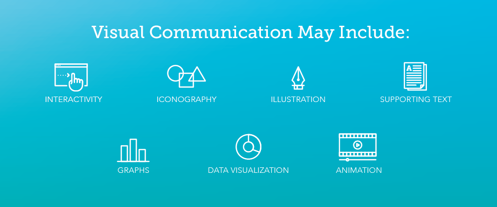
1. Visual Communication
Visual communication may be the most form of all.
It may sound simple enough: visual communication uses images and visuals to create meaning.
Why?
Because it is likely to become the only way that the majority of marketers communicate with their audiences — so you need to know it when you see it. This isn’t just because people prefer video to text, and are more likely to share photos. It’s also easier than ever for any brand to reach an international audience. Just take a look at Google AdWords, which (finally!) launched a redesign in March, of which an essential part of the design was making it language-agnostic to remove obstacles for audiences with a wide variety of backgrounds and skill sets.
 The new Google AdWords features clean visualization and icons that communicate the type of information being mapped, no matter what language you speak. Image Source
When necessary, limited text is included to explicate the meaning. Take a look at Starbucks’ visual communication strategy: one tweeted image incorporates autumn leaves combined with moss emblematic of their Pacific Northwest roots, announcing that the drink in hand is both seasonal and rooted in Starbucks’ larger tradition.
The holidays. When everything shows its heart. #HolidaySpiceFlatWhite pic.twitter.com/XIvy1ZFQMG
— Starbucks Coffee (@Starbucks) November 23, 2016
Starbucks’ visual communication strategy ensures every piece of visual content is immediately identifiable with their brand. In one of Starbucks’ most-liked tweets of the last few months, autumn leaves communicate the seasonality of the drink while moss connects to the company’s Pacific Northwest roots — no text necessary.
Another tweet reminds customers (without using a single word) that the brand is famous for just how personalizable their products are. Their stores and products project the same visual identity as their social pages. You know a Starbucks image immediately when you see it. That’s effective visual communication.
Find your holiday favorite: https://t.co/DgCc0G1fIS #RedCups pic.twitter.com/aXW1vNrYuz
— Starbucks Coffee (@Starbucks) November 12, 2016
Starbucks communicates its reputation for personalized drinks, the breadth of its product offerings, and its release of seasonal cups — all in a single, text-free illustration.
But it’s easy to fall short of this goal. A great piece of visual communication should communicate in just the same way as the AdWords interface now strives to: without reading a word, you should be able to look at the design and tell what the graphic is about — what message it’s trying to send.
Here are a few questions to ask to determine whether your visual content meets the standards that your audiences will hold you to. If the answer is “no” to any of these, rethink whether your content is really communicating effectively:
Ask someone unfamiliar with the graphic or video to glance at it for 5 seconds. Can she tell you what the theme is?
Are you using illustrations and assets custom-made for the content, as opposed to cookie-cutter graphics or clip art?
Is the content targeted toward achieving a single goal?
Are both the design and the copy calibrated to attract and interest your target audience?
Have you kept text to a minimum?
2. Visual Storytelling
Every brand has a story to tell, but with more stories to choose from than ever before, keeping an audience engaged can be a challenge.
The answer lies in what’s already interesting to your viewers: we’re living in the golden age of television and online video; game and virtual realities are becoming more complex every day; and websites encourage visitors to interact actively with their content. Storytelling today has to be something users can see, interact with or hear before they’ll share.
Take a look at Carrington College’s informational motion graphic on springtime allergies:
It transforms pollen, white blood cells, and even mast cells into humorous characters to reframe what could otherwise be a boring explanation as a story. Every audience is attracted to stories — it seems to be a part of our human DNA. And with the help of clever visual storytelling strategies, anything can become a story.
Visual storytelling uses visual communication to craft a narrative that explains a concept and often evokes an emotional response. It’s ideal for those marketers seeking to share an idea, promote a point of view, or convince potential customers of the quality and effectiveness of their product. As with visual communication, education is one of the end goals, but this approach aims to persuade the viewer to reach a specific conclusion.
Here are a few elements that make for a great visual story:
Plot: You should carefully guide your viewers from beginning to end.
Priorities: Only use the strongest data and arguments. Too much information is overwhelming.
Audience: Identify a single target audience and create a story they can relate to.
Goal setting: If you’re trying to make too many points at once, or share too many ideas, you’ll end up turning viewers away. A targeted, single goal promotes shareability and engagement.
3. Information Visualization
You’ve got more data than ever and no idea how to cull meaning from that data. Or maybe you do know what it means, but it’s nearly impossible to get your colleagues interested in what that data has to say — much less get your customers so excited that they’re willing to retweet that data to their followers. This is where quality information visualization comes in — and “quality” is the keyword.
Information visualization aims to convey meaning as quickly as possible. The primary focus is to educate the viewer, not to persuade them to form a specific opinion. Information visualization can also be aesthetically engaging and even interactive, as The New York Times proves with its visualization of deportation numbers.
 Massive amounts of data are made meaningful in The New York Times’ visualization of U.S. deportation numbers. The graphic transforms as readers scroll down. Image Source
But to be effective, you need to use visualizations that stand up to scrutiny, follow mathematical and scientific best practices, and quickly communicate the big picture. Not everyone is up to this task. Here are a few essentials for when you’re visualizing information:
Check your graphs: Using a pie chart for something that’s not a percentage or setting inconsistent scales for your graphs are both big errors that could take center stage instead of your actual message.
Keep it simple: Don’t try to pack too much information into one image. One graph should have one takeaway.
Focus on the message: Getting lost in the data is the opposite of the point. Help readers understand what’s important and why through careful organization of the content, as well as icons and illustrations when necessary.
4. Visual Campaigns
What if you have a more complex story to tell? Most companies do. One piece of content just can’t say everything you need to say.
One piece of content — even if it’s a social post that goes viral or a video that gets thousands of likes — also isn’t likely to assure the long-term success of your company. That’s why more and more organizations are looking at improving their branding by placing more emphasis on visual content and creating a consistent look and feel that will span multiple marketing campaigns and a variety of content types, from motion graphics and interactive pages to infographics and social posts. At the same time, marketing campaigns are now expected to have a consistent and recognizable visual element — something that can be recognized instantly.
Take a look at how Coca-Cola’s one brand campaign launched this year. Its products were available in dozens of countries, with dozens of looks designed for maximum appeal wherever they were sold. It was a massive undertaking, but the company pared down its product design to just four universally recognizable packages.
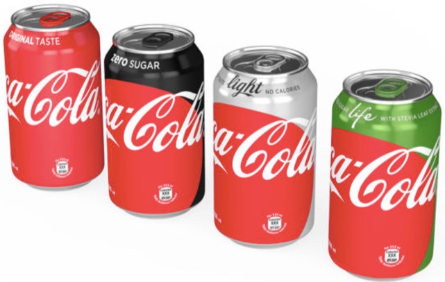 Image Source
Coca-Cola’s old strategy was to create new branding for each new product. Now, they’ve united their global branding with four consistent, and instantly recognizable, colors, each of which is visible on all sides, no matter which way the bottle or can is turned on the shelf.
“When people see this new brand identity, they’ll know they’re buying a Coca-Cola,” explained James Sommerville, vice president of global design.
This is all to say that companies are redesigning all their customer-facing content to offer up a consistent visual message. Here are just a few of the benefits of undertaking a visual campaign:
The consistent use of quality assets across your brand communicates an overall dedication to quality that customers today are equipped to recognize and prepared to appreciate through engagement and sharing.
A single face for your visual content communicates that you’re committed to authentic and honest communication — not changing your stripes with every new piece of content.
Multiple visual assets can reach a broader audience because of their adaptability to different platforms.
A consistent look builds brand awareness.
Conclusion
In the end, visual communication is an indispensable tool for any marketer, but execution is key. Not just any visual content will do the job. Consumers ignore sloppily designed or cookie-cutter graphics in favor of those that inspire — not only in how they look but also in how they deliver their primary message. Armed with these essential terms and a list of dos and don’ts, you’ll be well prepared to avoid the pitfalls as you navigate to the visual communications agency that’s right for your brand.
![]()
Did you know? With Kissmetrics, you can track the effectiveness of your online advertising. Optimize your marketing by knowing which campaigns perform and which don’t. Check out our infographic to learn more.
About the Author: Erin McCoy is the Public Relations Manager for Killer Infographics.
Why You Should Start With Copy Instead of Design: A Data-Backed Lesson

Most conversion rate optimization experts you’ll meet would agree: Copywriting first. Design second.
The idea is that copy (and the message you’re trying to convey through that copy) should dictate design – not the other way around. Now, this is in no way meant to underestimate the importance of design. Design can breathe life into the story the copy is telling, and done properly, great copy plus great design will always outperform great copy alone.
The point is, it’s not hard to find examples of “ugly” pages outperforming beautifully designed pages – and in those cases, it usually boils down to the copy.
Copy first. Design second.
We’ve been chatting about this a lot lately on HubSpot’s marketing optimization team. In the past, our marketing team has typically followed a design first, copy second order of operations when designing web pages. And it’s hard to blame us. We try to move fast and ship projects quickly, and the design before copy approach is definitely the quicker of the two, since copy can be written in tandem with the development of the design.
But when copywriting comes first, design can’t even begin until copy is complete. And because development can’t happen until design is done, this definitely extends the timeline of project execution. The problem is, this means you’re crafting copy under the limitations of a fully baked design, handicapping your ability to tell the story in the best way possible.
Now I’ll admit: All this “copy before design” business always sounded great to me in theory, but conversion rate optimization experts also warn against the dangers of “best practices,” so it was really enlightening to find an example of this theory proven out on one of our very own web pages.
The Experiment
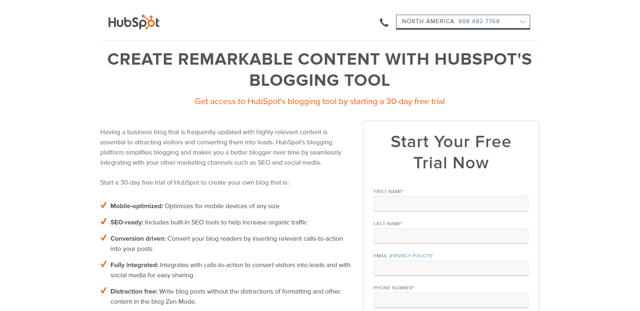
In addition to our main free trial landing page, we also have a bunch of targeted, tool-specific free trial landing pages that the marketing team uses for more segmented campaigns. Below you’ll find an example of one (image B), which is targeted to specifically promote HubSpot’s Blogging tool. And here are the two compared to each other …
A. Main Free Trial Landing Page (Above the Fold)

B. Tool-Specific Free Trial Landing Page (Above the Fold)
As you can see, these tool-specific landing pages were built using an older template, and when we redesigned our main free trial landing page to look the way it currently does, its tool-specific counterparts remained in the former design. Seeing this as low-hanging fruit from a conversion perspective, I converted three of our most trafficked tool-specific free trial landing pages into the newer template. To be sure the newer design was still in fact the better converting design, I A/B tested each page against its pre-existing design.
The Initial Results
When I first analyzed the results of these three tests, the variation (i.e., the design using the newer template) only won for two of the three pages. Naturally, I tried to understand why. When I took a closer look at the third one (the free trial landing page for our Keywords tool), I noticed a difference. Can you spot it?
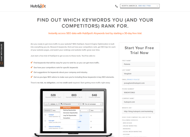
Older Template (Control)
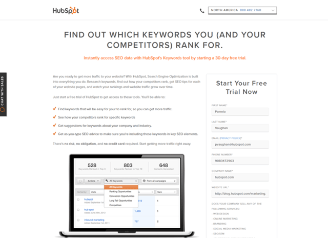
Newer Template (Variant)
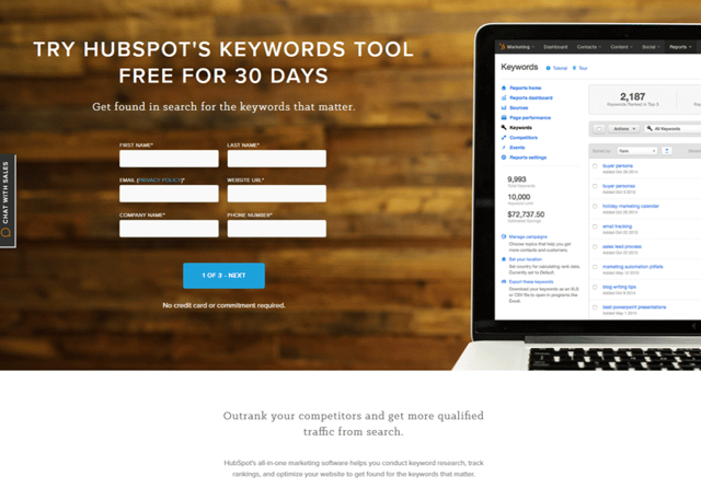
Okay … obviously there are a few differences here, considering the design is completely different. But the one that stuck out to me immediately was that the positioning of the header/subheader copy in the control was very different than that of the variant.
Control Header + Subheader Copy:
Find Out Which Keywords You (And Your Competitors) Rank For
Instantly access SEO data with HubSpot’s Keywords tool by starting a 30-day free trial.
Variant Header + Subheader Copy:
Try HubSpot’s Keywords Tool Free for 30 Days
Get found in search for the keywords that matter.
The positioning in the control was primarily focused on the value of the Keywords tool, specifically emphasizing the competitive intelligence the tool provides, whereas the positioning in the variant was focused on clarifying what the offer was itself (i.e., a free, 30-day trial). And while I had made sure the variant still mentioned the competitive intelligence value of the Keywords tool, I had buried it lower down on the page … below the fold.
Isolating Variables
The problem with this test was that I wasn’t isolating the variable I was trying to prove. In this case, I wanted to prove that the new design for the page performed better than the existing design, yet I was manipulating more than one variable: design and copy. So after I had my “duh” moment, I decided to tweak the positioning in the header copy of the variant to match the control, and let the test run for a few more weeks. This way I’d be doing a better job of isolating design as the variable I was testing.
Here’s what the header and subheader copy in the control and variant looked like after I tweaked the variant. Note that I made no changes to the copy in the control …
Control Header + Subheader Copy:
Find Out Which Keywords You (And Your Competitors) Rank For
Instantly access SEO data with HubSpot’s Keywords tool by starting a 30-day free trial.
Variant Header + Subheader Copy:
Find Out Which Keywords You & Your Competitors Rank For
Get SEO data instantly with a free trial of HubSpot’s Keywords tool.
And here’s how it looked in each template variation …
Older Template
Newer Template
Final Results
A few weeks after making those tweaks, I re-evaluated my test. Bingo!
The variant was the new winner with 99.07% confidence and a 20% increase in conversion over the control.
Aside from the fact that this was (ultimately) a successful test, what I love is that it proves how influential copy can be. The only reason the control originally outperformed the variation was because people preferred the copy in the control — even though the design of the variant ultimately performed better.
So there you have it: Don’t underestimate copywriting in favor of design. In fact, copywriting can be even more influential than design when it comes to conversion rate optimization.

![]()
Why Your Company Might Need a Content Audit
 Content is used as a valuable marketing tool across all industries. From social media content to long-form evergreen content, marketers constantly write to build awareness and nurture relationships. While the goal of content marketing is clear, many companies forget to track what type of content is actually working.
Even powerhouse Microsoft fell into that habit. At one point the Microsoft.com website had 10 million pages of content but 3 million of them had never been visited. By removing unnecessary and irrelevant content, Microsoft made its customers much happier and learned what type of content works in attracting consumers. And all of that happened by conducting a content audit.
5 Reasons for a Content Audit
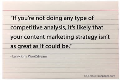
There are a variety of reasons that a company might need a content audit. Here are some of the problems that plague companies because of the lack of a content audit.
Lots of Traffic Coming in But Not Many Qualified Leads
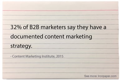
Here’s a scary stat: one-third of B2B marketers don’t track where their leads come from. This clearly needs to be corrected in order to figure out what marketing channels work and which should be eliminated. Once your company takes a look at lead generation, you may find that while more and more traffic comes in, none if it is really relevant to your brand.
This is oftentimes a content problem. The content could be attracting the wrong target and therefore no one converts. 56% of survey respondents said they were doing content marketing without a plan. When qualified leads are not coming in, maybe the content was not written with a clear buyer persona; therefore, the content does not address a specific need or pain point of that audience.
Unclear Value Proposition = Unclear Content
Only 7% of leadership teams can explain a clear, common value proposition, but 85% of CEOs say their employees can state the company’s value proposition. This dichotomy leads to very unclear content. If writers do not have a clear picture of the company’s value, then the content will reflect this and appear confusing to the reader. A value proposition helps build relevance for target buyer personas, helping to improve engagement, shares, conversions, and trust.
Blog Doesn’t Play a Role in Sales
B2B marketers that use blogs receive 67% more leads than those who do not. Many companies, however, do not use the blog as part of the sales process, which means no leads or opportunities come through because of the blog.
This can be because the sales and content marketing teams are not aligned. The blog should help push leads down the sales funnel, helping to produce qualified leads. A company’s blog can also help provide sales teams useful nurturing content as they help prospects navigate the awareness, consideration, and decision stages of the buying process.
Leads or Sales Goals Aren’t Met
If leads or sales metrics are falling behind, surprisingly this could be because the content strategy is not tied to the sales strategy. Before revising the sales process, performing a content audit could uncover why certain goals aren’t met. Content must aid the sales process, as 41% of businesses say curated content increased the number and/or quality of sales-ready leads.
Blog Subscribers Don’t Read Your Content
If people that actively subscribed to your blog content are not reading it, then a content audit is desperately needed. By finding out why these people subscribed, you can start to get your content back on track. Perhaps with different team members writing, blog content began to drift from its original purpose, making it no longer useful for the audience.
What To Do Next
Before launching into a full scale content audit, take a step back and ask some key questions about the content being created.
Is the Content Value-Driven? Does the content align with the company’s value proposition? What are the key value points that relate to your customer and does the content reflect this?
Is the Content Persona-Driven? Does your content align to the needs, interests, and opportunities associated with target buyer personas or an ideal buyer profile?
Is the Content Results-Driven? Does your content assist in the conversion of leads and sales opportunities? Does the marketing team align efforts with results? Which content assists in conversions of leads and which content does not? Using Hubspot, identify which content directly influencers sales qualified leads.
Have You Invested in a Content Strategy? Have time and resources been fully invested to craft the best content strategy? Has this content team continually updated and improve and build upon top-performing content?
Are the Sales and Marketing Teams Aligned? Content can play a huge role in sales, so identify the weak points in the sales process and align marketing strategies along those points. Have you found opportunities to support, educate, inspire, and guide buyers through the sales funnel? Content can help with each step, so marketing and sales teams should meet on a consistent basis.
You Probably Need a Content Audit
If you answered no to any of these questions, then it is time for a content audit. A content audit can help improve sales, make your customers happier, and get rid of unnecessary pages that can be bogging down your website, so if you have fallen into any of the traps listed above, it’s time to audit the content on your website.
View more content marketing stats and trends.

![]()