
What Not To Do at Your Company Holiday Party

Ah, December: a month filled with festive decorations, hot chocolate, and the long-awaited company holiday party.
Company holiday parties are a fun occasion to celebrate the season with your friends, family, and colleagues. However, even if the party has all of the trappings of an event you would throw at your home, such as food, alcohol, and party games, it’s still a work function. We’re aware that last bit can be easy to forget, which is why we put together this post.
To help you have fun at this year’s holiday party without embarrassment, check out our top 10 rules for things to do (and to avoid) with your colleagues, direct reports, and managers.
10 Dos & Don’ts for Your Company Holiday Party
Don’t:
1) Don’t skip the party.
Whether you’ve been invited to another function on the same date or you’re simply feeling antisocial, avoid turning to your backlog of excuses to get out of this year’s party.
Social work functions are great opportunities to get to know your teammates, meet and network with people you don’t work with directly, and have fun with the people you spend 40 (plus) hours a week with.
At the risk of sounding cliché, don’t be a Grinch — go to the party.

Source: Giphy
2) Don’t talk about work excessively.
The holiday party is a work event, but that doesn’t mean you should talk shop the entire time. You’re there to have fun, so mingle with colleagues. Ask about their plans for the holidays, meet friends and family members your coworkers brought with them, and don’t forget the cardinal rule of conversation in mixed company: avoid politics and religion.
Ask questions, don’t monopolize the conversation, and if you get stuck, here are some networking tips to check out.

Source: Wordpress
3) Don’t bring an inappropriate gag gift to the swap.
If your office plans a gift swap or Secret Santa for your company party, remember that your coworkers and supervisors will be witnessing your gift being unwrapped. You can purchase something funny, but not inappropriately so. Our advice? Stick to the price limit and grab something thoughtful for your deskmate. (Here’s a list of Secret Santa gift ideas to inspire your search.)

Source: Imgur
4) Don’t appear bored or antisocial.
Everyone is glued to their phones these days, but try to resist the urge to constantly check texts and social media at the office holiday party. Hiding your face behind a screen sends the message that you don’t want anyone to talk to or approach you, and that’s not the way to make connections with your colleagues. Leave your phone at your desk and you’ll appear more engaging and have better conversations with people.

Source: KiK
5) Don’t drink too much.
With parties comes alcohol, and we highly encourage that you drink in moderation at the office holiday party. When supervisors and executives are around, you’re better off erring on the side of cautious. You don’t want to cause a scene, discuss anything inappropriate, or make coworkers uncomfortable, and those can happen if inhibitions are lowered.
If you don’t want to come into work the next day wondering if you jeopardized your job, drink wisely — and be sure to sample the snacks, too.

Source: Quotesgram
Do:
6) Dress festively (but not inappropriately).
Use good judgment and stick to the office’s dress code policy when you’re getting decked out for the company party. Here at HubSpot, we’re huge fans of ugly holiday sweaters, but generally speaking, avoid wearing anything to the work party that could double as an outfit for a night out at the club. Office parties are fun, but should still be professional.

Source: Giphy
7) Be careful with what you share on social media.
You may be tempted to live-tweet your office holiday party or post videos to your Snapchat Story, but keep what you’re sharing on social media innocuous. Your colleagues likely wouldn’t appreciate you posting candid photos of them without them knowing, so stick to posting group photos you all posed for.
Additionally, make sure you’re not inadvertently posting sensitive company information visible on computer screens or white boards if the party is held at your office.

Source: Giphy
8) Meet new people.
Have fun at the party with your work buddies, but don’t miss opportunities to meet new people. You may not have the chance to mingle with other teams very often, so take advantage of the fun atmosphere to make new friends, too.
If someone introduces you to a client, an executive, or their partner, have an interesting follow up ready after they inevitably ask you what you do at your company. HubSpot Staff Writer Aja Frost put together a comprehensive list of conversation starters for every occasion — my favorite is “Gryffindor, Ravenclaw, Hufflepuff, or Slytherin?”
Remember: You’re more than just your job title, so come ready to chat with a story, a joke, or a question to get the ball rolling.

Source: Odyssey
9) Skip the dancing. Or just avoid “getting it started” like Elaine.
Dancing is fun, but read the room before you start busting out your signature move like poor Elaine on “Seinfeld.” If people are dancing on a designated dance floor, you should feel free to join in, but remember that you’re at a work event. Always refer back to number five on this list (don’t drink too much), don’t make people uncomfortable, and when in doubt, skip it altogether.

Source: Giphy
10) Thank the host.
If you can’t thank them in person at the party, be sure to follow up with a thank-you note or email for your events manager. It’s hard work to plan an event for an entire company — make sure it’s not thankless work, too.

Source: Giphy
Every company is different, so these are flexible suggestions. When in doubt, abide by your company’s culture whenever you’re at a work event. Be respectful, engage with your colleagues, and have fun. We hope you have a warm and happy holiday season this year.
What’s your advice for company holiday party etiquette? Share with us in the comments below.

![]()
3 Ways to Take Your SEO to the Next Level by @sejournal
It is absolutely essential in today’s SEO environment to have a trusty SERP tracker keeping track of your ranks. Otherwise, you will end up losing a substantial amount of time, money and effort checking manually, and even worse, only getting inaccurate results. Here are three awesome ways Pro Rank Tracker can upgrade your SEO.
The post 3 Ways to Take Your SEO to the Next Level by @sejournal appeared first on Search Engine Journal.
![]()
PPC Analytics Strength: Building A Stronger Revenue Stream With Less Traffic
Editor’s Note: This marketing infographic is part of KlientBoost’s 25-part series. We’re super excited to partner with them so you can enjoy a new gifographic once a day in your inbox. You should subscribe here.
With what seems like an endless amount of PPC metrics out there, it can be challenging to navigate all those numbers to find out what’s actually making you money in your PPC campaigns.
By having a better understanding of the various Google, Facebook, Twitter and other PPC analytics, you can drill down on the benchmarks that truly matter.
Kissmetrics and KlientBoost have partnered up to bring you these PPC analytics tips that can help you increase your revenue stream with more conversions, sales, and revenue, all with less traffic.
That way, you can measure the PPC stats that matter most, when it comes to reaching your business goals.
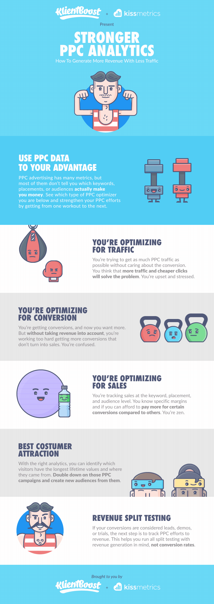
Graphic not loading for you? Here’s a link to the direct file.
You’re Optimizing for Traffic Without Thinking About Other Factors
Sure, attracting the most amount of traffic to your site and landing pages sounds exciting.
After all, it’s a numbers game right?
Not if all that traffic isn’t the right type of traffic. If you’re not drawing in quality traffic, then more visitors does not mean more revenue.
Rather than focusing solely on PPC analytics like clicks, impressions, quality scores and click through rates (CTRs), take a look at the bigger picture and analyze macro metrics that tell you more about revenue streams.
Find out if your optimized traffic is quality traffic that’s actually converting into sales.
Ask Yourself: How do I lower my cost per conversion first? Are my landing pages optimized for the type of traffic that’s coming in?
You can focus on lowering your cost per click once you understand the conversion cost metrics first. This will keep you focused on your overall business goal.
You’re Optimizing for Conversions Without Accounting for Revenue
Are your conversions turning into actual money-generating sales?
If your PPC campaigns are focused more on increasing conversions and lowering your cost per conversions, you’re headed in the right direction. A lower cost per conversion can help you afford more effective ad spend.
When optimizing for conversions you naturally put your attention toward making your landing page offers convert by being relevant and valuable to your visitors.
In this stage you are no longer focused on cost per clicks and see a more full story.
Here’s an example of when you might think a certain cost per conversion is outperforming the other:
 Keyword 1 looks better in this example
But what if you had more information and more details to the story?
Here’s the same keyword example but with sales metrics:
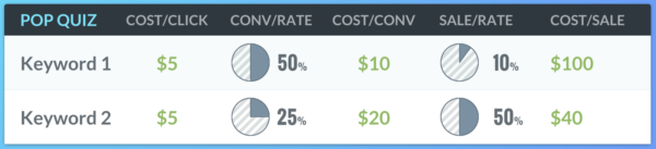 Now Keyword 2 looks like it’s winning
Dig a little deeper into your PPC analytics to uncover sales related info. This can tell you more about your conversions and whether or not they’re actually helping you reach your revenue goals.
Optimizing for conversions can be a step above optimizing for traffic, but if you’re still confused about whether or not those conversions are making you more money, then you still need to think more macro.
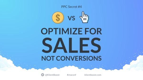
You’re Optimizing for Sales and Know Your Costs and Margins
The next level of macro thinking is optimizing for sales, which should be directly related to your bottom line.
Knowing how much revenue is coming in from your PPC campaigns is especially beneficial if you’re zoned in on the profit margins and knowing which PPC tactics margins are tied to those margins.
Tracking your sales at various levels like keyword, placement and audience level can help you zero in on where to give credit within your PPC campaigns.
 Optimizing for sales instead of conversions can help you save ad budget
That way you can boost your ad spend on those keywords generating sales, and decrease budget for those specific parts of your PPC campaigns that aren’t.
You Attract Customers and Know What Their Lifetime Values Are
Now that you’re clued in on optimizing for sales, it’s time to look at the long run and plan for future revenue streams.
Ask Yourself: Do you know the lifetime value of your customers?
Do you know everything about your valued customers and the PPC journey they took to get to you, and then convert and become a client?
If you can answer these questions, then you should be able to pick out the specific ads, ad formats, keywords and landing page URLs that drove specific visitors to become customers.
Once you have that golden information, your future should be bright… now you can put some extra muscle, energy and budget into the PPC targeting and PPC optimization that’ll win you more of the same sales success.
You Run Revenue Split Testing That Goes Beyond Conversion Rates
Without conducting diligent testing, you could be missing out on opportunities you may not even know about.
The best way to make sure capturing as much potential revenue as possible?
Split test your PPC campaigns and landing pages with not just conversions in mind, but revenue goals.
Find out which elements of your PPC campaigns perform the best when directly comparing two variants for revenue generation.
Tip: Consider the various stages of the conversion funnel and test out different keywords that speak to the various intent levels.
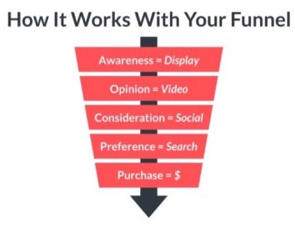 Visitors from your various PPC channels have different intent levels
Closing Thoughts
As you’ve learned, it’s not about the amount of traffic you’re driving, but more about the quality of your visitors.
Not only that but you need to make sure those quality visitors are converting into actual sales and generating you revenue that aligns with your profit margin goals.
Once you’ve got that down, you can break down the PPC analytics and repeat that golden recipe for more of those valued lifetime customers.
Now it’s your turn to uncover useful insights in your PPC analytics, so you can reveal the bigger picture and repeat the sales success for the long-term.
Introducing Yelp Data Management and Claiming through Moz Local
Posted by dudleycarr
Today we’re making an announcement that’s exciting for marketers at local businesses, enterprises, and agencies focused on digital marketing.
Back in August we announced the industry’s most advanced duplicate detection and closure toolset. And just last month we unleashed our new Moz Local packages, adding Google My Business sync, listing alerts, Apple Maps distribution, reputation monitoring and management, and more to the mix. Well, we have one more announcement to squeeze in before the year ends, and it’s a big deal!
Yelp data management for everyone!
We’re announcing a partnership with Yelp — the leading source for consumer reviews — bringing a new level of Moz Local product integration that will help you make Local your advantage. This integration is the first of its kind in our industry; one that will enable marketers to capitalize on the convergence of local search and consumer reviews more easily than ever before. Whether you have one location or one thousand, you can now claim and manage all your Yelp locations directly from your Moz Local dashboard.
What’s new?
Marketers will now be able to claim and manage data for all of their Yelp listings in Moz Local to increase the likelihood that more new customers will be able to find their business in local and map searches.
Claiming Yelp pages
Businesses can now use their Yelp login to claim and manage their listings through Moz Local — either individually or as a group. Create a new Yelp account or use your existing one, you can manage it all through us!
Ongoing management of Yelp pages
Once claimed, Yelp listings can be accessed and updated by Moz Local. This includes pushing updates to those Yelp pages from the Moz Local dashboard as well as monitoring the status of those updates and getting listing alerts in our recently introduced activity feed.
A Complement to our Reputation Management functionality
This new advanced Yelp functionality in Moz Local — claiming and active management functions — will complement our existing Reputation Management functionality, which provides notifications of new Yelp reviews and review snippets themselves right in the Moz Local dashboard, enabling users to link to the review user experience on Yelp.com in order to respond to a review.
What’s the big deal?
We’re excited about this partnership for a number of reasons. First off, our primary goal has always been to make it easier for brands and marketers to manage their local marketing strategy. As the leading consumer review service, Yelp is one of the most authoritative citation sources in the Local SEO ecosystem, and, as such, is an important source of information to Google. On top of that, Yelp data is critically important to Bing, Apple Maps/Siri, Amazon Alexa, and Yahoo, which use both its location data and reviews directly for their own results.
Everyone agrees Yelp is vital to local marketing strategy, and businesses that employ digital marketing have always told us they would love to be able to update and manage their Yelp listings. In both small and large-scale scenarios, they’ve been waiting for an efficient solution for updating their listings. A comprehensive solution that enables them to do this, as well as manage their Yelp reviews, streamlines the online management process substantially.
Finally, as the leading consumer review site, Yelp attracts over 100 million unique visitors monthly. It provides a critical customer touchpoint for businesses, and having listings on Yelp helps a business rank in local searches.
How will it work?
Moz Local users will provide the email address associated with the Yelp page(s) for their business location(s) to Moz Local, which will then start the claiming process. This will include a bulk claiming process that will prove especially valuable for businesses that have a large number of locations.
Once the Yelp page(s) for their business have been claimed by Moz Local on the user’s behalf, then automatically associated with Moz Local listings as appropriate, the user will be able to monitor and update those pages with all the efficiency and effectiveness that Moz Local provides through its unique, industry leading Active Location Data Management process. This will be available in all Moz Local product packages (Moz Local Essential, Moz Local Professional, and Moz Local Premium).
Yelp review snippets and review notifications are available in the Reputation tab in all Moz Local product packages.
Yelp performance metrics will become available in the Performance and Visibility tabs of Moz Local Professional and Moz Local Premium packages, our product packages that offer SEO analytics.
Cool. When will it be available?
The new Yelp advanced functionality will be available in early 2017.
Questions about this announcement? Leave a comment or contact us at help@moz.com.
Sign up for The Moz Top 10, a semimonthly mailer updating you on the top ten hottest pieces of SEO news, tips, and rad links uncovered by the Moz team. Think of it as your exclusive digest of stuff you don’t have time to hunt down but want to read!
![]()
SEO Trends 2017: 43 Experts on the Future of SEO by @DannyNMIGoodwin
Here’s what 42 of the top experts say will be the biggest SEO trends you need to know to succeed in organic search in 2017 – and beyond.
The post SEO Trends 2017: 43 Experts on the Future of SEO by @DannyNMIGoodwin appeared first on Search Engine Journal.
![]()
3 Common Google Analytics Gaps You Need to Plug
Google Analytics is the de-facto industry standard analytics tool.
It’s installed on almost every single business site. (It’s even looked at too, sometimes, too.)
It provides a tremendous amount of data that you can manipulate, along with customization options for advanced features that power users crave.
Also, it’s free.
Google Analytics excels at providing surface level, top-of-the-funnel, aggregate data.
Here’s an example of where that comes in handy, along with a few problems it presents.
Where Google Analytics Excels
That super-duper-in-depth Quote Request forms works fine on your desktop. But what about for mobile and tablet users?
It’s a mobile world, and we’re just living in it. Not only are more searches done on mobile than desktop, but mobile usage in general (and growth) continue to eclipse desktop usage.
Today, the best sites are mobile-first from the ground-up, ridden of legacy issues like poor UX, IA, and speed that shackle conversions.
Like, for instance, long-ass forms.
With just a few keystrokes inside Google Analytics, your answer is waiting for you.
Easy.
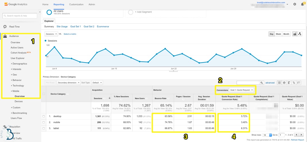
While tablet conversions compare favorably to desktop, mobile suffers a bit.
You can extrapolate this further: pull up a basic spreadsheet and plug in the desktop conversion rate multiplied by your average lead value. Do the same for the lower mobile one. Hit enter. Find revenue or cost discrepancy.
Now you’ve got a cold, hard case to bring to your boss or client to fight for additional resources.
Google Analytics also does admirably with traffic channel source and page behavior.
For example, organic search will (generally speaking) be your top driver of traffic (whether that’s a deliberate strategy on your part or not).
Let’s take a quick look at which specific pages are performing best, so we can:
Identify ways to improve them and get more people to convert from them.
Reverse-engineer their success so we can start cranking out new content like them.
Again, if you know where the proverbial bodies are buried, you can pull up the most popular content on your site and add a ‘secondary dimension’ to highlight Source or Medium.
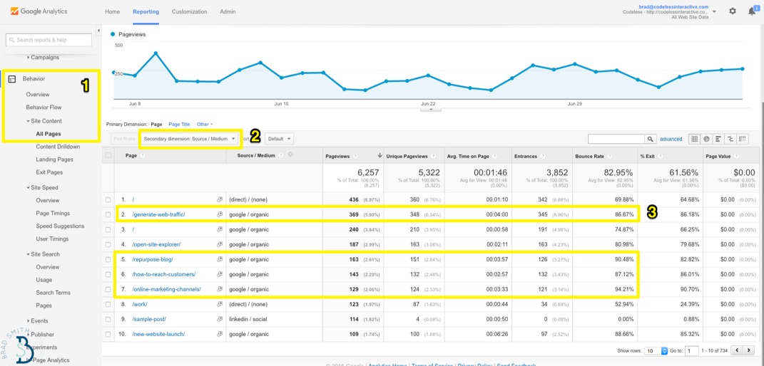
Awesome, a lot of older blog posts are performing well!
Perfect. Let’s make a few general notes of the topics that are performing well, and other ‘variable’ patterns they might have in common (like the images used, the category or style of content, the word count, etc., etc.).
But oh no, look at those bounce rates!
Maybe it’s time to reinvest in that old stuff and breath new life into it so we can better capitalize on all those search visits that are coming in.
They can probably use some new statistics and data as the world has evolved over the past few years. Today’s blog posts also tend to be more visual and step-by-step tactical, so let’s flesh out some of those high-level sections too.
With the help of a few basic Google Analytics reports, you can quickly spot high-level trends like this, and get decent reporting metrics on how your day-to-day tactical stuff (like blogging, tweeting, ads, etc.) are affecting new leads or purchases.
If you’re scrappy, you can even run some advanced tactics like split tests directly inside Google Analytics too.
However…
For all the good, there’s some bad.
There’s a few problem areas and obvious gaps where Google Analytics drops the ball. And you’re most likely going to need other software or tools to augment it in order to get the full picture.
(After all – Google Analytics is free. We can only complain so much.)
Here’s where Google Analytics struggles (and how to get around those problems).
Where Google Analytics Falls Short
Analytics for low-priced products are surprisingly cut-and-dry.
Extreme volume can always present a problem. But otherwise it’s a direct shot from A -> B. Point, click, and buy.
Google Analytics will show you product revenue in line with conversions, and you don’t always have to overthink what you’re looking at.
Consumers don’t overthink the process either, going from Stranger to Customer all in one fell swoop (or session).
Unfortunately, we can’t say the same for other organizations.
If you have a complex sales cycle, or a multi-step conversion process (like most SaaS apps) that go from Visits -> Free Trial -> Paying, you’re going to need to connect the dots.
And with Google Analytics, that sometimes feels more like you’re reading tea leaves as opposed to making data-driven decision.
Here’s why.
1. Attribution Problems & Last Touch Bias
Want quick, at-a-glance performance stats to draw surface-level conclusions? Open up GA.
However when it comes to tracking specific campaign performance (and comparing it to others), or looking further down the funnel at how leads are turning into prospects, sales opportunities, customers, and loyal promoters… it begins to get cumbersome.
Google Analytics is ‘session based’, looking mostly at individual visits. That means it can tell you what happens (more or less) during one visit. But if that visitor takes off, and comes back next week, there’s (mostly) no way to know that.
That brings about a whole host of attribution problems which can misinform your marketing decisions.
For example, let’s say you sell insurance. Here’s how that typical flow looks:
Prospect gets a new, high paying job, just celebrated their one-year anniversary and has a baby on the way. Now they realize they should probably get some life insurance!
So prospect begins doing general ‘unbranded’ searches for what type of coverage they might need and how much it’s going to cost.
After becoming a little more informed, they start doing specific searches around individual products and vague terms (like ‘riders’).
They read a few articles on a few different websites, and begin researching companies or brokers to reach out to (by typing in commercial keyphrases like, “life insurance quotes”).
They click around on a few websites, and possibly opt-in to one or two to begin the sales process.
Ok, let’s stop for a minute.
There’s still a ton of stuff that needs to happen. The majority of those leads are never going to become a customer, but already there’s a few glaring problems.
Problem #1. Within Google Analytics, you can only see step 5. Not anything before that.
Problem #2. You take a gander at conversion sources, and you’re only seeing that commercial-keyphrase search done in step 4.
Confirmation bias. No duh – heavily commercial keyphrases are gonna convert well.
You can bid directly on those, but have you seen “life insurance” CPC ranges lately?!
And what happens, is that your company neglects or ignores all the other steps (specifically, 1-3) that lead up to this point, along with the marketing requirements it takes to deliver those things – like how your social media work increases reputation and credibility, how SEO for unbranded topics to increase brand awareness, how design and UX affects first impression, which conversion paths are most effective, and more.
Because you can’t see any of it! At least not in Google Analytics alone.
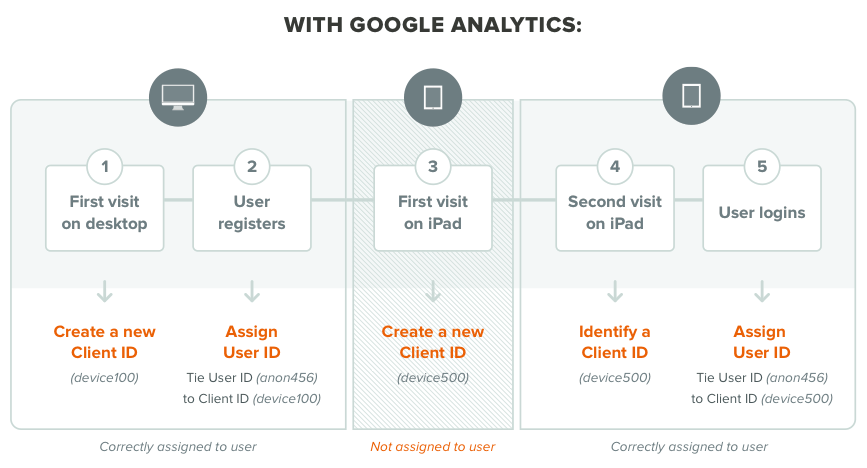
That’s where you need to layer in other tools to assign each user an individual ID and compile all of their visits (that sometimes happen over days or weeks) leading up to a lead opt-in or purchase.
TL;DR? Real-life is nuanced.
Google Analytics will show you that a conversion happened after a paid search.
BUT that visitor originally came to your website through an organic one. And then they came back because of a social one.
Those first two campaigns deserve a bit of credit, and any eventual share of the revenue that was generated as well (because the eventual paid conversion may not have happened without their assistance).
![]() The Kissmetrics Revenue Report
The Kissmetrics Revenue Report
Another side benefit of this approach: you’ll get more accurate visits/sessions and pageview data as well.
For example, GA doesn’t combine one person’s site view’s and activity over several different devices or browsers – so you’re getting skewed, inaccurate information that could possibly be 2-5x more views than you’re actually getting.
2. Campaign Measurement Difficulties
Let’s revisit our hypothetical “life insurance” example to see where the next problem arises.
The ‘converting’ campaign was a paid search one for “life insurance quotes”.
If campaigns are tagged properly you can kinda track this work.
Another hack or workaround is Oli’s inbound traffic segmentation, where you create dedicated pages for each source or channel – even if they’re the same information – for measurement purposes).
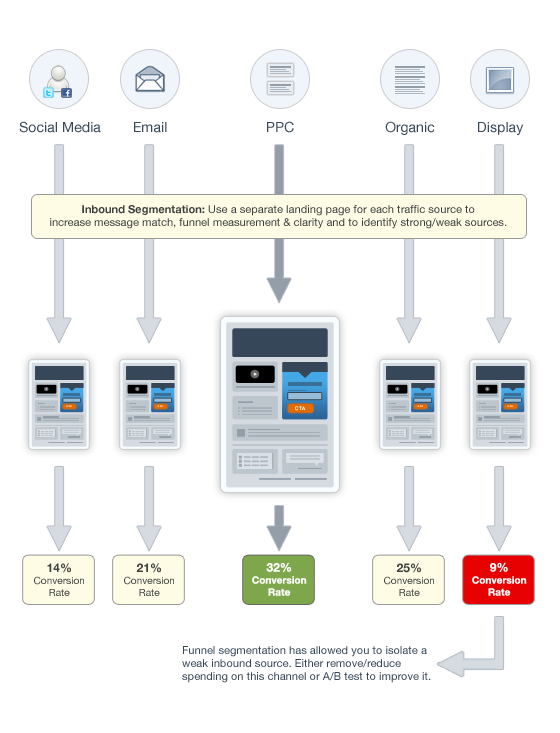 Image Source
But… an AdWords ‘campaign’ doesn’t = a larger promotional or advertising campaign.
A company-wide, revenue generating campaign involves multiple touchpoints and channels. Unlike offline, those channels help assist each other online (as we saw in the first step).
And our bosses (or clients) want to see how Campaign A compares with Campaign B across all marketing initiatives (not granular, leading indicators of the CPC from one term vs. another).
Thankfully, the recent updates to the new funnel report can help tremendously, picking up all of the various touch-points that contributed to your campaign’s success.
First, you want to create events that pick up all of your tracking codes and landing pages with that specific campaign variable.
You can then also add the desired revenue-generating steps to see how the entire campaign – across channels – performed. And most importantly, you can compare this campaign’s success to other recent ones this year, or prior ones from previous years for context.
You can also dive deeper into these conversions paths, including multiple ‘variables’ along the way, like if there are two possible ways to ‘complete’ a single campaign.
For example, let’s say – like most companies – you have multiple ways for customers to contact you. There’s the dedicated landing page you spent so much time on, but many people will still click away from that page, browse around your site for a bit, click on your Contact Us page or call the number in your footer.
The Funnel Report allows you to assign both conditions, like both a Signup form and a Demo Page.
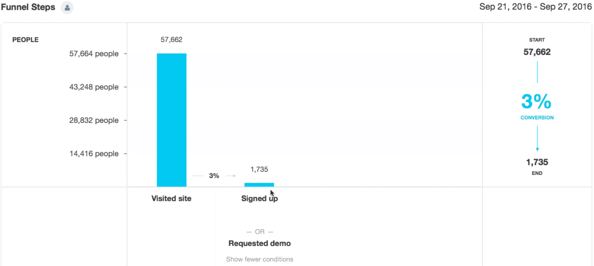
You can click between the two to get individual results, helping you figure out which path, conversion point, or page is most effective at driving your goals.
Like with the mobile example earlier, you can identify the ‘opportunity cost’ associated with one underperforming page against the better one.
Just imagine if you funneled all those wasted visits from the low ‘Request Demo’ to the higher converting ‘Signed Up’ page.
That arms you with powerful insight into how your campaigns line-up against each other, but also which campaign tactics to repeat or improve in the next one.
3. Post ‘Conversion’ Events
So far so good.
We’ve gained better insight into how different marketing channels have contributed to driving conversions in one or two sources.
And we’ve been able to finally prepare and deliver a comprehensive campaign performance report that gives you the ability to compare-and-contrast results against other campaigns (and pinpoint areas of improvement for the next one).
But we still have a problem.
Many times a ‘conversion’ only means a lead. There’s still a TON of stuff that needs to happen before those leads become honest-to-God paying customers.
Which most, unfortunately, won’t.
The objective here is the same, whether we’re talking about good old-fashioned lead nurturing or app onboarding – increase engagement along ‘micro-conversions’ until that person’s ready to sign on the dotted line (or enter their billing info).
These little ‘micro-conversions’ are success milestones; the key interaction points that turn passing interest into devotion.
For example, watching a video.
Videos on a landing page can increase conversion rates by 80%. But the important part, is what happens after people watch a video.
For example, after watching a video:
64% of viewers are more likely to purchase the product
50% of executives look for more information
39% of executives call a vendor
Wanna increase sales? Turn more prospects into customers? Convert more trial-ers into buyers?
Get people to watch that damn video.
GA can show you general video views as an aggregate engagement metric.
But that information is useless if you can’t decipher what those visitor’s lead status is or if your specific prospects are viewing it or not.
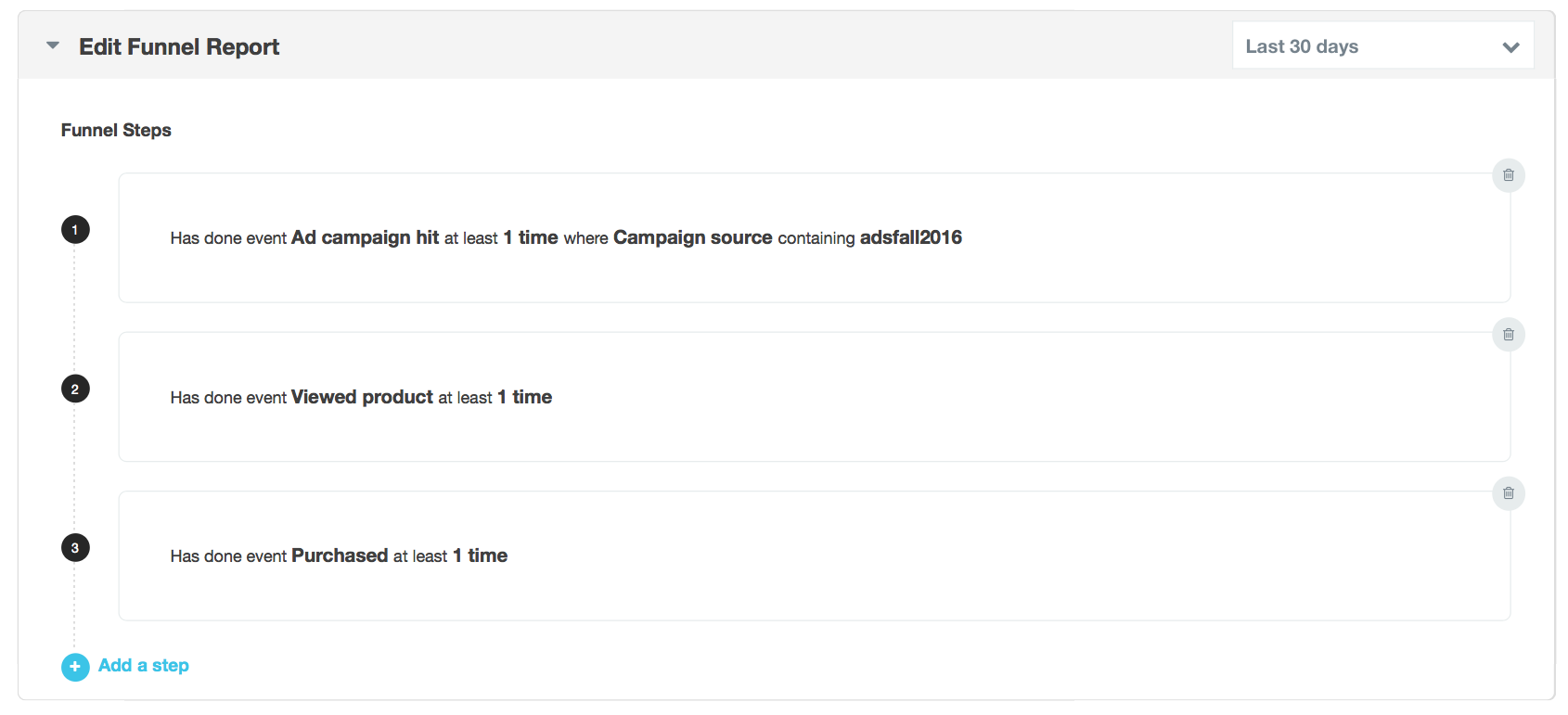
Solve this by creating a Funnel Report and identifying those that HAVE NOT done the specific event you’re looking for:
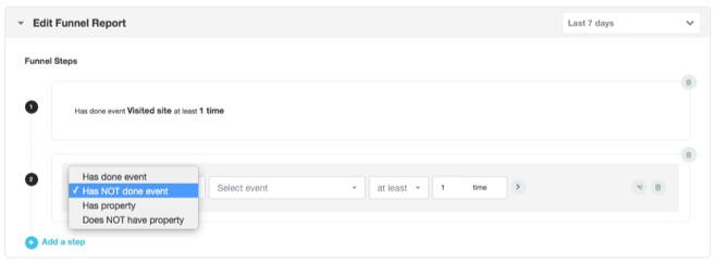
You can also get fancy and add different variables here (like we did in the last step); one for people who DID view, and those that DIDN’T.
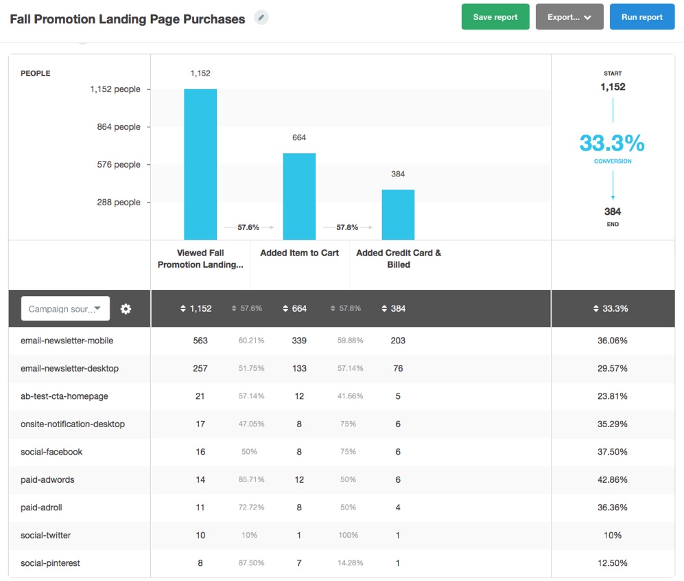
Now you get the cold-hard data:
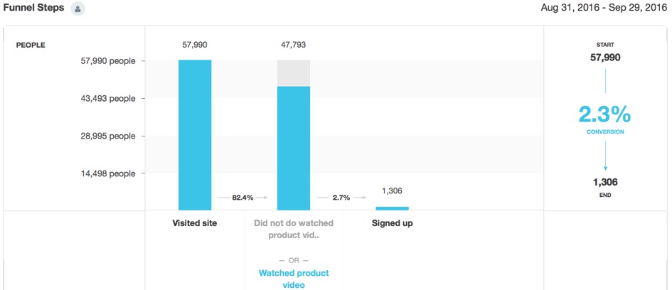
Now you can see (and prove), empirically with your own data, that people who view the video have higher sign-ups.
You can then also add more steps to this funnel to see if there is anything specific causing a bottleneck in your onboarding process, and/or identify whatever-it-is that’s holding back your leads from watching the video in the first place.
We’re using videos as an example in this case. But these variables for your business could be anything that gets people to start taking ownership of the process.
You increase those big numbers (sales revenue) by increasing the number of people completing all the success milestones along the way.
Conclusion
Google Analytics is great.
It gives you access to helpful aggregate data within seconds of opening it up (if you know where to look that is). Also, free.
The problem, is that there are a few places where Google Analytics falls short too. There are gaps where you (as marketer and decision maker) aren’t getting the full picture. And that either leads to stagnation, or bad decisions.
You need something that gives you a detailed view of individuals (and not just sessions). Of campaign performance (and not just individuals channels). And of pre-identified success milestones based on someone’s lifecycle stage as opposed to generic event data.
You don’t need to replace Google Analytics outright.
You just need to augment it with a tool or platform that excels where it doesn’t.
About the Author: Brad Smith is a founding partner at Codeless Interactive, a digital agency specializing in creating personalized customer experiences. Brad’s blog also features more marketing thoughts, opinions and the occasional insight.
4 Surprising Things That Keep Us Motivated

You can’t “hack” motivation. There’s not a quick trick in existence that’s going to motivate you to do something if you just don’t want to do it.
But you can make an effort to understand the psychology behind motivation, and use this to your advantage.
The things that keep us on track towards our goals might surprise you. In this article, we’ll discuss four perspective changes that can help keep you motivated — even when you feel like giving up.
4 Surprising Things That Keep Us Motivated
1) Overcoming a setback.
Despite being one of the seven deadly sins, pride is actually an important factor in staying motivated towards long-term goals. Pride comes in two different forms: There’s hubristic pride (the kind that inflates your ego and gets you into trouble) and authentic pride, which describes those warm, rewarding feelings you get from making progress on meaningful work or accomplishing a hard-won goal.
Jessica Tracy, a psychologist at the University of British Columbia, and author of Take Pride: Why The Deadliest Sin Holds The Secret To Human Success, has extensively studied the effects of authentic pride (i.e., feelings of accomplishment and fulfillment) on human motivation.
In a recent study, Tracy and her colleagues examined the effects of authentic pride on students’ test taking abilities. When students reported feeling a low sense of authentic pride after receiving a poor test score, they were more likely to change their study approach and work to improve their results for next time. Students who did not report feeling a low sense of authentic pride after receiving a poor test score were much less motivated to improve.
In other words, having your ego bruised a little bit will actually motivate you to work harder in the long run. So if you’ve recently suffered from a setback or disappointment at work, channel that energy into changing up your approach and improving your results, rather than pushing those feelings away and ignoring them.
But be wary of taking it too far. Tracy warns that there’s an important distinction between using the absence of pride productively and suffering from a problematic lack of confidence — i.e., shame.
Shame, Tracy explained, is characterized by feelings of uselessness, and thoughts of “I’m not going to try to work hard because it’s just going to end up in failure.” In contrast, feelings of low authentic pride push you to restore feelings of fulfillment and achievement by working harder and more efficiently.
2) Being at peace with distractions.
Embracing distractions instead of fighting through them certainly goes against conventional wisdom about motivation — a quick Google search for “motivation and distraction” reveals a list of articles about “killing” or “eliminating” distractions as a strategy to stay motivated. But resisting all distraction can actually make it more difficult for our brains to stay focused.
Oliver Burkeman, the author of The Antidote: Happiness for People Who Can’t Stand Positive Thinking, believes the typical way of approaching distractions as the enemy of productivity is misguided, and could counterintuitively be causing us to become even more distracted.
Although it’s easy to blame external factors like your chatty coworker or the addictive allure of social media, Burkeman said the real cause of our chronic distraction is an internal urge to fight anything that compromises our autonomy.
In other words, we like to feel in charge, and when we’re told we have to focus on something specific, the idea of fixating on anything but the task at hand becomes irresistibly magnetic.
For example, I recently set aside a block of time on my calendar to get a project I’d been putting off completed once and for all. When the time finally rolled around, all I really wanted to do was mindlessly look at pictures of dogs on Instagram. This was my brain’s way of rebelling against the task at hand, and assuming autonomy by drifting towards a more appealing activity.
“The good news is that when you see distraction for what it really is, you’re much better equipped to fight it,” Burkeman wrote in 99u. “Remember, too, that you don’t need to ‘feel motivated’ in order to do important work. Instead, let yourself feel like you’d rather be doing something else, and at the same time, do the work: Open the laptop, make the phone call, type another sentence.”
3) Strengthening your tolerance for discomfort.
We’ve all been here before: you’re just about to jump into a big project, and the thought of taking those first steps is almost physically painful. All you can focus on is the hardship to come: the effort you’ll have to expend, the hours you’ll have to put in, and how taxing the project will be from start to finish.
Carson Tate, a productivity coach and business consultant, calls this phenomenon intellectual discomfort, and pretty much everyone has experienced it at one time or another. It’s a gut-level aversion to doing any work that requires us to come off autopilot and challenges us on a deeper level.
And to get any meaningful work done, you have to learn to fight through it.
It will be unpleasant at first, but it is possible to train yourself to become more comfortable with the discomfort of intellectually demanding work. Think of it like preparing for a marathon: If you make a training schedule and put in the effort to stick to it, eventually the running gets easier every day. That first day, running a mile might seem tortuous, but in six months, it’ll be a breeze.
To start increasing your tolerance for work that requires your full attention, consider using a structured framework to manage your working hours. One of the most commonly used (and widely discussed) methods is the Pomodoro Technique, which relies on a intervals of work and rest to keep your mind on track without burning out.
When used consistently, structured methods like this can help increase your endurance for intellectually taxing work — and make it easier to prevent those pangs of dread and premature fatigue before the project even kicks off.
4) Stop obsessing about being unmotivated.
The overarching theme in the previous three methods seems to be this: stop beating yourself up about not feeling motivated, and just start working. It sounds counterintuitive — how can you work when you don’t feel like it? — but constantly fixating on how motivated you wish you felt only amplifies your lack of motivation.
Harvard psychologist Daniel Wegner famously demonstrated that attempts to forcibly coerce your own thoughts or emotions overwhelmingly backfires. If you force yourself to get super motivated to start your next big project — but in reality, you’re really not feeling it — you could actually end up feeling more unmotivated than before.
All you accomplished was making yourself feel bad that you weren’t experiencing what you perceived to be the ideal emotional responses: excitement and motivation.
The takeaway? Don’t judge yourself so harshly for feeling unmotivated. It’s perfectly okay, and you can still get things done without being extremely excited about them. So go ahead, give yourself that Twitter break. And then get down to business.
How do you stay motivated when things get tough? Let us know in the comments.
![]()
Upgrading SMS for Rogers customers on Android
Many of us rely on SMS every day — to make plans, confirm an appointment, or stay in touch with friends. But even as smartphones have become more powerful and the apps we use on them more vibrant, SMS hasn’t changed a lot. It’s still just plain text. We believe this standard messaging experience should be better, so through a mobile industry initiative called RCS (Rich Communications Services), we’ve committed to working with carriers and manufacturers to upgrade SMS to a more enhanced messaging experience for people everywhere.
Last month, we announced our first carrier supporting this richer messaging experience. Now we’re bringing RCS to even more people by working with Rogers Communications to launch RCS messaging to their Android customers in Canada.
Rogers customers will have access to enhanced features — including group chat, high-res photo sharing and read receipts — as part of their standard messaging experience on Android. You can access the upgraded messaging experience by downloading the Messenger app for Android devices from the Google Play Store, and the service will be powered by the Jibe RCS cloud. We’re beginning to roll out the enhanced messaging experience today, and it will be available to all Rogers customers soon.
Next year, Rogers intends to preload Messenger as the standard messaging app for new Android devices. We’re excited to provide a better messaging experience to Canadians, and look forward to launching RCS with more partners in the coming months.
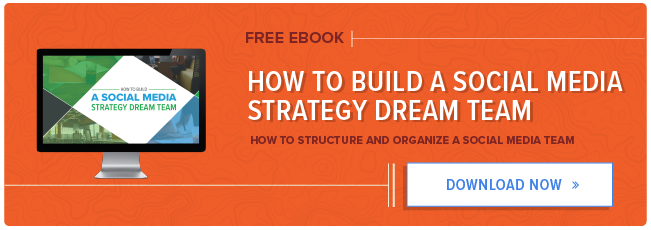
How to Build A Social Media Strategy Dream Team [Free Ebook]

Social media is no longer the new kid on the block when it comes to marketing channels. Today’s most successful B2B and B2C companies have recognized and harnessed its potential as a scalable lead generation tool. It’s also a great growth engine, driving conversions throughout the funnel.
Although the importance of social media seems obvious to modern brands, many are still struggling to make it work. In fact, in certain contexts, social media is the hardest strategy for 38% of SMBs to execute. At the same time, a sound social media strategy has never been more critical to the health of a growing business’s inbound funnel.
Most of the challenges working against these brands come from poor social media team structure and organization. Whether you’ve got a team of one or a bevy of interns working on social, now’s the time to reassess how you build and incentivize your team for ROI and scalability.
That’s where HubSpot and Sprout Social’s new guide, How to Build and Manage a Social Media Team, comes in. Inside, you’ll find tips on:
Structuring your team for social media ROI
Looking for the right skills in a social media hire to complement your team
Shortening the onboarding process by setting up new hires for success
Measuring individual success to ensure your employees have a trajectory of career growth
Preventing burnout with leadership and team-building activities
Click here to download How to Build and Manage a Social Media Team.
![]()
10 of the Best Infographic Examples of 2016

If you ask us, infographics aren’t going anywhere.
This year alone, we’ve covered how essential they are to SEO, and the numerous resources available to create beautiful infographics of your own.
And yes — when it comes to infographics, we do like to play favorites.
That’s why we went scoured the web for some of the best infographics of 2016. Their topics are vast and their formats are many, but this year, we truly saw some excellent examples of informative design. 
Have a look and let these examples inspire you. Who knows — with all of those resources and a new year around the corner, they might help you create of the best infographics of 2017.
10 of the Best Infographic Examples of 2016
1) Music and Productivity, by WebpageFX
Music is known to enhance many situations. It livens up a party, gets us through a brutal workout, and can make a long commute seem quicker. But did you know that it can also make you more productive? WebpageFX collected these science-backed reasons why music can help you get your work done, and worked them into an infographic that delights us.
This infographic does a nice job of balancing two different color sets — a best practice, according to Marketing Consultant Brian Downard’s infographic design playbook. Downard encourages the use of soft, subtle colors in the background, with pops of color in the foreground to highlight important elements. As you can see below, this approach results in a really clean design.
Beyond the color palette, the folks at WebpageFX did a nice job of following through with the theme, with various musical notes and other symbols that represent a melodic sound. Speaking of symbols, take note of how they used the image of the brain to break down how music stimulates and activates specific sections.

2) “15 Terrifying Statistics On Your Cellphone Addiction” by Trustmypaper
There’s so much information out there about the drawbacks of overusing our mobile devices. They make us lose sleep. They facilitate email addiction. But very rarely, it seems, can we find all of this information in one place — until now.
Trustmypaper created this infographic, which packs 15 eye-opening statistics in a condensed yet engaging format. Plus, the accompanying images help us to process exactly what each number conveys, and reinforces the danger of each fact.
As for the font, it’s more than legible, but isn’t so big that it doesn’t fit in with the overall design scheme. According to a Kissmetrics article from Henneke Duistermaat and Neo Mammalian Studios, poor font choice is one of 19 infographic red flags, and while it may seem obvious, you’d be surprised how many brands just don’t get it right.

3) “Vacations Are a Must” Quill
We are definitely preachers of vacation — how to relax when you’re there, how to catch up on email when you’re back, and how many of us feel too guilty to take one. But it’s a must — and this infographic explains why.
From the good, to the bad, to the ugly, Quill makes great use of imagery here. The infographic uses a generally bright color palette, to reflect the lightness of vacation. The “happier” images incorporate the benefits, too. But when it comes to the negative impacts of not taking time off, the pictures don’t hide them — even if it’s a cartoon, we can sense the annoyance of the characters that work or receive a call from the office during their time away.

4) “How to Leave Your Worries Behind,” by Happify
Some of us have a tendency to chronically expect the worst. (Cough — guilty.) But chronically worrying isn’t good for you — from heart disease to memory loss, all of that stress can take a toll on one’s health.
So how do we knock that off? It turns out that there are some fairly simple, science-backed steps to decreasing our anxiety and worry, which Happify has organized into an easy-to-follow infographic. It even has a delightfully helpfully step on figuring out when and how to let go of our negative thoughts, and when they (rarely) deserve merit.
Not to mention, we love the design, especially the combination of bold colors and white space. This infographic manages to work in a vast palette, without seeming to be all over the place with its design scheme — but its brightness reflects the overall theme of happiness.

5) “The 2016 #GivingTuesday Infographic,” by Classy
When it comes to color, sometimes less is more. In fact, according to an analysis of over 200+ infographics on Pinterest, Venngage found that infographics with only two colors earned the highest number of Pins and Likes. While Classy snuck in a few highlights into this infographic on #GivingTuesday, the primary color scheme is a festive red and green combination — which aligns perfectly with the “Home Alone” theme.
Speaking of the “Home Alone” theme, the designer of this infographic did an amazing job incorporating subtle, nostalgia-inducing nods to the classic movie — from the tar-covered staircase to the silly microcopy on the VHS tape. According to Psychology Today, nostalgia memories are social in nature and have the power to inspire social behavior, making this infographic inevitably more sharable.

6) “The Female Entrepreneur: Women Who Run Their World,” by USC Marshall
Female entrepreneurs are taking the world by storm. In fact, among Generation Y entrepreneurs, women are more successful than men. But what makes them so successful? And how are they improving the business landscape as a whole? This infographic from USC Marshall outlines those positive points, from job creation to career growth.
The infographic also includes other fun facts about female entrepreneurship, like the geographic regions where it’s most concentrated, and other tidbits on revenue and valuation. It look a somewhat difficult-to-broach topic around which there’s a lot of conflicting information, and incorporated the facts into a well-designed visual.
It has consistent style and lighting, and we love infographics than can seamlessly incorporate a map. Being able to share geographic statistics in visual way is key — and, it helps people digest a big chunk of data. But our favorite part has to be the use of pictogram charts — where each icon represents a specific value — to make it easier for the viewer to visual the data. Pictogram charts can help you achieve a more representational view of your data, and even overcome differences in language, culture, or education, according to The Data Visualization Catalogue.

7) “How to Avoid a Hangover” by Fix
As you might be aware, there’s a new year around the corner. With that comes New Year’s Eve, which brings a lot of partying. In other words, January 1st might be known as the most hungover day of the year.
Knowing that, Fix provided yet another helpful infographic that breaks down all things hangover. We’re delighted by the design of this visual. It incorporates a ton of helpful information, ranging from what a hangover really is, to how to prevent them, to how to cure them the next day. And the images? We don’t know about you, but we’re craving a full English breakfast.
What we really like about this infographic is the ability to condense important details that, were they in the format of a full article, may not have been as easy to process. We’ll drink to that.

8) “Typography And Font Deconstruction” by The Logo Company
When it comes to design and text, there are two things we know to be certain:
Comic Sans is bad.
We have to be able to read it.
As for the rest, it seems like learning typography is like learning a second language for many marketers. It has to be on brand, it has to be legible, and what the heck is a ligature?
The Logo Company took some fundamental pieces of the typography vocabulary and compiled it into this well-designed infographic. Following its own advice, the text is perfect. It’s readable, but considering there aren’t a ton of pictures in there, it doesn’t leave us feeling overwhelmed by text. At the same time, each vocabulary word has a clever visual representation next to the written definition, which helps to keep the image from looking too text-heavy.
![]()
9) “Why a Website Redesign Doesn’t Always Work,” by VWO
Sometimes, a website redesign is necessary. User preferences change, as do brands themselves — that should be reflected in your public-facing content. But are you going about it the right way?
According to this infographic from VWO, many marketers aren’t. And while we don’t love the errors of website redesign outlined in this visual, we do like the way they’re represented. It’s thematic — there’s a recurring use of contrasting red and green, for example, to symbolize the necessary A/B testing that, evidently, 57% of website redesign projects lack. Plus, we enjoy how literal the imagery is, without going over the top. A burger represents “food for thought,” and a brain accompanies the statistic on psychological factors in design.

10) “12 Classic Sauces and How To Make Them” by Quid Corner
When the holidays roll around, one of our favorite parts is the food. And what enhances any dish — besides wine? An accompanying sauce, of course.
So when Quid Corner combined two of our greatest loves — food and infographics — we were thrilled. It’s not often that actual photos appear on infographics, but when they do, it can be tricky to pull off. The lighting has to be just right, and the coloring has to match the overall design scheme of the infographic at large. This infographic manages to pull that off, by using a backdrop that’s ample in white space, and a specific color theme according to each recipe — red for tomato and green for parsley, for example. Is anyone else feeling hungry?

Let’s Get Visual
Okay, so maybe we have a thing for infographics. But it’s easy to see why — they’re such a concise, comprehensive device for conveying detailed statistics and facts in a visual way that makes them easy to follow.
So as you plan your marketing for 2017, don’t leave out the visuals — and certainly don’t leave the infographics behind. Need some help creating your own? Be sure to check out these free, pre-made Infographic templates.
What were some of your favorite infographics of 2016? Let us know in the comments.


![]()