
Grain Valley School District’s new approach to 21st-century education
Editor’s note: As part of the ExploreEDU event series, schools are working with Google for Education Premier Partners to throw open their doors and invite neighboring educators to learn first-hand from their own experiences using Google tools to innovate and improve. To see if there is an event near you, visit the ExploreEDU site. For those who can’t join in person, we’ll also share the schools’ experiences here. Today’s guest author is Nicholas Gooch, Director of Technology, from Grain Valley School District. The school is hosting an event on Dec. 15-16 with Best Buy.
It’s daunting to realize that many of us are preparing students for jobs that don’t yet exist and a world we can’t quite imagine. At Grain Valley School District, we’ve designed our schools to prepare students for the future workplace. We’ve created our curriculum to emphasize communication and creativity. We’ve done away with the traditional 100-point grading system to instead focus on helping students master their subjects. We’ve even started the process of redesigning our high school campus to create dedicated spaces for group and individual learning.
We see technology as critical to helping students master the skills they’ll need in the 21st-century workplace. We began integrating technology into everyday learning by launching G Suite for Education at our high school, two middle schools and four elementary schools during the 2014-15 school year. Last year our high school became the first of our schools to go 1:1 with Chromebooks. Each of our 1,250 high school students has access to a Chromebook that they can use in class and at home. With the help of technology and the support of our innovative teaching staff, here are a few ways we changed how we educate to better prepare students for the future:
Fostering teacher leadership and innovation
To empower our teachers to push the envelope and take more risks with technology in the classroom, we created Breakthrough Learning cohorts. The cohorts are made up of elementary and secondary teachers who applied for the program. One day each month, these teachers work with our instructional technology coaches to learn the best practices for integrating technology into their curriculum. These sessions go beyond typical “how-to” sessions and instead focus on helping teachers make learning, assessment, and digital citizenship a seamless component of the classroom. Not only does the program develop this capacity in our own teachers, it allows them to do the same for their fellow teachers.

High school students using TV screens to collaborate on shared assignment.
Emphasizing subject-mastery over grades
In 2006, school and district leadership reexamined the 100-point grading system. They decided to try a new approach — helping students achieve subject mastery rather than measuring them on a graded scale. Standards-based grading and feedback practices have been fully integrated at the high school since the 2013-2014 school year. Today, we personalize each student’s learning program. Google Classroom has also helped us emphasize the learning process rather than a final grade. Teachers can easily give feedback on an assignment, even before a student has turned it in.
Building for collaboration
The new architecture for our high school is designed to make it easier for students to study together outside of class. We’re creating communal spaces with whiteboard walls and TV screens. Students can use these TV screens to visualize projects they’re working on together — for instance, a presentation they’ve made in Google Slides. We’re also providing WiFi access and ample charging stations for laptops and mobile devices across the campus. Over the next few years we hope to introduce similar changes to other schools in the district.
We’re excited to be hosting an ExploreEDU event on December 15-16. If you’re in the area, join us to hear more about how we redesigned our approach to teaching and learning for the 21st century, supported by technology and an openness to change.
7 Laws of Sales Funnel Physics Every SaaS Business Needs to Know

Back in college, I visited to this run-down pizzeria shop called Sammi’s.
Their logo had a picture of a pyramid on it. No one understood what that had to do with pizza.
I pitched Sammi repeatedly on my startup’s text message coupon product at the time. He never bought.
But I’ll never forget the time I saw him hand a $200 check to some kid selling an ad from a local magazine like it was nothing.
Two-hundred bucks looks like a lot of money when you’re a nineteen-year-old college kid. And especially when all your customers are on a free trial.
What caused Sammi to buy a print ad but not what I was offering?
The education you need to become an effective marketer is just a lot of little experiences like that.
Those experiences are like “flicks” to your forehead.
They are the market saying, “Pay attention!” as it tries to teach you something.
In the years since that time at Sammi’s, I’ve started and launched a SaaS business. Today I run a growing subscription-based service business. So far, my team and I have created hundreds of sales funnels for startups and small businesses. I also had the opportunity to lead a Mastermind group for entrepreneurs starting SaaS companies.
From this wide mix of experiences, I’ve been able to observe several success patterns. These success patterns are relevant to every business marketing itself online—but especially SaaS companies.
I’m telling you this, because what I’m about to share with you is not just theory.
This is about people. It’s about the people who are stuck in your sales funnel. It’s about the people who haven’t heard about your product yet. And it’s about the people who are your competitors.
While people may not always behave in a predictable manner, they are influenced by the Laws of Sales Funnel Physics.
Let’s jump in.
Note: At 6,300 words, I don’t expect you will read this all in one sitting. So I created a free PDF of this resource that you can refer to again and again when it’s time to redesign your site.
Law of Visibility
Law of Big Changes
Law of Repetition
Law of Clarity
Law of Proof
Law of Friction
Law of Alignment
First Law of Sales Funnel Physics: Law of Visibility
What is it?
Imagine two different scenarios.
Scenario A—Relaxing on the beach on a hot summer day with no sunscreen.
Scenario B—Relaxing on the beach on a hot summer day when your doctor shows up to tell you you’re at risk of getting skin cancer.
In scenario B, you’re going to react right away. You’re on the beach without sunscreen, and the doctor has given you urgent information on why you should wear sunblock.
If putting on sunscreen became your “conversion goal” after the need was recognized, B outperforms A, because the offer is right in your face.
That’s why the first law of Funnel Physics is the Law of Visibility. In other words, people will convert on offers that are highly visible and noticeable to them.
If they don’t see it, they won’t convert.
So it all comes down to something being seen.
Now, how can we apply this to your marketing funnel?
Example:

Andrew Warner and his team at Mixergy rolled out a new site design a little while ago.
One thing that stood out to me was the prominent call-to-action button in the top right corner.
It’s visible on every page of the website.
This is an excellent example of the Law of Visibility in action. By featuring a highly visible call to action (CTA) for your core offer across your website, conversions are almost guaranteed to increase.
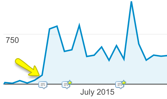
In fact, we did the same thing on our website:

We wanted more people across our website to see and learn about our productized service. You can see below how this change had a sustained impact on how many people viewed our homepage.
But this is just one example.
How to Apply it to Your Marketing Funnel
Let’s brainstorm for a second.
Where can you put in place a simple change like this on your website to cause more traffic to flow deeper into your funnel?
Think in terms of “global” or structural changes that will be seen across many pages on your website.
Here a few ideas off-hand:
Navigational changes like the example above
Redesign or add a CTA to your footer
Install an exit pop-up
Promote a lead magnet in the sidebar of your blog, as well as at the end of every blog post
Run a new campaign using Kissmetrics Engage that targets only visitors with a specific offer
Those would be the top ones to implement, especially if your SaaS business is trying to grow via content marketing.
The Bottom Line
Offers—free or paid—that aren’t seen, don’t convert. So shine some light on them!
Second Law of Sales Funnel Physics: Law of Big Changes
What is it?
Imagine you’re an engineer building a cross-country railroad.
But there’s a problem: a stretch of mountains lies in-between the train’s start and end points.
You have two options: you can lay the track so it snakes around the mountainside, or you can use explosives and heavy drills to create a tunnel that goes straight through.
Which do you choose?
Consider that the universe is (mostly) rational. By this, I mean there is cause and effect.
Nothing happens unless something causes it.
If you want to cause growth in how your sales funnel converts, you have to make a significant change to your sales funnel—the copy, the structure, the design.
Whatever big result you are looking to produce, be prepared for the change to be significant from the customer’s standpoint.
That last part is important, because you are trying to influence your target customer, and changes that seem significant to you may not be that different from their point of view.
Sometimes the difference is hard to understand.
In the mountain scenario, the decision becomes easier if we view it as a customer optimization problem.
We could ask – what does a passenger on the train line want?
Do they care about seeing the beautiful snow-capped mountain scenery while on their cross-country journey?
Do they care more about getting to their destination faster?
There is a big difference between drilling a tunnel and snaking around the mountain. But if you know your customers value a shorter trip, the tunnel would be the better choice.
If they care more about speed, then the answer to the problem is to drill a tunnel through the mountain.
Lucky for you, you’re laying down code on your website, not train tracks.
Example:
Demo Consultation vs. Instant Video Demo
This is a good one, especially if closing the sale means getting on a phone call.
The example below is from a case study where a consulting company A/B tested a “Free 5-Min Demo Video” offer in place of an offer to schedule a demo consultation.


The results were powerful.
By changing the offer to a demo video instead of a scheduled demo, the conversion rate went from 1.7% to 15.3%—a 9X increase. The offer of the free demo won in a landslide.
Although nothing on the page changed except the text describing the offer, this mattered a lot from the customer’s perspective.
Why? Most people aren’t enthusiastic about scheduling a demo or a consultation because it requires them to (1) wait, (2) coordinate their schedule, and (3) commit a fixed amount of time.
The “free 5 min demo” offer converts much better, because customers can watch it right away without a phone call.
Side note: We recently tested this same idea of a free demo offer on our pricing page vs. scheduling a consultation. The data is still coming in, but lead conversions are up significantly.
This example illustrates that structural changes are most important when you are thinking about “big changes.” Structural changes include a difference in the number of steps or the offer itself.
This is different from merely changing design or copy, because it represents a more significant change to the customer’s experience in your funnel.
As a result, the change is more drastic and so are the results.
Freemium vs. Free Trial
When I started my first SaaS business, we offered a free trial.
Later, we removed it and went from generating weekly sign-ups to zero (bad move, duh).
A better example here is MailChimp. After building a profitable business with 100,000 users, they went freemium in 2009 offering free email marketing accounts to 500 subscribers.
One year later, they reported a revenue increase of over 150%.
How to Apply it to Your Marketing Funnel
If you’re not converting or you see a big bottleneck in your online sales funnel, start with a BIG change.
Go big or go home! If you’re only seeing a “trickle” of people moving from one step to the next, the issue is probably bigger than simply, “Oh, let’s test a different headline,” or “Oh, let’s change the button color to yellow.”
The Bottom Line
The results may be positive or negative. The important thing here is that you won’t really know which version is more effective unless the spread is statistically significant.
When creating an A/B test or a sequence test to improve your conversion rate, go for big changes. Little changes (usually, but not always) yield a proportionally smaller result.
So blow a hole in the mountain.
Challenge your assumptions.
And take a walk in your customer’s shoes.
Big changes mean big growth for your bottom line.
Third Law of Sales Funnel Physics: Law of Repetition
What is it?</h3
You’ve probably heard some guru say that people don’t remember a brand name until the 7th time they’ve heard it.
This is not that.
The Law of Repetition says that following up multiple times (via email automations, retargeting ads, or call-to-action buttons on your website) will cause more conversions within your funnel.
Yes, you could say that this law is saying, “beat your prospect over the head with your offer enough times, and you’ll get more sales.”
That’s true, and it’s why spammers use this technique.
But I am not advocating for that. Rather, I am giving you this universal pattern with the hope that you will use it responsibly.
Let’s look at a few examples.
Examples:
The Law of Repetition is about repeated messaging and consistent follow-up.
This happens when you are presented with multiple lead magnets asking for your email address.
For instance, Clay Collins and co. over at Leadpages have repeatedly pointed out that each of their blog pages have multiple offers and CTAs. This, in turn, has helped them quickly build an email list of 200,000+ email subscribers.
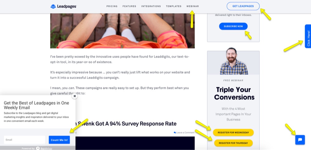
I applied and refined this technique on my company’s website in 2014 and later wrote about the results in a guest post on Leadpages. I gave the method a name—“The Every Page Rule.”
The Law is always in effect when you implement email follow-up sequences or retargeting ads.
In 2013, I tried my hand at launching an info product. The email sequence I wrote was “OK” so I rewrote it and kept iterating.
The final sequence was aggressive with the follow-up, but the truth is that it worked. People bought the course at a very consistent rate.
Noah Kagan later reminded me of this principle when he published some research from people using his SumoMe tool to help people build their email lists faster.
The research showed that people were more likely to opt-in if they were repeatedly shown the pop-up on a website until they signed up.
Again, not saying that’s the best way to do it. In fact, I would say being too aggressive makes you look not cool.
Want another example? Look at the Kissmetrics funnel. If you sign-up for a free trial or opt-in to one of their lead magnets and request a demo, you are instantly entered into a follow-up sequence where an Account Manager will contact you to schedule a demo.
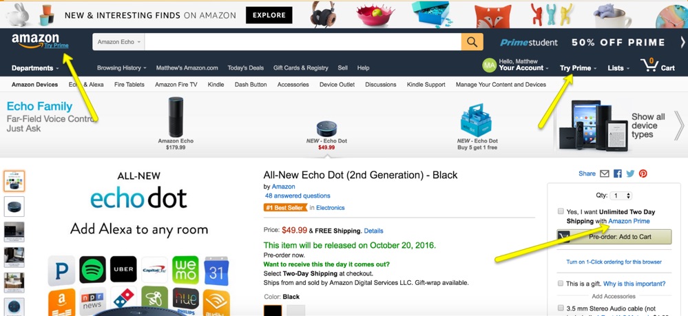
And here’s one more from a little-known multi-billion dollar company called Amazon.
Ever heard of Prime?
Prime is a premium subscription that gives Amazon customers perks like free 2-day shipping and access to streaming movies.
The Amazon website is covered with call-to-action buttons for Prime, and 54 million customers have opted into this service as a result.
How to Apply it to Your Marketing Funnel
If you’re a SaaS business, you can apply the Law of Repetition in a variety of ways to your own sales funnel.
Here are the best ideas, in order of priority:
On-site CTAs that are clear and relevant to the stage of the funnel the prospect is in.
Follow up with potential customers using email automation to get them on the phone, get their feedback, or nudge them toward signing up.
Show an ad or link in your blog’s sidebar or navigation, along with an exit pop-up, to promote your lead magnet and grow your email list.
Get more return traffic with retargeting ads. Make sure to segment visitors based on where they are in your funnel. For instance, you may want to treat people who reached your checkout page differently from those who signed up for your free 5-day e-course.
Finally, you can get more advanced using a combination of tactics (Think: Amazon + Smart Funnels). For instance, after a customer checks out, you can upsell him/her on the benefits of the next-level pricing package. Similarly, when he/she comes back to the website later on, he/she will see CTAs on the blog nudging him/her and offering benefits for upgrading. This can also be done over a course of weeks or months via automated email follow-up to anyone who has purchased.
The Bottom Line
Repetition yields higher conversion rates and can also increase the value of an average customer to your business.
Don’t let leads forget about you and your services—constantly remind them of what you offer and how it can benefit them.
Just be sure not to overdo it, or you risk hurting your brand.
Fourth Law of Sales Funnel Physics: Law of Clarity
What is it?
“Better to be clear than clever.”
When I was a little kid, I’d go to the doctor at least once a year for my checkup.
I remember the waiting rooms were always gray and super boring.
So I’d pick up one of the outdated magazines they had laying around and flip through it.
I found most of the ads weird and frustrating, because I couldn’t tell what they were trying to sell.
Did they want to make money, or just confuse people? It was unclear to me.
Turns out, I was on to something.
Fast forward years later to the first time I heard the expression, “Better to be clear than clever” from Dane Maxwell, a serial entrepreneur, while he was being interviewed by Andrew Warner from Mixergy.com.
This expression highlights the biggest reason why most sites don’t convert well in the first place: people don’t buy what they don’t understand.
Many people make the mistake of focusing on creating a catchy headline, instead of focusing first on customers’ understanding by creating effective copy for their sales funnel.
Consider a few examples.
Examples:
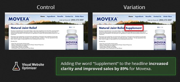
The following case study documented on Visual Website Optimizer’s blog illustrates how clear copy converts.
Movexa is a supplement product with a direct response website funnel. In other words, they are looking to make sales directly to people visiting their site.
In an A/B test where they clarified what the product was by adding the word “supplement” in the headline, sales increased by nearly 90%!
Here’s another example from a company selling personal training subscriptions.
As cited by Unbounce, the company A/B tested a clearer “boring” and uncreative headline against the original.
The result? 38.46% more training memberships were sold.
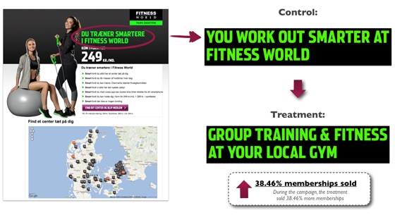
Michael Aagaard, the author of the case study reflected after the fact:
“I have yet to see a creative headline beat a clear headline in an A/B test.”
Clarity over cleverness, indeed.
Further, research has consistently confirmed that website users prefer copy that is “simple and direct.” Here are a few key nuggets from the research conducted by the Nielsen Norman Group:
“Users often leave web pages in 10–20 seconds, but pages with a clear value proposition can hold people’s attention for much longer.”
Users will often have multiple windows or tabs open and leave and come back to your site within a single session. When this happens, having clear straightforward copy helps the reader to re-establish context.
Of the first three items a user focused on, almost 80% was on text, not graphics.
Reduce use of wording that could be seen as marketese (i.e. clever copy or slogans) in order to build trust.
How to Apply it to Your Marketing Funnel
Of course, you could jump right into A/B testing.
But this wouldn’t be much better than taking a wild guess.
You’ll be more likely to see growth if the changes you make are inspired by feedback from prospective customers. You want to hear from users currently “stuck” in your funnel who are actively considering your product.
You want to hear the questions they have, ask them open-ended questions, and hear how they react to your website’s current copy.
Here are the two best ways to do that:
User feedback survey tools can be set to automatically ask visitors leaving the site a question. Survicate is a free tool that works well for this purpose. HotJar is also a very solid option with lots of additional features, which now has a free plan for basic use as well.
Order a user test where complete strangers will test your website. It’s ideal if you have people in your target market test the site, but when it comes to knowing if your website communicates clearly, feedback from strangers can provide a just as actionable insight. I recommend browsing Fivver for user testing services or check out UserInput.io (this one gives you more options for targeting).
After you have some actionable feedback (make sure you get enough so you notice patterns), it’s time to test.
If you have less than 10,000 visits per month, it could take a while to reach a high level of statistical significance for your A/B test. It might not even be worth a/b testing.
In that case, you might just want to do a sequence test (“before and after”). With this test, you can see an impact on your bottom line in as little as a month with a reasonable degree of certainty. Just make sure you are accurately tracking results before and after, while also tracking conversions that matter, like leads and sales.
For example, at Petovera we saw 25% MRR growth from June to July after we re-launched our new homepage, pricing page, and free email course.
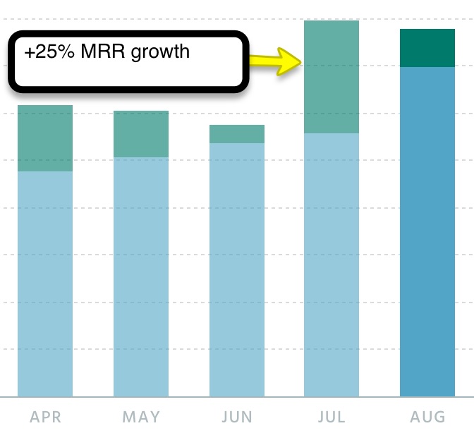
The sales results from this test were so significant compared to other months. When considered with the fact that no other major component changed on the site, the only conclusion we can draw is that the changes caused this growth.
Note: This example highlights both the application of the Law of Clarity (we did research on our target audience’s needs and questions before rewriting the copy for greater clarity), as well as the Law of Big Changes covered above (copy completely revamped along with the design).
The Bottom Line
The words you use to communicate about your product matter more than design.
Site visitors need to trust you; providing them with a clear understanding of the product’s value and how it works is a critical lever for growth in your sales funnel.
Fifth Law of Sales Funnel Physics: Law of Proof
What is it?
People buy what other people buy. That’s because we seek to minimize the risk of potential loss by relying on what other people are saying.
We are programmed to be loss-averse creatures.
Don’t believe me?
Watch yourself the next time you are picking out a movie on Netflix or browsing for a new book on Amazon.
Personally, I won’t buy a new book without at least 250 reviews and an average rating of 4 stars or higher. Even 4 stars are “iffy.”
I use the same risk minimization when it’s time to kick back and enjoy a new movie on the weekends. Less than 4.5 stars? That’s a no-go.
Your habit for loss aversion might be slightly different. Maybe you read individual reviews.
The point is, your customers operate the same exact way when they enter your sales funnel and become interested in your product.
The Law of Proof says that people are more likely to invest time and money in that which they see as low risk and likely to give them the result they desire.
Proof (or “social proof”) can come in a wide variety of forms:
Testimonials
Reviews
Case studies
Examples of past work (e.g. from a designer’s portfolio)
Vanity stats (e.g. “over 10,000 happy customers serviced since 2010”)
Customer logos
Press logos
Networking groups
Third party accreditations (e.g. certified Google AdWords Partner)
Other than making your business look legit, social proof elements will increase conversions in your funnel.
Example:
WikiJob, a website with over 500,000 monthly visitors ran an A/B test on their homepage.
The one thing they changed? A simple testimonials section was added. Here’s what it looked like.
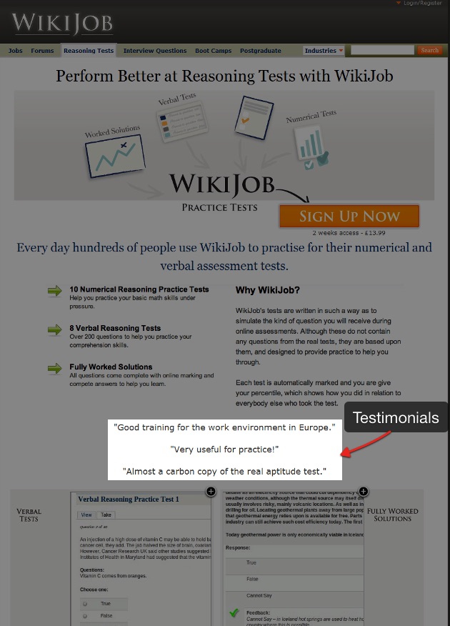
The result?
Here’s the response from the company owner:
[Adding the] testimonials increased sales by 34%. The testimonials we used are very ‘sober’ (compared with the overly enthusiastic ones you so often see in marketing literature). The test results were surprising. Although such increases of sales can be quite normal in split testing, I did not think that testimonials would make such a difference (and indeed put off testing them, thinking they were irrelevant). The increase in revenue was very substantial.
Social proof can make a huge impact because it influences how trustworthy people perceive your brand to be. It lowers perceived risk.
Research from Nielsen showed that 70% of people trust recommendations from people they don’t even know. That’s compared to 90% of people trusting recommendations from people they do know.
How to Apply it to Your Marketing Funnel
Test adding social proof on key landing pages.
Generally, it’s a pretty safe bet ASSUMING you have taken into account the context and the user’s intentions for that POINT in your funnel.
Here’s what I mean:
Derek Halpern documented a case where adding social proof did not grow conversions. See graphic below where the middle version won.
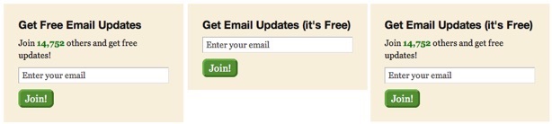
However, this is actually an example of the Law of Friction (discussed below) vs. The Law of Proof and NOT an argument against the effectiveness of social proof in general.
The middle example simply requires less “mental load” to understand. It could be as simple as the fact that the number “14,752” is difficult to read and the middle variation is visually more attractive because it is simpler.
Similarly, last year we A/B tested a lead box for our newsletter in the sidebar of our blog.

Here are the results:
The one without the social proof won by a large margin.
Here’s one more case study to drive home the importance of understanding context and user expectations when considering where to integrate it in your funnel.
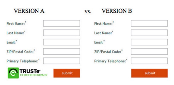
Security seals—also a common example of social proof—build trust, right?
Well, it didn’t work as one might have expected when tested on this lead generation form.
Version B increased conversions by 12.6%. In this case it didn’t work out, because security seals are associated with online checkout. As a result, users were confused or put-off by it.
The Bottom Line
Social proof is a key point of leverage when optimizing your sales funnel.
However, you’ll need to A/B test to know for sure. If your traffic is too low for A/B testing to be a realistic option, do a sequence test after taking into account user context and intentions.
Sixth Law of Sales Funnel Physics: Law of Friction
What is it?
Since I began my career as a web-based entrepreneur at 19, I’ve done many A/B tests and been part of many research-based website design projects.
I’ve spoken with hundreds of business owners about their conversion issues since that time.
I’m always learning, but I can say from experience that this issue is one of empathizing with the end user who is on your website.
That’s what it comes down to because people on your website have goals.
Often the business owner doesn’t know the potential customer’s goals or how their website is “blocking” these customers from buying.
This is what is meant by friction. When friction is minimized—and a user’s goals are made easier to accomplish—conversions go up.
Let’s look at a few examples that support this principle.
Examples:
An online retailer was able to increase annual revenues by $300 million by changing a button.
In a now-famous case study, Expedia was able to increase profit (not sales) by $12 million by removing a single text field from their checkout form.
And Barack Obama’s re-election campaign was successful in part because of rigorous A/B testing that minimized friction and in turn grew donations by 49% and sign-ups by more than 161%.
Let’s walk through each case briefly.
Kyle Rush was on the optimization team for President Obama’s re-election campaign.
They conducted numerous tests, and in his own words, Kyle explained how much he was able to learn due to the high traffic the site received.
This made A/B testing different designs and copy ideas easier, because they only had to wait days or even hours for results.
Here’s the law of friction at work in one of their tests.
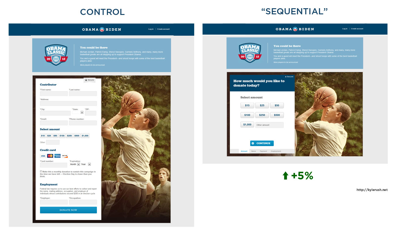
In the variation they tested on the right, the idea was, “maybe we can convert more people to make a donation if we make the donation process appear easier by breaking it into steps.”
The result was a net increase of 5% in donations. It might not sound like a lot, but over the course of a campaign and raising many millions of dollars, it is.
Jared Pool observed the Law of Friction at work for a major online retailer. He saw that 160,000 people per day were requesting a password reset on their account prior to checkout, and 75% of these people ended up not completing their purchase.
The issue was people would go to check out and be confronted with a simple but supremely annoying form that asked them to register in order to check out.
As one user who tested the site for Jared said:
“I’m not here to enter into a relationship. I just want to buy something.”
The solution? They replaced the Register button with a Continue button and added a note:
“You do not need to create an account to make purchases on our site. Simply click Continue to proceed to checkout. To make your future purchases even faster, you can create an account during checkout.”
The result? $15 million in new sales in the first month and +$300 million in additional sales for the first year.
Finally, the case of Expedia:
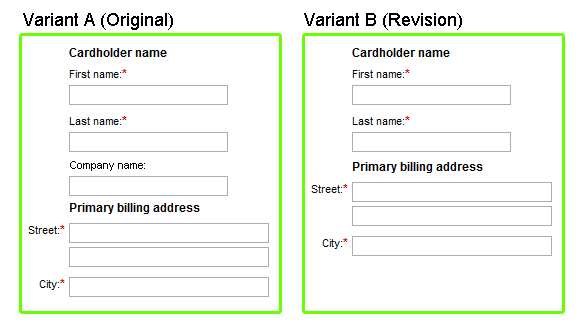
Simply by removing the “Company name” field, profit (not sales) grew by $12 million per year.
Of course the question is, why?
Well, the field simply confused users and set the wrong expectation. For instance, some thought that company name meant the name of their bank, which would cause them to put in the wrong billing address and then the payment would fail. This, in turn, killed sales.
The user interface was causing friction in this case.
Or, as Jon Correll from Conversion VooDoo put it,
“Conversion rate optimization gains are often just a function of getting your broken UI the $!@$!@ out of the way of your end user.”
How to Apply it to Your Marketing Funnel
Start by understanding where the bottlenecks are in your sales funnel.
Where are people dropping off? Look for outlier numbers.
For instance, a couple of months ago I saw that 60% of people clicked through from our homepage to our pricing page, but then only 7% made it to the checkout or consultation pages.
Numbers like this serve as a compass because they point you toward what should be worked on.
Next, as I discussed in Law of Clarity above, you want to gather lots of feedback from users.
You can have strangers test it, or you can talk directly to existing users of your site.
Both have worked in my experience. However, getting at least 10–15 people from your list of existing users will yield more accurate results.
If you’re doing it over the phone, establish rapport first, then ask open-ended questions and listen.
Maintain detailed notes as you go through this process. Look for patterns, but NEVER guide or do anything to influence the answers.
Again, you are gathering this feedback, because without this data, you will not gain a clear understanding of what is blocking sales on your site.
Once you have identified a pattern—perhaps a recurring type of complaint directly related to the bottleneck in your funnel—then you can start testing possible solutions.
Don’t expect an immediate $300 million change in your business overnight, like in the example above.
But also don’t underestimate the impact you can have with small, deliberate changes that work to address the source of friction in your funnel.
The Bottom Line
Friction is caused by design or copy that is not fully optimized to help people entering your funnel accomplish their goal. This matters whether their goal is buying from you or efficiently learning what you have to offer.
Seventh Law of Sales Funnel Physics: Law of Alignment
What is it?
Johnny rides a red bike.
He arrives at your imaginary bike store.
You try to sell Johnny a new set of tires, but he declines.
Why did Johnny not buy? Because the offer wasn’t aligned with his needs.
The difference between alignment and friction is that friction comes after alignment in the buying process.
Alignment deals with helping customers to identify the need your product can address.
Friction deals with the interactive experience of buying and how easy or difficult it is.
Alignment deals with the customer’s intentions, questions, or context (like what previous website or page the customer came from).
Get it? Got it. Good!
Examples:
Here’s an intriguing case study to demonstrate the Law of Alignment in action.
An SEO link-building company called The HOTH originally relied on a fairly straightforward homepage to generate leads for its service.
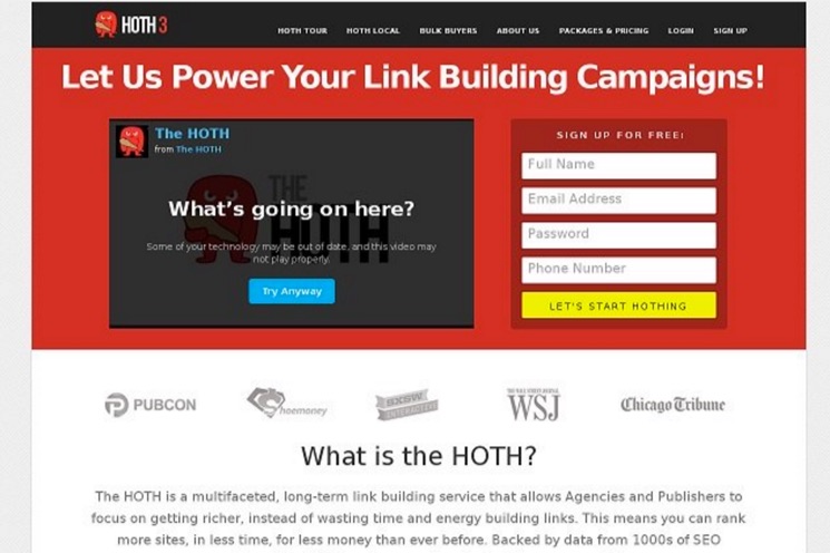
Leads were converting on the page at 1.39%.
Ok, not terrible.
So they tested the page against a minimalistic design.
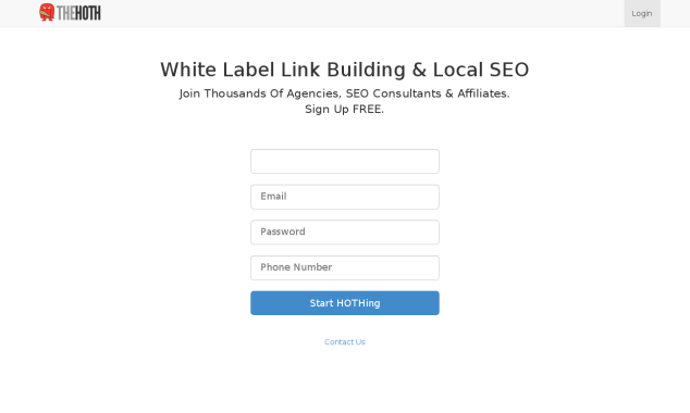
The results? 13.13% or almost a 10X increase in the number of people converted to leads by creating an account.
The case study’s author explained the reason this worked:
[The] majority of visitors coming on The HOTH website were from the direct and referral category. Hence, they had some background knowledge of the company already. This was also true for the social traffic. A very large portion of their search traffic also came from branded keywords…
In other words, the context of the people arriving on the page meant that they didn’t need a lot of information about the service in order to convert. They were already aware of the company’s service, and many already had some trust built with the brand.
The simplicity of the form aligned best with what they already knew or felt about the company’s offer. They didn’t need a long landing page in order to convert.
Important note: The HOTH’s website today looks a little different, with a video at the top above the form. This pushes the form and call-to-action button further down, below the page.
I would speculate that this introduces some friction on purpose.
Why?
I would guess—from direct experience doing lead generation for similar businesses—that the friction is good, because the leads are more educated and higher quality.
After all, you have to assume that a significant percentage of the traffic that does come to that homepage isn’t 100% familiar or clear on what the company has to offer.
Here’s one more example to prove the pattern of the Law of Alignment.
A personal organization service drove search traffic to a landing page via pay-per-click ads.
Which version do you think won?
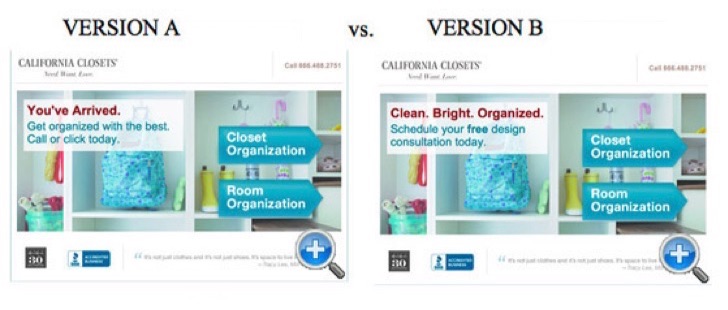
Version B would seem to have a clearer, more benefit-oriented headline and sub-headline.
But actually version A was the winner, increasing leads by 115%.
The reason is version A’s copy was written to align with the PPC ad copy that the user clicked on before arriving to the page.
The ad created an expectation of ideas in the mind of the user. So arriving on the page where the copy complemented and reflected those same ideas made them more likely to convert.
How to Apply it to Your Marketing Funnel
Traffic arrives on your website from five basic sources:
Direct (people typing in your website or clicking a link in your email)
Search
Social Media
Referral
Paid ads
The source heavily defines the context for people on your site.
One key to using the Law of Alignment in your funnel means tailoring the page that people enter into your website to the context of the traffic source.
Of course, you can take this to an extreme (i.e. if your traffic comes primarily from Google, that doesn’t mean you should redesign your site to have a similar UI and layout to Google with the hope of increasing conversions).
A more practical approach is to ask yourself:
How can we make that “on-ramp” into our funnel more inviting and anticipatory of the visitors’ needs?
What answers do visitors expect to find on each page based on what they searched for prior to arriving there?
What reassurances, if any, do they need once they are in the funnel, browsing our site, and evaluating our product?
As covered above in the Law of Clarity and Law of Friction, you have to do your research and listen with empathy to gain the biggest insights that will lead you to alignment.
The Bottom Line
The context from which a visitor comes to your site needs to be addressed; as does how you will deliver the information they need prior to making a buying decision.
Conclusion
I titled this article as “Sales Funnel Physics” because as in physics, these laws identify the universal principles behind why people do or don’t buy online, assuming there is a market need for the product.
I have not been able to find any case studies or A/B tests that do not fall under one or more of these principles:
The Law of Visibility says that offers must be seen in order for sales and conversions to occur. Sounds obvious, but it’s too often forgotten.
The Law of Big Changes says that as a general rule, testing more significant structural-, copy-, or design changes to your funnel is a best practice. This is because big changes will cause proportionally more varied results than small changes. It doesn’t have to “look” like a lot of work, as long as it is significantly different from your customer’s perspective.
The Law of Repetition is different from the Law of Visibility, because it says that the frequency of exposure to your offer has a direct impact on conversion rates. More exposure to the offer causes more conversion, though ROI diminishes after a point because people get annoyed.
The Law of Clarity says that before people become interested and decide to buy your product, they must first understand what it is.
The Law of Proof says that people care a lot about whether or not your product actually does what it claims. People are risk-averse, so they desire proof in order to minimize perceived risk before buying—in the form of testimonials, case studies, etc.
The Law of Friction says that the easier you can make the experience for an interested buyer, the more likely he/she will buy!
Finally, the Law of Alignment says that people will convert more often on offers and landing pages that better align with their context, like from which site they just came.
Have you noticed similar patterns when designing your sales funnel?
How will you apply the Laws of Sales Funnel Physics to grow your business?
Tell me about them in the comments and I’ll respond 🙂
About the Author: Matt Ackerson is the Founder of Petovera, a company that specializes in growing email lists faster with a pop-up optimization service. Business owners never have to lift a finger and you can see the results each month. Kissmetrics readers can grab an exclusive copy of the Law of Funnel Physics summary today, along with our free 5-day email course: How to Double Your Leads in 30 Days.
28 of the Best Chrome Extensions for SEO, Productivity & More

For all of the greatness that the internet affords — cute animal videos, GIFs, and interesting blogs — I think its biggest downside is how distracting it can be. How many times have you sat down to work and been pulled into a pit of procrastination?
Perhaps you get absorbed in updates on social media, or maybe you click through Wikipedia trying to determine what exactly Gina Rodriguez’s first TV role was (it was on Law & Order). No matter where you click online, it’s easy to be pulled into a black hole of distraction and low productivity.
Enter Google Chrome browser extensions. The Google Chrome web store offers a variety of different tools that help you be more productive with just one click. We can’t guarantee that they will make YouTube videos less tempting to watch, but we recommend them for busy marketers who want to make their time online more efficient. We’ve broken them down into different categories if you want to jump ahead:
Social Media, SEO, Content Sourcing, Blogging, Productivity
Please note: All of these are free tools, but some of the services that they work with have paid features or subscriptions, and those prices are included below.
28 of the Most Useful Google Chrome Extensions for Marketers
Social Media
1) bitly
This extension lets marketers quickly and easily shorten links and share them on social media directly from their browser. This is particularly useful for social media marketers, given that Twitter has a 140-character limit.
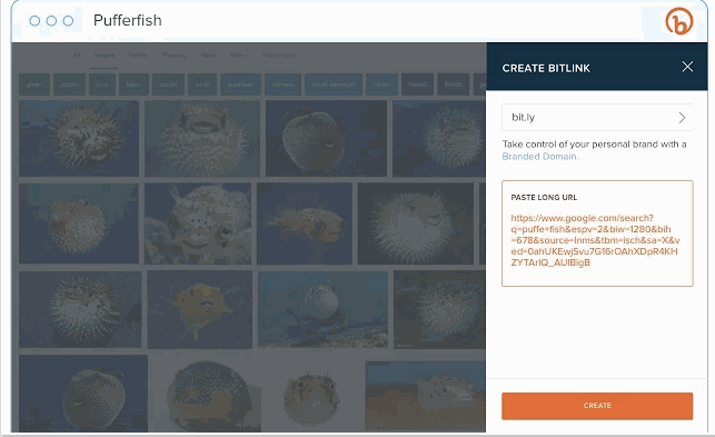
Image courtesy of bitly.com
Price: Free; bitly Enterprise pricing varies depending on company size
2) BuzzSumo
BuzzSumo provides insight into how content is performing. When you’re on a web page, click the extension to show metrics such as the number of social shares and backlinks to a piece. This tool provides an easy way to see how much engagement your content is generating. You could also use BuzzSumo to perform competitor analysis to uncover strategies that might make your content more shareable.

Price: Free with limited number of link analyses; BuzzSumo Pro starts at $99/month
3) Pinterest
This extension allows you to easily save items onto your Pinterest boards without navigating away from what you’re doing. What’s neat about this tool is that it shows you multiple pinnable items available on each website so you can save more than one item to your board at a time. (Normally, you would have to click into each blog post or image in order to separately pin each to your boards individually.)

Price: Free
4) Save to Facebook
Facebook’s new “Save” feature lets users aggregate links, images, and videos they find on Facebook in one location in their account. This bookmark allows you to do the same from anywhere on the web, making Facebook a centralized place to save content you’re interested in checking out later. (As you can see, in addition to inbound marketing, I’m also interested in learning more about footwear and vegan recipes.)

Price: Free
5) RiteTag
RiteTag shows you how hashtags are performing on Twitter and Facebook before you post content. Once you log in to RiteTag using your Twitter or Facebook credentials, it checks the hashtags you begin typing in real time and color codes them:
If your hashtag is green, it means the hashtag will help your content be seen now.
If your hashtag is blue, it means the hashtag will help your content be seen over time.
If your hashtag is gray, you should select a new hashtag because it has low levels of engagement.
If your hashtag is red, you should select a new hashtag because it’s so popular, your content will disappear into the crowd.

Price: Free
6) List Builder for Twitter
If you’re following a hashtag or event on Twitter, you may want to make a list of users tweeting about topics you’re interested in, which is time-consuming to do manually. With the List Builder for Twitter, you can navigate to a hashtag or trending topic and build a list of all users tweeting, or you can select which users you want to add to a list. Here’s an example of the tool in action: I built a list of all users tweeting “#INBOUND16.”

If you’re a HubSpot customer, you can easily create lists using the social streams featuring in the HubSpot Social Monitoring tool.
Price: Free
7) Instagram for Chrome
Want to keep tabs on Instagram notifications without having to constantly check your phone? With this extension, users can see what’s happening on their Instagram content directly within their browser.
Price: Free
SEO
8) MozBar
The MozBar is a Chrome extension that allows SEO marketers to easily get insights about different websites without leaving their web browser. With one click, you can find search ranking and link coding information about all of the search results on a Google results page.
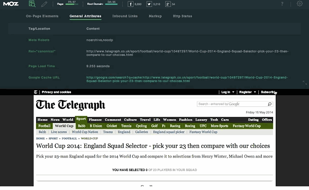
Image courtesy of Moz
Price: Moz subscriptions start at $99/month
9) Check My Links
Check My Links does what it says it will: It quickly scans web pages and shows you which links are working properly and which are broken. With this extension, marketers can ensure that their own websites are functioning properly for their visitors. Additionally, marketers can check for broken backlinks to their content on other websites to build backlinks to their content and increase their domain authority.

Price: Free
10) NoFollow
NoFollow quickly indexes web pages and identifies links that are coded with the nofollow metatag. Nofollow links aren’t crawled by search engines and don’t contribute to search engine authority, so SEOers can use this extension to determine if external sites are backlinking to them with followed, or indexed, links. Additionally, you might use nofollow links on web pages you don’t want crawled, such as a landing page or thank you page, and this extension can easily double-check if you’ve coded links correctly. In the example screenshot below, nofollow links are highlighted in red.

Price: Free
11) Impactana
Impactana’s Chrome toolbar offers a wealth of SEO, social media, and content marketing information about any web page. Its two biggest metrics are “Buzz,” which measures a website’s reach on social media, and “Impact,” which measures SEO metrics such as clickthrough rate, backlinks, and time on page. It also shares details like author and publisher contact information that are useful for PR professionals.
Price: Impactana subscriptions start at $99/month
Content Sourcing
12) HubSpot Collect
Whether you’re conducting research for a project or simply reading different articles online, you most likely come across resources that you want to save and return to for later use. That’s where HubSpot Collect will come in. Instead of saving content to another application or document, you can save it directly to your HubSpot software for easy reference when you sit down to write a blog post or web page. Coming soon to HubSpot software, Collect will automatically generate author attributions and citations if you want to cite a link you saved for a blog post.
Price: HubSpot Marketing Software starts at $200/month
13) AwesomeScreenshot
AwesomeScreenshot is a screen capture extension with capabilities for annotation and photo editing while staying in your browser. Once you take a screenshot of a selected area of your screen or an entire web page, you can crop, highlight, draw shapes, and blur sensitive information.

Price: Free
14) Evernote Web Clipper
Evernote is a note-taking and organization app that can be shared across teams for content collaboration. With the Evernote Web Clipper extension, users can save links onto a clipboard within their Evernote app for later reading and reference.

Price: Free
15) Giphy for Chrome
Everyone loves animated GIFs. They make emails, blogs, and social media posts engaging and funny, and with this extension, you can easily grab a GIF from Giphy’s huge database for whatever content you’re working on without navigating away.

Price: Free
16) Bookmark Manager
Manually bookmarking websites can sometimes be a tedious process, so Google created this extension to organize websites you want to save without having to open a new tab. Save websites to bookmarks, create folders, and add notes for later reference.

Price: Free
17) OneTab
When you conduct research for a piece of content, it’s easy to get swamped in multiple open tabs with great resources you want to cite. The trouble is, once it comes time to write and refer back to the sources, it’s hard to navigate between all of the tabs. Luckily, OneTab lets you put multiple different URLs into a single tab for easy reference.
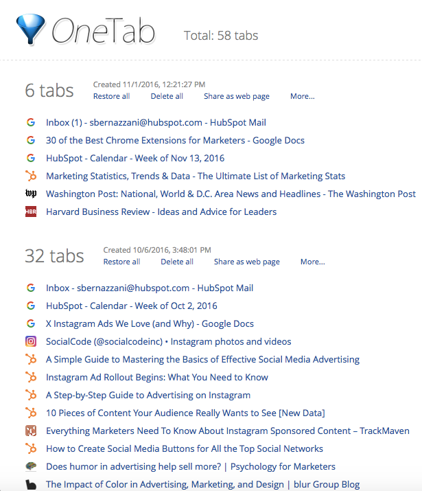
Price: Free
Blogging
18) Grammarly
Grammarly is my go-to app for reviewing blog posts for proper spelling, grammar, and word use. You can drop large pieces of text into the desktop application for review, or you can use the handy Chrome extension to call out any grammar errors you’re making while typing on the web. Here’s an example of Grammarly pointing out an error I was about to make in a tweet:

Price: Free with subscription upgrades for more in-depth reviewing
19) Google Dictionary
Have you ever come across a word you’re not familiar with while doing research online? Instead of Googling it in a separate tab, quickly highlight the word and click on the Google Dictionary extension to get the definition.

Price: Free
20) Office Editing for Docs, Sheets & Slides
For those times when you and your coworkers are working on computers with different operating systems, or want to collaborate on a live document together, check out Office Editing. This extension lets you easily drop Microsoft Office files into Google Drive to view and edit them without needing the software installed on your hard drive. Here’s an example of an Excel file that I dropped into my Google Drive:

Price: Free
21) QuickWrite Text Editor
Sometimes it’s hard to free yourself of distractions to write productively, especially if you’re writing online. This extension quickly opens a new tab for a clean and neutral text editor that auto-saves while you’re working if you need a break from where you normally write.

Price: Free
Productivity
22) ToDoist
ToDoist is a project management tool that lets you create highly organized and visually appealing to-do lists across all of your devices. What’s neat about the Chrome extension is that you can see your to-do list, or your team’s shared lists, and add tasks to it without having to open a separate tab, app, or device.
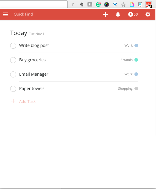
Price: Free for Basic; $29/year for Premium
23) Rapportive
Rapportive uses LinkedIn account information to provide details about the recipient of an email you’re drafting. This is a great way to get details about someone you’re trying to connect with and to ensure that you’re contacting someone on their correct email address.

Price: Free
24) Momentum
Momentum is a simple Chrome extension that replaces blank new tabs with beautiful photography, inspiring quotes, weather reports, and a space for you to write down a priority for the day when you open up your browser for the first time. (Don’t worry — the temperature is in Celsius, it’s not that cold in Boston.)

Price: Free
25) StayFocusd
StayFocusd lets you budget your time on specific websites so you can eliminate distractions when you need to buckle down and work. It’s highly customizable — you could set your time limit to 20 minutes on Twitter and only five minutes on Facebook, for example. It also has neat features like the Require Challenge: Once you set time limits on sites, if you want to go back and change your settings, you have to complete a challenge (think: retyping a piece of text without typos or answering questions).

Price: Free
26) LastPass
LastPass is a password manager that auto-fills in passwords for all of the accounts you save with this extension. You only have to remember one password: your LastPass password. This saves you time, headaches, and increases the security of your personal data.
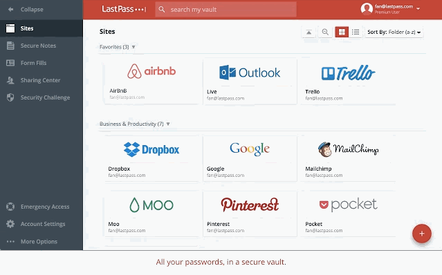
Image courtesy of LastPass
Price: Free
27) Add to Trello
If you use Trello for project management, team collaboration, your content calendar, or just a personal to-do list, this extension lets you easily add links as cards to your Trello boards.
Price: Free; Trello subscriptions start at $9.99/user/month
28) Extensions Manager
We couldn’t give you 27 different extensions to try out without also suggesting Extensions Manager. Try this tool to organize all of your extensions so they don’t take up half of your browser’s screen. It shows you what extensions you have operating on Google Chrome and gives you the option to hide some of the icons to keep your browser better organized.

Price: Free
Now that your browser is loaded with extensions to make marketing easier on a day-to-day basis, test them out to see what time and efficiencies you’re able to save. When you’re ready to work on your next piece of content, try these content curation hacks and tools to make that process simpler, too.
What’s your favorite Google Chrome extension? Share with us in the comments below.

![]()
Bringing a virtual Pride parade to students in Bogota, Colombia
Editor’s note: Earlier this year, we launched #prideforeveryone, a global virtual reality Pride parade that anyone, anywhere could join. Since then, we’ve distributed Google Cardboard and the virtual Pride experience to more than 20 groups and nonprofits, worldwide. This is the story of Alba Reyes, founder of the Sergio Urrego Foundation, who brought the parade to students in Bogota, Colombia.
In 2014, my son Sergio took his own life because he was suspended and discriminated by his school for kissing another boy. Unfortunately, neither I nor his friends were able to prevent the harassment and isolation he felt.
Since then, I’ve made it my mission to make sure what happened to Sergio doesn’t happen to any other young person in my country. I started the Fundacion Sergio Urrego to travel to schools across Colombia and lead inclusion workshops with local students. Although LGBTQ children may be more likely to feel isolated, many young people don’t feel accepted by their families, friends or teachers. My workshops create activities and safe spaces that help students understand how it feels to be discriminated against – reinforcing the importance of diversity and inclusion.
An important part of these workshops is helping students put themselves in another person’s shoes. This summer, we used Google Cardboard to give students in my workshops a way to experience Pride parades from across the globe. Most of these students have never seen a LGBTQ Pride parade. But with virtual reality, they can learn more about the global LGBT community, and feel supported by a global community that celebrates diversity.
Celebrating Virtual Pride in Bogotà, Colombia #prideforeveryone
After seeing the impact of my workshop and virtual Pride parade on children in Colombia, institutions like the Ministry of Information and Communication Technologies have have showed their support to scale my workshops to even more children across the country.
My fight is not just for my child. It’s for all children who have endured discrimination and bullying from their peers, teachers and community.
If you’d like to join Alba, teachers, and community leaders around the world in bringing this virtual reality experience to your group, you can use this discussion guide created by one of our Google Educators. Interested in creating your own #prideforeveryone lesson plan based on the 360 film? Share your lesson on TES, the world’s largest online community of teachers
The Year in Search: 2016
It’s that time of year — when we look back at the last 12 months and reflect on the trends that defined the year in Google Search. From Powerball numbers to Olympic champions, whether making dessert or becoming a mannequin, this year affected us all in different ways. Through all the highs and lows, people came to Search to learn more and understand.

So to celebrate the end of 2016, here’s a peek at some of the trending U.S. topics that caught our attention as especially unique to this year.
Powerball: It may seem like a distant memory now, but back in January a record-breaking jackpot made Powerball a hot topic. Search interest in Powerball spiked more than 166 percent, and it’s the top trending search for all of 2016.
Politicians and athletes: In a year with the Olympics and U.S. Election, it’s not surprising that nine of our 10 top trending people of the year fell into one of these two categories — from Donald Trump to Michael Phelps and Hillary Clinton to Simone Biles. The one outlier? Steven Avery, the subject of Netflix’s “Making a Murderer” documentary.
Pokémon Go: Pokémon Go took our lists — and the world — by storm this year. The addictive game appeared four times in our list of top 10 “How to…” questions, with “How to play Pokémon Go?” at the top. Clearly searchers were eager to learn how to catch ‘em all!
Quinoa and Budweiser: From Big Macs to quinoa, Budweiser to Maui Brewing, Brussels sprouts to Buttercream Frosting, it’s clear from our trending calorie, recipe and beer lists that we’re a country of many tastes. One of the new trending recipes this year? Snow cream, a dessert that’s the perfect winter treat with some fresh snow, sugar, milk and vanilla.
Slime and… mannequins: “How to make slime” isn’t a phrase we hear often — until now. Maybe it was the new “Ghostbusters” movie, but while voting and Pokémon dominated much of this year’s “How to…” list, one green, slimy question made its way up to #4. Meanwhile, on the “What is…?” list, the mannequin challenge is standing proud — and very, very still — at #7.
These are just a few of the trending terms that made up 2016. From remembering past icons like David Bowie and Prince, to searching for current ones like Beyoncé and Alexander Hamilton (a.k.a. Lin-Manuel Miranda), to looking for information on Brexit, Zika, Orlando and Brussels, Search brought us together in dozens of ways this year. Dive into google.com/2016 to see lists from around the world.
Here’s to finding what we’re searching for in 2017.
(Google) Home for the Holidays
It’s that time of year. Holiday music, sweet treats, classic movies — all the reasons to cozy up and spend time at home with the ones you love. And with Google Home, there are countless ways to spread the holiday cheer.
Play Netflix on your TV with the magic words “Ok Google”
Serve up the holiday classics that make your season bright, hands-free, right to your TV — when Google Home is paired with a Chromecast device. Now, in addition to YouTube videos, you can stream any movie or TV series from Netflix to the TV, using just your voice*. Start with “Ok Google, play Stranger Things from Netflix on my TV” or “Ok Google, play Love Actually on Netflix on my TV”. You can even control your media with commands like “Pause this episode”, without lifting a finger. Here’s how to link your Netflix account to the Google Assistant from the Google Home app (make sure you’re running the latest version). Netflix linking in the Google Home app is available now for iOS and rolling out to Android this week.
Enjoy your Google Photos on the big screen, hands-free.
The holidays is the perfect time to gather around and relive memories from the year. Google Photos now works with Google Home, so you can share your photos on your Chromecast-connected TV, using just your voice. Simply say, “Ok Google, show my photos of Lake Tahoe on my TV” to see your beautiful pictures bigger. Even if you can’t remember the name of the album, you can search for pictures. Try “Ok Google, show my photos of selfies at Christmas on my TV” or “Ok Google, show my photos of Brazil sunsets on Chromecast”. You can even use your voice to search for your places, things and people.
Learn how to link your Photos account to the Google Assistant here.

Enjoy holiday music from your favorite apps
Fill your home with festive tunes from your favorite music apps like Google Play Music, Spotify, Pandora, or YouTube Music with just a simple voice command. Say, “Ok Google, play Hanukkah music” or “Ok Google, play Christmas music” and you’ll get into the spirit in no time.
Keep track of Santa
Whether he’s preparing his sleigh or already in flight, your Assistant keeps you informed of Santa’s latest whereabouts (tracked by Google Maps). Just say “Ok Google, where’s Santa right now?”
Get YouTube Red FREE for six months
Keep the holiday glow going well into the new year as you enjoy a premium music experience — more songs, more versions, no ads — with YouTube Red. Get six months free of YouTube Red when you buy a Google Home before December 31, 2016**.
Make your holidays truly magical with Google Home.
*Netflix streaming membership required
**Offer expires 12/31/16. Terms apply. New subscribers only.
How to Increase Conversion Rates with Better Product Content
If you’ve been reading our blog for awhile, you likely already know that a good product description can help sell a customer on your product or service. But too often, we put too much emphasis on the description itself while blissfully ignoring the other aspects of a product’s presentation.
According to a recent study from SurveyMonkey available through Salsify, fully 94% of customers will abandon a site if they can’t find the information they need to make an informed purchase. And 88% of shoppers said that product content plays an extremely or very important role in their purchase.
So what kind of content makes the biggest difference in sales? You may be surprised.
Price Isn’t Everything When it Comes to Motivating the Customer to Buy
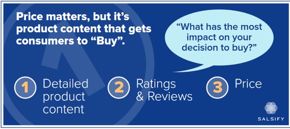 Image Source
Price is understandably a big factor in making shopping decisions. But it is not the biggest or most pivotal reason in the customer’s mind. Customers who were surveyed for the study indicated that product features – particularly bullets, images, videos and reviews were much more likely to convince them than price alone.
When asked about the underlying reasoning behind their decision, the customers explained that these points were the only way they could know exactly what they were getting. The closer the item comes to fulfilling their needs, the better their overall experience.
Oftentimes, e-commerce sites have so many products or so many variations that they simply put up whatever the manufacturer has written about the item and hope that it’s enough to seal the deal. But manufacturers aren’t in the business of selling to end users, therefore their product details are usually bland, boring and highly technical.
If this is the case for items in your e-commerce catalog, it’s worth doing a content audit to determine which of the most in-demand items aren’t getting the conversions you’d hoped for, and then taking a closer look at what’s actually being presented to the customer.
Customers Want to See Things in “3’s”
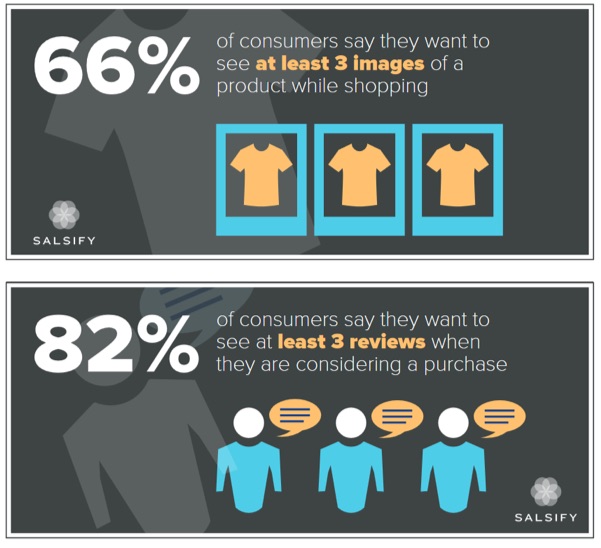 Image Sources (Top & Bottom)
According to the study, the vast majority of customers wanted to see at last three images of the item, and read at least three reviews about it. What may surprise you here, however, is that around 75% of them said that they would rather see the image itself against a plain background or being used, rather than photos from users that bought the item.
What’s wrong with user-submitted photos? While “user generated content” is often promoted as another branch to your existing content marketing efforts, in this case it can backfire. Oftentimes they may include accessories or add-ons that don’t come with the original standalone item, or they may already have used the item, so it’s not an accurate representation of what’s in the box.
Here, it’s the responsibility of the brand to make sure the images they submit of the product are crisp, clear and show precisely what the customer is getting.
Even after you have crisp, clear images of the product, solid reviews and a competitive price, there’s still the question of catering to mobile shoppers. Do mobile shoppers carry the same priorities in mind as their more traditional desktop-shopping counterparts?
Mobile Shopping Still Has Some Growing Up to Do
Consumers shopping on mobile devices have their own issues to contend with, and scant product descriptions don’t help here either. Oftentimes, in a rush to make sure they can attract mobile-browsing consumers, companies make the mobile version as bare bones as possible. But, as you might imagine, there’s a major trade-off between fast-loading sites on a phone or tablet, and getting all of the information you need.
Here were some of the complaints, according to the study:
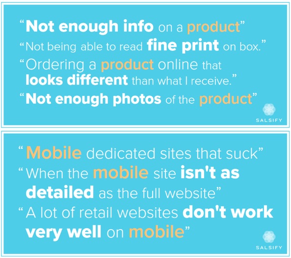 Image Source
And if you thought not having enough images, a lack of reviews, or boring technical data about a product were conversion rate crushers, just look at what mobile users have to contend with! Things like not being able to read the fine print (what are they hiding in there, anyway?), buggy websites, and even product fulfillment issues all considerably dampen the customer experience.
Fortunately, these are all things that can be remedied with a more thorough look inside the mobile shopping process. Don’t look at your mobile e-commerce as a branch off from your desktop-friendly version, but rather treat them as one and the same. Is it just as easy for a mobile user to find information on a product as it is browsing from a tablet or laptop?
If not, take steps to remedy that, as Google and other search engines are a prime spot for mobile users to begin their research – and the better prepared you are to accommodate mobile users, the more you could earn in revenues.
Targeting Moms or Millennials? Then Pay Close Attention…
As we gear up for the holiday shopping season, there’s no better time to carefully analyze your product descriptions. But there are two groups in particular that advertisers are keenly looking to attract: moms and millennials. Although product content is just as important to these two groups as all of the other demographics, there are specific approaches that need to be kept in mind if you’re targeting them.
First, millennials were 40% more likely to report that product content influenced their decisions to buy. They were also 50% more likely to rank ratings and reviews as having the biggest impact on deciding which site to buy from. Social and user-generated content are important to them as well, and unlike most shoppers, they are 72% more likely to buy an item based on photos from other users.
Moms, on the other hand (to the surprise of absolutely no one) don’t have a lot of time. They were nearly a third more likely to shop on their phones than others, and tend to only visit one or two sites before making a decision. That’s why it pays to invest in making sure your site’s mobile shopping experience is just as easy and thorough as regular desktop-based online shopping.
Making Your Product Content Shine
So what insights can you take away from these findings? First, if you’re focusing too much on your product description to the exclusion of everything else (reviews, images and even social content), you’re doing a major disservice to your users. Every aspect of your product detail page should be looked at – from bullet points to image selection to even unboxing videos and so forth.
Look for ways to integrate social and user content in ways that lend to – but not overshadow – brand-powered content. And above all, take the time to ensure that mobile shoppers can access the same kinds of details, swatches, photos and other information as regular online shoppers. Too often we pour our attention into making a site’s product and checkout flow as seamless as possible – leaving mobile as more of an afterthought hastily tacked on to the process than the integral part it should be.
What are your thoughts on getting the most out of product descriptions? Have you ever read a product detail page so irresistible you couldn’t help but buy? For many of us, the description is the make or break point of a conversion – so take the time to make sure yours is the best it can be, starting right now.
About the Author: Sherice Jacob helps business owners improve website design and increase conversion rates through compelling copywriting, user-friendly design and smart analytics analysis. Learn more at iElectrify.com and download your free web copy tune-up and conversion checklist today!
14 Scientific Reasons to Disconnect This Weekend [Infographic]

So. Any exciting plans for this weekend? I bet you’re looking forward to spending some time with your family, or catching up with friends. Maybe there’s a new recipe or restaurant you’ve wanted to try. And, of course, there are those countless minutes of checking your work email.
Wait. What? That doesn’t sound like a relaxing way to spend the Saturday. Or Sunday. Or both.
And yet, so many of us do it. In fact, 81% of American workers say they are required to be in contact outside of working hours — that includes weekends. 
The thing is, we know better. There’s plenty of research out there on the negative impact of screentime on our health, especially when it comes to our sleep cycles. But there’s even more science to support the art of unplugging, which our friends at NetCredit compiled into this helpful infographic.
So have a look. And then — please — disconnect for the weekend.

![]()
How to Plan a Seasonal Marketing Campaign: A 5-Step Guide

Seasonal events and celebrations present different opportunities for different business sectors. For many brands, seasonal opportunities are huge and often the most commercially critical times of the financial year.
But planning an effective seasonal campaign not only takes a lot of organisation, it also takes a considerable amount of time. For this reason, smaller brands tend to let these opportunities come and go without making the most of them.
Rather than miss out on an opportunity to connect with you audience and leverage the ongoing conversation during any given season, we put together some tips designed to help you get your campaign off the ground. Let’s walk through them below.
How to Plan a Seasonal Marketing Campaign: A 5-Step Guide
Step #1: Choose a seasonal opportunity.
When choosing a season to serve as the jumping off point for your campaign, it’s important that you’re being strategic. In simple terms, one of the key routes to success with seasonal campaigns is using an opportunity that engages your audience. If your audience doesn’t engage with the season itself, you can’t expect to see results from a campaign centred around it.
That said, if you have conducted research into your audience, then you’ll likely know their attitudes around these big seasonal events and should be able to pair that with an event that suits your product or service.
Audit Existing Seasonal Campaigns
Once you have decided on a seasonal event to utilise for a campaign, have a look at some of the last few years’ most successful content campaigns for this occasion — Ahrefs and BuzzSumo are great places to start with this. When evaluating existing, successful campaigns, spend some time thinking about how each piece approached content format, distribution, messaging, and emotion.
When validating a campaign, you might find that it’s helpful to ask yourself the following questions:
How has this piece used multiple content types and distribution platforms?
Is the messaging clear and if so, what is it?
What emotion does this campaign evoke in the user?
This type of analysis makes it easier for you to uncover common denominators that may inspire the ideation for your own campaign and contribute to your strategy when planning.
Gather Insights via External Outreach
If you’re looking for an outsider’s opinion, try doing some outreach to journalists or various digital publications that have previously covered some of the campaigns you analyzed above.
By sending out some feelers to see what kind of content they like to post around your chosen season, and when they like to receive press releases for these pieces, is a valuable way to spend a couple of hours or so.
That isn’t to say you must take the feedback you get as gospel, but it is good to bear in mind when you are planning your seasonal campaign.
Step #2: Nail down the messaging.
As with any marketing campaign, your seasonal campaign messaging is so important. To help you get started, you should be thinking the following:
The customer journey and the story you want to tell
The emotions you want to evoke in your audience
A call-to-action or the desired next steps you want to encourage
In 2013, MegaRed — a company that sells a type of krill oil supplement that is good for your heart — launched a noteworthy digital Valentine’s Day campaign.
The basis of the campaign was simple: ‘Whose Heart do you Love?’ consisted of a video piece that urged viewers to give the gift of a healthy heart to someone they love on Valentine’s Day by applying for a free sample of MegaRed via its Facebook Page. To return the love, MegaRed would send the user a free sample, too.
To add an additional tug on the old heart strings, MegaRed also promised that once 100,000 free samples has been claimed, it would donate $100,000 to the National Coalition for Women With Heart Disease.
When it comes to messaging, this campaign hit on all the points mentioned above:
The customer journey and the story you want to tell: The messaging focused on new customer acquisition, and pushed the universal importance of hearth health.
The emotions you want to evoke in your audience: In this case, it was love. MegaRed promoted its product by urging those watching to help their loved ones take care of themselves and their heart.
A call-to-action or the desired next steps you want to encourage: Request a free sample.
Step #3: Establish a schedule.
With seasonal campaigns, timing is of the essence. This means not only scheduling time to plan well in advance of the event, but also planning the execution of each stage of the campaign at the right time.
With today’s journalists, editors, and site owners receiving hundreds of content pitches and press releases each and every day, you can imagine the influx they receive around peak seasonal times. That said, you need to have your content prepared, built, planned and ready to be sent to sites at least two months before the big event — preferably sooner.
When creating a schedule for your campaign, don’t forget about your audience. When is the best time to contact them? When will they be most willing to share the content or engage with the campaign? Plan around that, too.
Step #4: Organise your assets.
You should consider all marketing platforms — email, social, PR, blogging, SEO — when planning your seasonal content campaign, as incorporating different platforms in your campaign allows for an effective content flow, increased reach, and increased engagement.
One of Zazzle’s most successful seasonal campaigns was one done for AO.com, a retailer specialising in household appliances. This simple idea — ‘A Guide to the Ultimate Christmas Dinner’ — manifested into a truly successful campaign that spanned many different content formats and platforms.

↓

↓
The hero piece was a content hub that sat on the AO.com blog. This interactive piece greeted the user with 12 of the staple ingredients that make up a Christmas dinner that, when clicked on, lead to a simple recipe on how to cook them — including both an ingredients list and a methodology. This recipe could then be downloaded by clicking a ‘download recipe’ CTA.
Outside of the content hub, we created an infographic that detailed step-by-step instructions for cooking a Christmas dinner. This was distributed via our blogger relations team to help AO.com’s campaign gain traction on related websites.
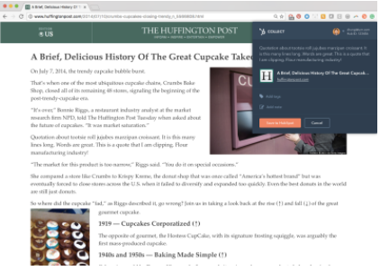
Then it came down to outreach. And with the help of an organized press release and PR push, this campaign was featured in three different articles — including spots on Daily Mail, The Huffington Post, and 50 Connect.
Finally, due to the useful nature of the content, it shared well on social platforms, adding to the overall success and visibility of the campaign.
The lesson? Think big picture when planning your campaign assets. By distributing your campaign’s message across different mediums and placements, it’s easier for folks to find it and share it with their following.
Pro Tip: Having an effective, up-to-date campaign plan document is absolutely essential during this part of the process. It will enable you to better organize the timing and frequency of content release, and keep your messaging consistent by serving as a home for all of your campaign assets and communications. Check out these content marketing planning templates to get started.
Step #5: Report and remain agile.
Something that is imperative when managing and planning a marketing campaign is the ability to be agile. Report and review the campaign’s performance as you go along and adjust your strategy if you feel it’s necessary.
Where is the majority of traffic coming from? Which pages have the best bounce rate? Which ones are converting the best? Use these simple metrics, and other campaign success measurements, to inform your strategy moving forward.
Don’t be afraid to make alterations to the original plans. If the changes you are going to make will ultimately improve the campaign’s success, why wouldn’t you make them? Remember: It doesn’t matter that this plan isn’t what you started with.
Getting Started
With 2017 coming at us full steam ahead, begin to think about which seasonal events your brand could benefit from over the next 12 months. After all, nailing these seasonal campaigns could be the key to your best financial year yet.
What are your best tips for planning a seasonal campaign? Share them below.

![]()
User-Generated Content: The Secret Weapon for Your Next Email Campaign
Today’s economy is all about social proof.
User-generated content (UGC) is one way to showcase why your brand matters. Moreover, email combined with UGC is a chance for ecommerce businesses to connect with consumers and generate revenue.
Olapic found that “user-generated content in email sees a 43% increase in click-through rates and a 2-3X conversion rate.” Visualization and authenticity accelerates consumers’ desires to purchase.
“UGC creates an opportunity to transition customers into brand advocates and provides customers with instant feedback about the product that doesn’t appear as a list of features,” says Kimberlee Morrison, a SocialTimes columnist.
Let’s explore how to integrate UGC into your next email campaign.
Earn Credibility
Integrity remains a cornerstone in the business sector. If you can’t prove that your company has the trust and respect of your customers, the market will question your influence and services.
That’s why social proof is an effective tool for earning consumer’s confidence. Having others speak on your behalf means people are willing to vouch for your brand’s quality. In essence, it shows potential customers that your business deserves their attention.
“The purpose of user-generated content is to humanize your brand. And with 51% of consumers trusting user-generated content over information on your brand’s website, you can build better relationships with this content stream,” says Alex York, a writer and SEO specialist.
Email is one of the best methods to exhibit your UGC. This communication channel gives your subscribers an intimate perspective on how your company can serve their needs.
In addition, research shows that “77% of consumers prefer email for marketing communications.” Customers can read your messages when and where they prefer, unlike a phone call.
UGC lets your audience see real-life testimonials about your products. Below is an example email from Foot Locker. The footwear retailer displays selfies from customers wearing its sneakers. The brand also encourages others to participate with the opportunity to be featured in the next email campaign.
 Image Source
To earn extra credibility with your consumers, publish the first name of the individual beside the UGC. Or link the person’s social media account to his or her submitted photo. This tactic reassures the email subscriber that you’re highlighting real people in your emails.
Validate your brand’s worth with user-generated content. It’ll uncover more value to your customers.
Create Commerce
At the end of the day, your purpose is to bring sales to your company. And your team’s marketing efforts must possess a connection to revenue. If not, you risk losing sight of business goals.
Salesforce Marketing Cloud reports that “20% of marketers say that their business’ primary revenue source is directly linked to email operations.” Email is more than just informing your subscribers about product releases or sending the occasional thank you note.
“Email is one of the most popular channels retailers use to engage with new and returning shoppers. Triggered emails are especially powerful to re-engage shoppers who have abandoned some type of action on your site,” states Liz Bedor, a senior content marketing manager for Bluecore.
Use email to bridge your UGC to the sales funnel. For instance, consumers in the awareness stage may benefit from content that displays multiple products sold by your brand. This exhibition will show off what you can offer interested buyers.
On the other hand, when consumers are ready to buy, focus on adding a call-to-action to your UGC that leads people directly to your product pages. GlamGlow places UGC alongside the product with a link.
Another approach is to tie your sales to a notable charity. Studies reveal that “at least 70% of millennials have purchased a product that supports a cause.”
ONA, a retailer of fine bags and accessories, teamed up with charity: water to donate a portion of its sales to the nonprofit. Customers were sent an email motivating them to buy a specific product and to show their support with hashtag #GivingTuesday on social media.
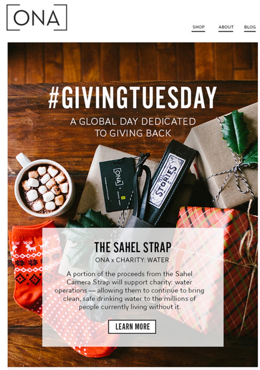
It’s possible to attach user-generated content to your sales strategy. Experiment with different options to find what works for your business.
Host Contests
Your team recognizes the benefits of UGC combined with email. However, how can you inspire consumers to actually create it?
Hosting contests and giveaways is a simple technique to acquire UGC and spread the word about your brand. People want the chance to really engage with your culture.
Decide what type of campaign you want to run. What will be the theme? How will consumers enter the contest?
Be specific on what is acceptable UGC. Some companies prefer photos featuring their products, while others desire text describing their services. A good tip is to focus on how the customer experiences your brand, rather than emphasizing your products.
Also, think about what prizes will be suitable for your participants. It must be enticing enough to get them involved, but not too extravagant that your business is struggling to make payroll.
“To give your subscribers an extra push to submit, you can hold a contest, with a gift certificate or other prize going to the most creative submission,” writes Amber Humphrey, a VerticalResponse contributor.
JewelMint promoted its #FestivalFashion giveaway via email. The message persuaded consumers to snap photos of themselves wearing the brand’s products during Coachella. Tagged pictures on Instagram gave the entire community the ability to see the entries. Winners received four pieces from JewelMint’s collection.

As always, check with your legal department when initiating contests. You need consumer permission to use content, and it’s vital that you adhere to all your local laws.
Make submitting UGC a fun-filled experience. It’s time to host your very own contest.
Build Community
The power of UGC lies in its capacity to amplify the voices of your consumers.
Just a couple of decades ago, companies controlled how they crafted messaging around their brands. Now, customers can post content, positive or negative, about their experiences.
Your business can help narrate UGC by building a community of advocates. These brand ambassadors are engaged individuals who emulate your company culture and speak highly of your brand amongst their peers.
“By utilizing UGC, brands give real users the opportunity to tell real stories – something that may be inherently missing from brand generated content,” says Brian Peters, social media at Buffer.
With email, you can talk directly with consumers and build camaraderie through customer anecdotes. Your subscribers receive a personal view of how others interact with your brand.
Fashion retailer Revolve sends emails with photos spotlighting its clothing worn by brand advocates. It’s unique and strengthens the company’s credibility in the marketplace.
 Image Source
Shape how your brand is presented to the public. Enlist influencers to move UGC in a favorable direction.
![]()
Did you know? With Kissmetrics, you can track the effectiveness of your online advertising. Optimize your marketing by knowing which campaigns perform and which don’t. Check out our infographic to learn more.
Try UGC & Email Together
Leverage user-generated content to build trust with your email subscribers. Demonstrate your brand’s uniqueness and build real consumer connections.
Earn credibility by adding customer testimonials to your emails. Host contests to excite consumers about submitting their content. And link UGC to your sales funnel to add revenue to your bottom line.
UGC is your secret weapon for your next email campaign.
About the Author: Shayla Price lives at the intersection of digital marketing, technology and social responsibility. Connect with her on Twitter @shaylaprice.